
Critique is uncomfortable. I’ve been shooting full-time for twenty years and I still feel it, that slight tightening in the chest when someone picks apart an image I was proud of in the field. But critique is also, consistently, the fastest way I’ve ever improved. Not the vague kind, where someone tells you an image “feels busy,” but the specific, actionable kind where someone sits down with your file and says: here’s exactly what’s pulling the eye the wrong direction, and here’s how to fix it.
That’s what makes Watch the full tutorial on YouTube worth your time. In this William Patino tutorial, he works through a selection of submitted images from photographers he’s mentored, and the feedback he gives is surgical. He doesn’t just say what’s wrong. He opens the file, makes the adjustment, and shows you the before and after. The section I keep coming back to is his breakdown of an aurora image, because the problems he identifies there are ones I see constantly, in student work, in my own early work, and honestly sometimes in shots I’m still tempted to keep.
The core lesson is this: a beautiful subject does not automatically produce a cohesive image. An aurora, a mountain, and a bridge can all be genuinely spectacular and still fight each other into a muddy, unfocused frame. What Patino walks through is how to diagnose that tension and, where you can’t fix it in the field, how to manage it in post so the viewer’s eye lands somewhere intentional.
Step 1: Identify Competing Focal Points Before You Edit Anything
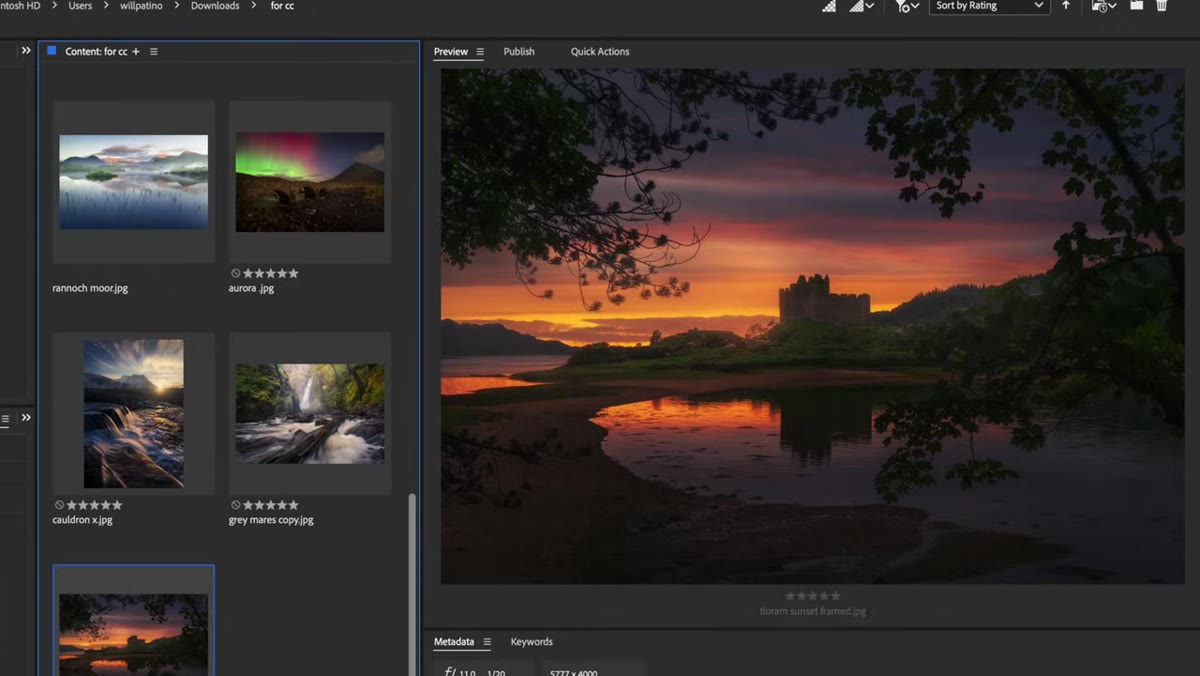 Aurora image with mountain and bridge open on screen
Before touching a single slider, Patino looks at the image and names what’s competing for attention. In this aurora frame, there are three strong elements pulling in different directions: the aurora itself on the left side of the frame, a large mountain on the right, and a bridge roughly in the center. Any one of those could anchor a strong image. All three together creates a tug-of-war.
Aurora image with mountain and bridge open on screen
Before touching a single slider, Patino looks at the image and names what’s competing for attention. In this aurora frame, there are three strong elements pulling in different directions: the aurora itself on the left side of the frame, a large mountain on the right, and a bridge roughly in the center. Any one of those could anchor a strong image. All three together creates a tug-of-war.
His point here is compositional and it applies in the field as much as in post. If the aurora is breaking to one side and your mountain is on the other, you have a decision to make: either exclude the mountain and commit to the aurora and its reflection, or find a framing where the mountain and aurora work as counterweights with the bridge threading between them. Neither is wrong, but the choice has to be deliberate. Accidental balance reads as chaos.
Step 2: Cool the Global White Balance to Neutralize Warm Moonlight
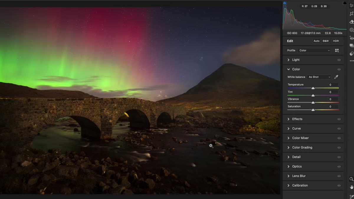 Temperature slider pulled left in Camera Raw
The most immediate problem Patino flags is the warm orange cast sitting in the lower half of the frame. Moonlight hitting a landscape and then being interpreted by the camera’s auto white balance often produces this result: golden rocks, amber water, tones that feel like a campfire when they should feel like midnight. It works against the cold, ethereal quality that makes aurora images so striking.
Temperature slider pulled left in Camera Raw
The most immediate problem Patino flags is the warm orange cast sitting in the lower half of the frame. Moonlight hitting a landscape and then being interpreted by the camera’s auto white balance often produces this result: golden rocks, amber water, tones that feel like a campfire when they should feel like midnight. It works against the cold, ethereal quality that makes aurora images so striking.
His fix is a global temperature adjustment, pulling the white balance cooler by roughly minus 20 in Camera Raw. That single move neutralizes the orange rocks and the golden water and lets the blue-green of the aurora feel coherent with the landscape below it. This is a move I make on almost every blue-hour or overnight shot I edit. Auto white balance is useful in daylight. At night, it tends to panic.
Step 3: Lift the Aurora’s Reflection in the Water with a Local Brush
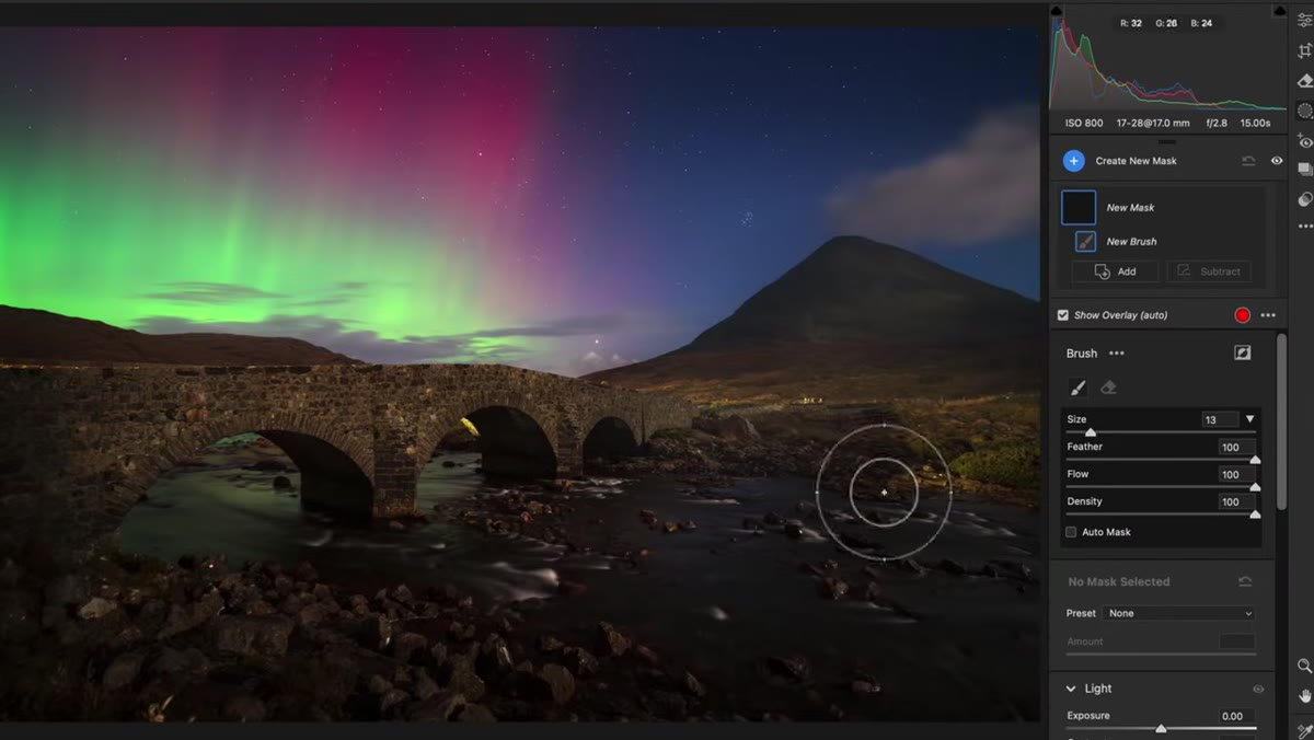 Adjustment brush brightening river reflection
Once the global temperature is corrected, the aurora’s reflection in the river becomes more visible, but it still needs help. Patino uses a local adjustment brush to selectively raise the exposure and lift the whites in the water. The goal is luminosity, not blown highlights. You want the river to carry light in a way that breaks up the dark tones in the foreground and pulls the eye through the frame from bottom to top.
Adjustment brush brightening river reflection
Once the global temperature is corrected, the aurora’s reflection in the river becomes more visible, but it still needs help. Patino uses a local adjustment brush to selectively raise the exposure and lift the whites in the water. The goal is luminosity, not blown highlights. You want the river to carry light in a way that breaks up the dark tones in the foreground and pulls the eye through the frame from bottom to top.
The specific values matter less than the intent: you’re looking for the water to glow without going clinical. Bring up exposure, nudge the whites, and watch the histogram. If you’re losing texture in the reflections, you’ve gone too far. The reflection should feel like light on water, not like a studio backdrop.
Step 4: Darken the Sky Edges to Push Attention Inward
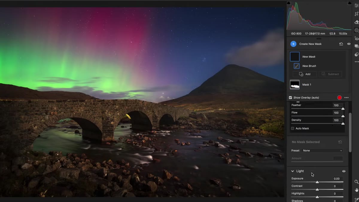 Brush applied to upper sky corners with dehaze and blacks pulled down
The second local brush Patino applies goes to the upper portions of the sky, particularly the edges. He pulls the blacks down and adds a touch of dehaze to deepen those corners and vignette the frame without using an actual vignette slider. The effect is subtle but deliberate: it funnels the viewer’s eye away from the periphery and down toward the bridge and the river, which is where he wants the composition to resolve.
Brush applied to upper sky corners with dehaze and blacks pulled down
The second local brush Patino applies goes to the upper portions of the sky, particularly the edges. He pulls the blacks down and adds a touch of dehaze to deepen those corners and vignette the frame without using an actual vignette slider. The effect is subtle but deliberate: it funnels the viewer’s eye away from the periphery and down toward the bridge and the river, which is where he wants the composition to resolve.
I’ve used this technique for years, and the reason I prefer a brush over the lens vignette tool is control. You can shape exactly where the darkening falls rather than accepting a uniform oval. On wide compositions where your strongest subject isn’t centered, that asymmetry makes a real difference.
Step 5: Use a Second Brush to Selectively Warm the Sky Back
 Brush warming upper sky after global cooling adjustment
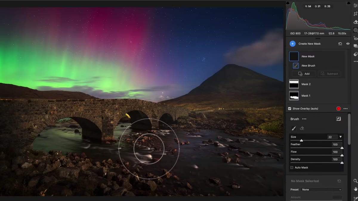
Here’s the nuance that a lot of tutorials skip. The global temperature pull that neutralized the warm foreground may have overcorrected the sky. An aurora often has its own warmth, particularly in the yellow-green bands, and if the entire image goes too cool, that warmth gets lost. Patino’s solution is to paint a second brush over just the sky and nudge the temperature back in the warmer direction to recover what the global adjustment took away.
Brush warming upper sky after global cooling adjustment
Here’s the nuance that a lot of tutorials skip. The global temperature pull that neutralized the warm foreground may have overcorrected the sky. An aurora often has its own warmth, particularly in the yellow-green bands, and if the entire image goes too cool, that warmth gets lost. Patino’s solution is to paint a second brush over just the sky and nudge the temperature back in the warmer direction to recover what the global adjustment took away.
This is two-stage color grading using brushes as zone control, which is a more precise approach than trying to find one white balance setting that works for the whole frame. The foreground needs one treatment. The sky needs another. Letting them be different is not a mistake. It’s how you make the image feel intentional.
What I’d Add From My Own Work
I shoot a lot of high desert skies out of Bend, and one thing Patino doesn’t address here, probably because it wasn’t an issue in this particular image, is color fringing where the aurora meets the dark ridgeline. If you’re shooting at a high ISO with a fast wide-angle, you’ll sometimes get a magenta or green fringe along that edge that reads as a processing artifact even when it isn’t. A targeted hue adjustment in the HSL panel, just enough to nudge that specific color range, will clean it up without touching the rest of the aurora’s palette. It’s a five-second fix that keeps the image looking like a place rather than a composite.
The single most important thing Patino demonstrates here is that the eye needs somewhere to land. Every decision, the white balance correction, the lifted reflection, the darkened edges, is in service of that one goal. A beautiful scene that goes unedited often leaves the viewer’s eye wandering. A scene that’s been thoughtfully processed gives them a path to follow.
Watch the full tutorial on YouTube to see Patino work through the second photographer’s images as well, including a waterfall scene and a castle frame, each with their own specific problems worth studying.
Comments
Leave a Comment