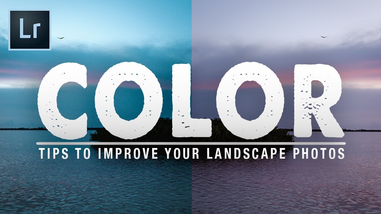
Color That Feels True: 7 Lightroom Tips From a Tutorial Worth Your Time

Color That Feels True: 7 Lightroom Tips From a Tutorial Worth Your Time

Color has always been the thing that either pulls a viewer into a landscape image or quietly pushes them away. I’ve been making photographs in the field for twenty years, and I still come home from shoots where the light was extraordinary and find that the raw files look flat, muddy, or just slightly off in a way I can’t immediately name. The colors in my head don’t match the colors on the screen, and closing that gap is the real work of editing.
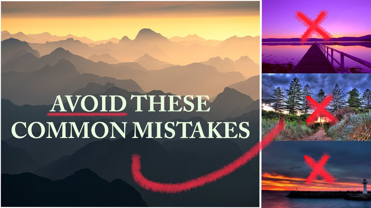
Why Your Landscape Photos Look Flat (And Three Field Fixes That Actually Work)

Why Your Landscape Photos Look Flat (And Three Field Fixes That Actually Work)

There’s a particular kind of learning that only happens when someone shows you their failures. Not polished, curated “before and after” content, but the real stuff, the photographs that made them wince years later. I’ve been shooting landscapes full-time for two decades, and I can still pull up folders from my early years that make me question my own taste. Which is exactly why this William Patino tutorial stopped me mid-scroll.