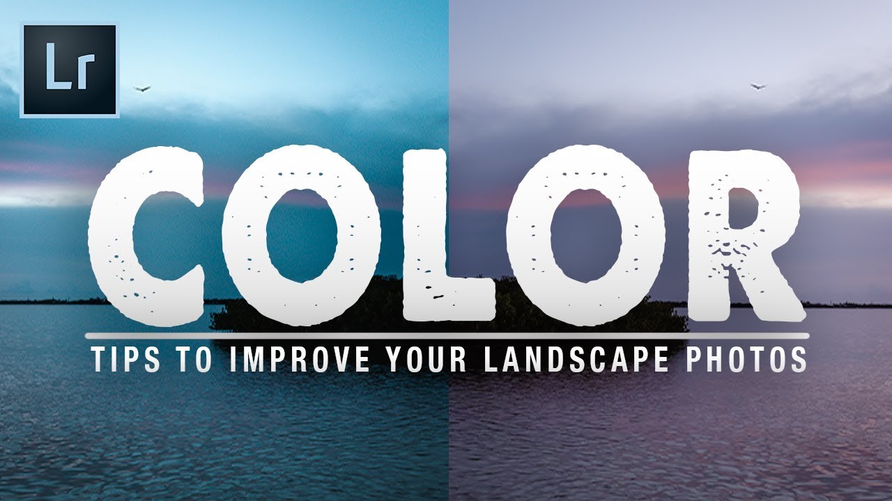
Color has always been the thing that either pulls a viewer into a landscape image or quietly pushes them away. I’ve been making photographs in the field for twenty years, and I still come home from shoots where the light was extraordinary and find that the raw files look flat, muddy, or just slightly off in a way I can’t immediately name. The colors in my head don’t match the colors on the screen, and closing that gap is the real work of editing.
That’s why I kept coming back to a tutorial by Mark Denney titled 7 Simple Tips To Improve Color In Your Landscape Photos. Watch the full tutorial on YouTube before or after reading this. Denney makes a point early in the video that I think is worth sitting with: within Lightroom, color has more available adjustment pathways than any other single attribute. More than exposure, more than contrast. That’s not an accident. It reflects how central color is to the emotional weight of a photograph. These aren’t tips about making everything louder or more saturated. They’re about precision, and that’s the part that matters.
Step 1: Use White Balance Intentionally, Not Just the Eyedropper
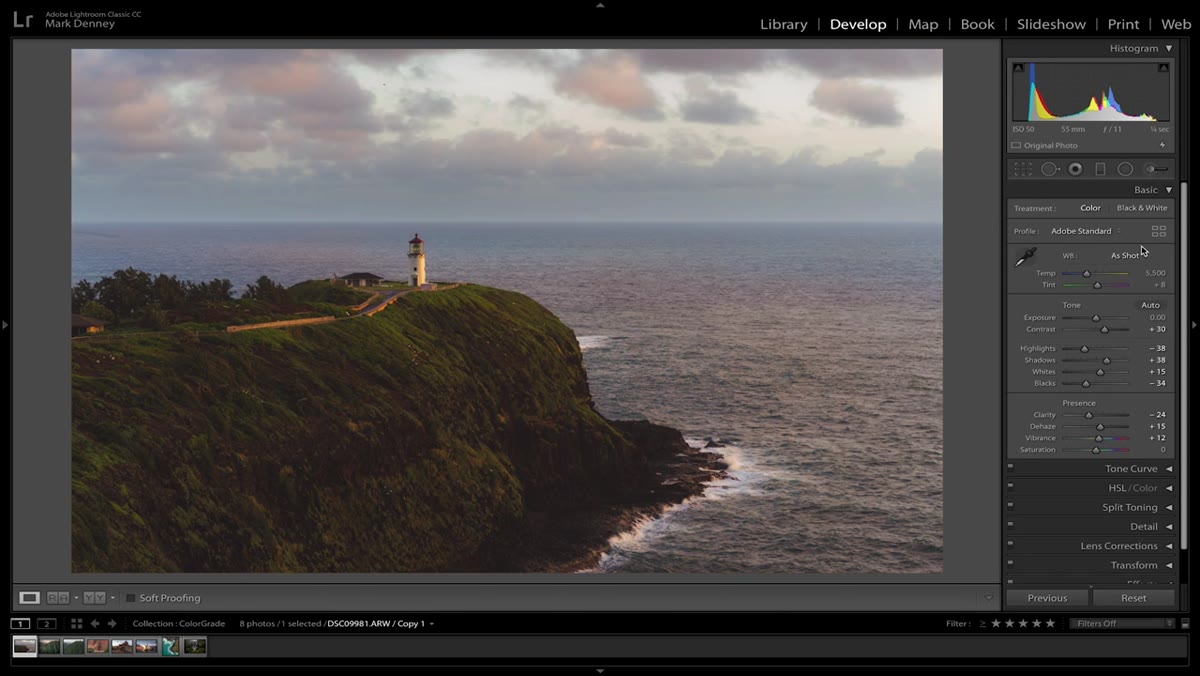 White balance dropper tool moving across landscape image
Most of us click the eyedropper tool, drag it over something that looks neutral, and hope for the best. Denney points out that with landscape photography, you often don’t have a clean neutral area to sample. Rocks are color-casted, water reflects sky, and skin tones aren’t in the frame to anchor anything. The fix is to use the RGB readout at the bottom of the Loupe view as your guide. Hit W to pull up the white balance dropper, then hover slowly across areas of the frame. You’re looking for a spot where the Red, Green, and Blue values are as close to each other as possible. That convergence is your neutral. It’s methodical in a way the guesswork never is.
White balance dropper tool moving across landscape image
Most of us click the eyedropper tool, drag it over something that looks neutral, and hope for the best. Denney points out that with landscape photography, you often don’t have a clean neutral area to sample. Rocks are color-casted, water reflects sky, and skin tones aren’t in the frame to anchor anything. The fix is to use the RGB readout at the bottom of the Loupe view as your guide. Hit W to pull up the white balance dropper, then hover slowly across areas of the frame. You’re looking for a spot where the Red, Green, and Blue values are as close to each other as possible. That convergence is your neutral. It’s methodical in a way the guesswork never is.
Step 2: Understand What Auto White Balance Actually Does
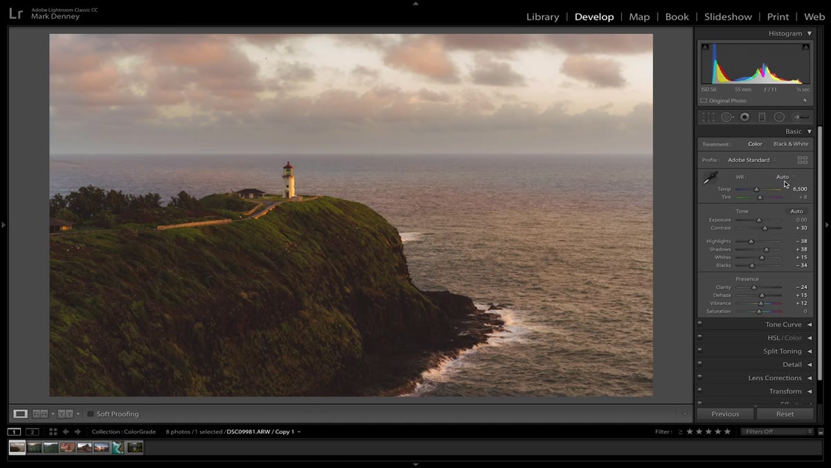 Lightroom Auto white balance result on landscape photo
Denney flags something I’ve noticed for years: Lightroom’s Auto white balance tends to push landscape images warmer than they actually were. It’s not wrong exactly, but it’s not trustworthy. Auto reads the scene and makes an assumption, and that assumption is often biased toward warmth. If you’re using Auto as a starting point, fine, but walk it back with intention. Compare the result against your “as shot” reading and ask whether the warmth serves the image or just flatters it. Those are different things.
Lightroom Auto white balance result on landscape photo
Denney flags something I’ve noticed for years: Lightroom’s Auto white balance tends to push landscape images warmer than they actually were. It’s not wrong exactly, but it’s not trustworthy. Auto reads the scene and makes an assumption, and that assumption is often biased toward warmth. If you’re using Auto as a starting point, fine, but walk it back with intention. Compare the result against your “as shot” reading and ask whether the warmth serves the image or just flatters it. Those are different things.
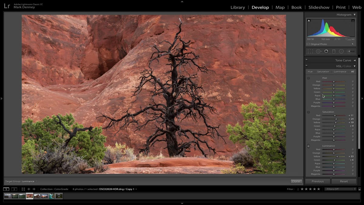
Step 3: Work the HSL Panel Color by Color
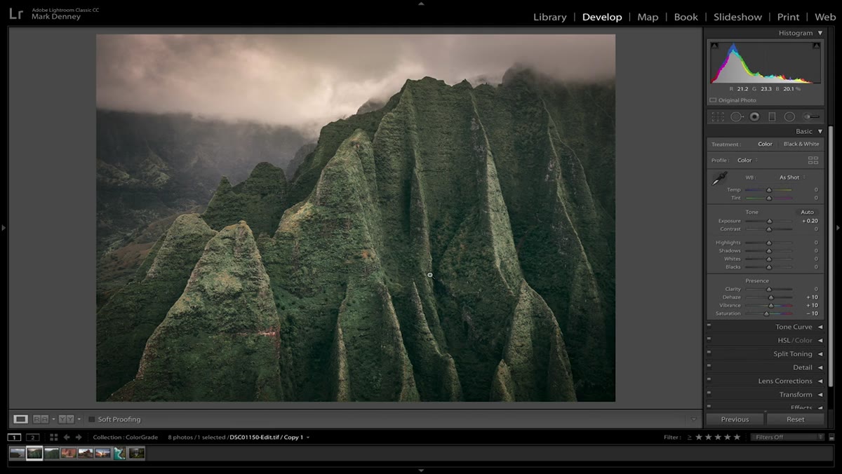 HSL panel open with individual color hue sliders visible
The HSL (Hue, Saturation, Luminance) panel is where color editing gets genuinely interesting, and Denney spends real time here. Instead of treating color as a single variable, you’re adjusting each color family independently. The targeted adjustment tool, the small circle icon at the top left of the HSL panel, lets you click directly on a color in the image and drag up or down to shift its hue, saturation, or luminance. If the greens in your foliage look too yellow, you drag on a green area and shift only that range. Nothing else moves. This is the difference between blunt and surgical.
HSL panel open with individual color hue sliders visible
The HSL (Hue, Saturation, Luminance) panel is where color editing gets genuinely interesting, and Denney spends real time here. Instead of treating color as a single variable, you’re adjusting each color family independently. The targeted adjustment tool, the small circle icon at the top left of the HSL panel, lets you click directly on a color in the image and drag up or down to shift its hue, saturation, or luminance. If the greens in your foliage look too yellow, you drag on a green area and shift only that range. Nothing else moves. This is the difference between blunt and surgical.
Step 4: Use Luminance to Control Visual Weight
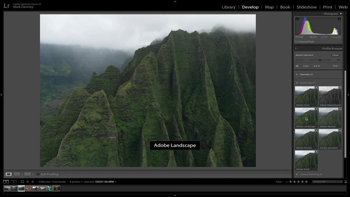 Luminance sliders adjusted for blue sky in HSL panel
Most photographers reach for saturation when a color isn’t doing what they want, but luminance is often the better tool. Luminance controls how bright or dark a specific color appears without changing how vivid it is. Pulling down the luminance on a blue sky, for example, deepens the tone and adds a sense of weight without overcooking the saturation to a point that looks artificial. Denney demonstrates this with a sky that looks hazy and pale, and a modest luminance reduction transforms it without the image starting to look like it came out of a preset pack.
Luminance sliders adjusted for blue sky in HSL panel
Most photographers reach for saturation when a color isn’t doing what they want, but luminance is often the better tool. Luminance controls how bright or dark a specific color appears without changing how vivid it is. Pulling down the luminance on a blue sky, for example, deepens the tone and adds a sense of weight without overcooking the saturation to a point that looks artificial. Denney demonstrates this with a sky that looks hazy and pale, and a modest luminance reduction transforms it without the image starting to look like it came out of a preset pack.
Step 5: Shape Color With the Tone Curve
 Point curve adjusted per channel in Tone Curve panel
The tone curve isn’t only for contrast. When you switch from the combined RGB curve to individual channel curves (Red, Green, Blue), you can introduce specific color casts at the highlight and shadow ends independently. Lifting the blue channel in the shadows adds a cool, cinematic feel to the darkest areas of the frame. Pulling down the blue in the highlights warms them slightly. These are small movements with real impact. Denney treats the curve as a color tool first and a contrast tool second, and once you start thinking about it that way, a lot more becomes possible.
Point curve adjusted per channel in Tone Curve panel
The tone curve isn’t only for contrast. When you switch from the combined RGB curve to individual channel curves (Red, Green, Blue), you can introduce specific color casts at the highlight and shadow ends independently. Lifting the blue channel in the shadows adds a cool, cinematic feel to the darkest areas of the frame. Pulling down the blue in the highlights warms them slightly. These are small movements with real impact. Denney treats the curve as a color tool first and a contrast tool second, and once you start thinking about it that way, a lot more becomes possible.
Step 6: Use Color Grading for Creative Separation
 Color Grading panel with shadow and highlight wheels adjusted
The Color Grading panel, which replaced Split Toning in newer versions of Lightroom, gives you separate color wheels for shadows, midtones, and highlights. Denney’s approach is restrained: small moves toward complementary colors in the shadows and highlights create depth and visual separation without the image looking processed. A slight warm push in the highlights and a slight cool push in the shadows, for instance, mimics the way light actually behaves at golden hour. The midtone wheel lets you set the overall feel of the image without contaminating the extremes.
Color Grading panel with shadow and highlight wheels adjusted
The Color Grading panel, which replaced Split Toning in newer versions of Lightroom, gives you separate color wheels for shadows, midtones, and highlights. Denney’s approach is restrained: small moves toward complementary colors in the shadows and highlights create depth and visual separation without the image looking processed. A slight warm push in the highlights and a slight cool push in the shadows, for instance, mimics the way light actually behaves at golden hour. The midtone wheel lets you set the overall feel of the image without contaminating the extremes.
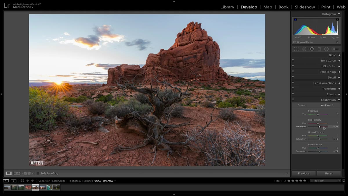
Step 7: Calibration Panel Fine-Tuning
 Camera Calibration panel with primary color sliders moved
The Camera Calibration panel sits at the bottom of the Develop module and often goes untouched. Denney surfaces it as a useful final layer. The primary color sliders here affect the raw interpretation of the file before any other adjustments are applied, which means changes here influence everything sitting on top of them. Small shifts to the hue of the red, green, and blue primaries can resolve color casts baked into the sensor’s profile, or they can nudge an image toward a particular palette you’re after. It’s worth experimenting with even if you move sliders only a few points in either direction.
Camera Calibration panel with primary color sliders moved
The Camera Calibration panel sits at the bottom of the Develop module and often goes untouched. Denney surfaces it as a useful final layer. The primary color sliders here affect the raw interpretation of the file before any other adjustments are applied, which means changes here influence everything sitting on top of them. Small shifts to the hue of the red, green, and blue primaries can resolve color casts baked into the sensor’s profile, or they can nudge an image toward a particular palette you’re after. It’s worth experimenting with even if you move sliders only a few points in either direction.
One Thing I’d Add From Experience
I’d put mask-based color work in the same breath as everything Denney covers here. Lightroom’s masking tools now let you create luminance-range masks, which means you can target an adjustment to only the brightest portion of a sky or only the shadows in the foreground. I use this constantly when the sky and the land need different color treatment without a hard transition line. It’s not a beginner move, but if you’ve absorbed the seven steps above, it’s a natural next layer. Color rarely needs the same correction across the whole frame.
The single most important thing Denney’s tutorial reinforced for me is that color in Lightroom is not one problem. It’s a set of layered problems, each with its own tool, and working them in sequence produces results that a single saturation drag will never touch. These seven steps give you a real framework for that kind of deliberate, layered work.
Watch the full tutorial on YouTube to see each step demonstrated directly on a landscape image. Denney’s screen work makes the subtlety of these moves much easier to calibrate against your own files.
Comments (1)
I've been looking for exactly this kind of tutorial. Perfect timing.
Leave a Comment