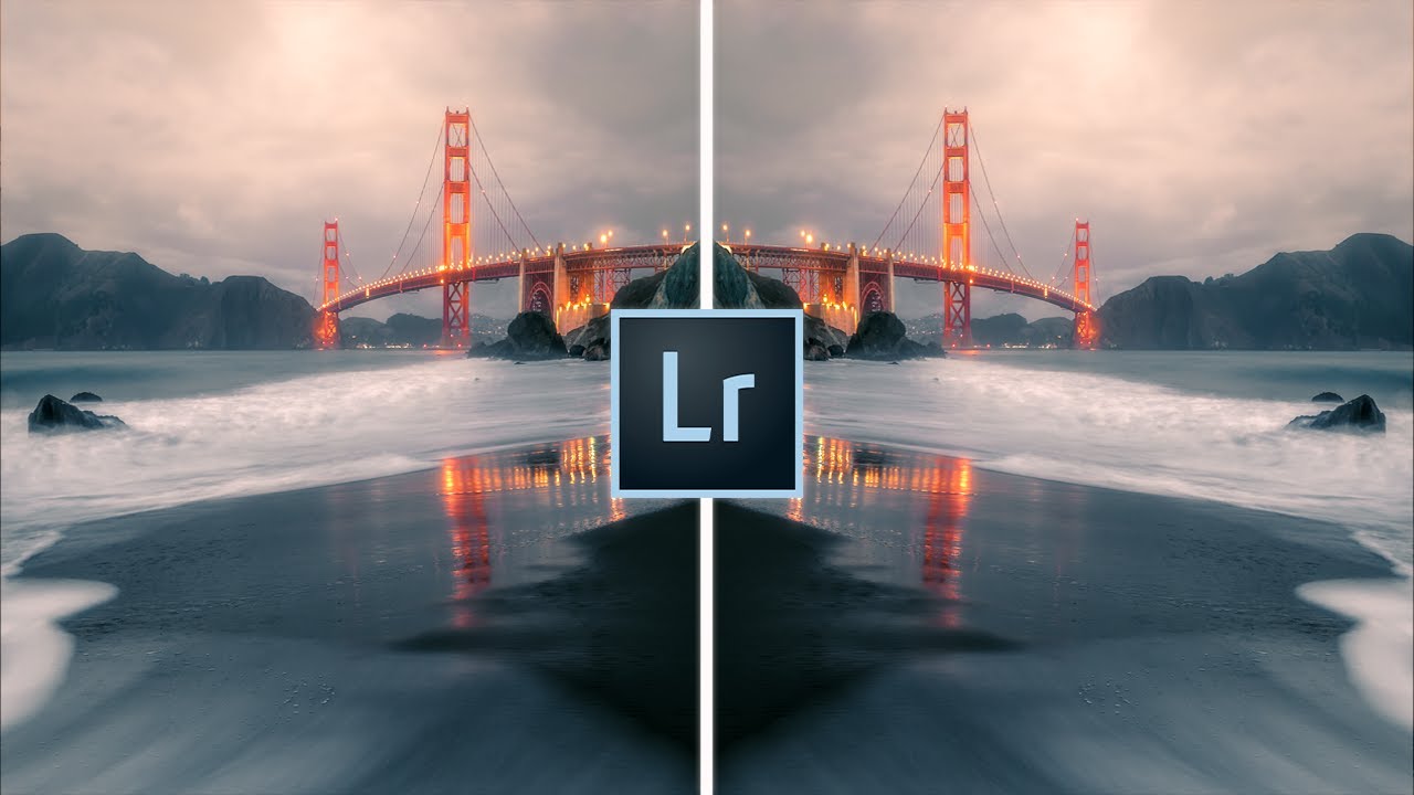
There’s a moment in every edit when I realize a photo isn’t working the way I felt it should in the field. The light was right, the composition was deliberate, and I stood in that river at 5am for a reason. But something in the final image feels scattered. The viewer’s eye wanders to the corner, to a bright patch of sky, to anything except the thing I drove four hours to photograph. After twenty years doing this full time, I still run into that problem more than I’d like to admit.
The fix I reach for, almost every single time, is a vignette. Not the heavy-handed darkroom effect that gives photos that overdone, vintage-filter look. Something subtle and purposeful, applied with intention. In this Mark Denney tutorial on dramatic landscape photos, Denney breaks down four specific ways to use vignetting in Lightroom, and his framing of why the technique works is worth sitting with before you touch a single slider. The human eye moves toward brightness and retreats from shadow. A well-placed vignette uses that instinct against distraction and toward your subject.
What follows is my own walkthrough of his four methods, with the settings he recommends and a few notes from my own practice.
Step 1: Understand What a Vignette Actually Does
 Definition of vignetting shown over a landscape photo with darkened corners
Before touching anything in Lightroom, it helps to get clear on the mechanics. A vignette darkens the edges and corners of a frame while leaving the center relatively brighter. That brightness gradient is doing psychological work. When someone looks at your image, their eye follows the light. By reducing competing brightness at the edges, you’re quietly steering attention toward your subject without the viewer ever knowing it happened. The best vignettes are invisible. They feel like the photo was always that way.
Definition of vignetting shown over a landscape photo with darkened corners
Before touching anything in Lightroom, it helps to get clear on the mechanics. A vignette darkens the edges and corners of a frame while leaving the center relatively brighter. That brightness gradient is doing psychological work. When someone looks at your image, their eye follows the light. By reducing competing brightness at the edges, you’re quietly steering attention toward your subject without the viewer ever knowing it happened. The best vignettes are invisible. They feel like the photo was always that way.
Step 2: Apply a Basic Vignette Using the Effects Panel
 Lightroom Effects panel open showing Post-Crop Vignetting sliders
The most accessible starting point is the Post-Crop Vignetting tool in Lightroom’s Effects panel. Open the panel, find the Amount slider, and pull it to the left. Denney drags it fairly far for demonstration purposes so the effect is obvious, but in practice you’ll want something much gentler. The goal is to darken all four corners evenly, which works well when your subject sits near the center of the frame, like a waterfall or a lone tree against a wide sky.
Lightroom Effects panel open showing Post-Crop Vignetting sliders
The most accessible starting point is the Post-Crop Vignetting tool in Lightroom’s Effects panel. Open the panel, find the Amount slider, and pull it to the left. Denney drags it fairly far for demonstration purposes so the effect is obvious, but in practice you’ll want something much gentler. The goal is to darken all four corners evenly, which works well when your subject sits near the center of the frame, like a waterfall or a lone tree against a wide sky.
Step 3: Dial In the Midpoint
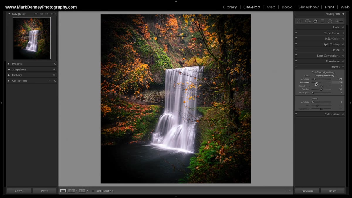 Midpoint slider being adjusted, showing vignette size changing on image
The Midpoint slider controls how far the darkening reaches toward the center of the image. Pull it left and the dark edges creep inward, eating more of the frame. Push it right and the effect stays tucked into the extreme corners. Denney leaves this near the default of 50 for most images. I tend to drop mine slightly below that, around 40, when I want the vignette to do a little more heavy lifting on a busy scene. The midpoint is the slider most people ignore, and it’s the one that makes the biggest difference in whether the effect looks natural or manufactured.
Midpoint slider being adjusted, showing vignette size changing on image
The Midpoint slider controls how far the darkening reaches toward the center of the image. Pull it left and the dark edges creep inward, eating more of the frame. Push it right and the effect stays tucked into the extreme corners. Denney leaves this near the default of 50 for most images. I tend to drop mine slightly below that, around 40, when I want the vignette to do a little more heavy lifting on a busy scene. The midpoint is the slider most people ignore, and it’s the one that makes the biggest difference in whether the effect looks natural or manufactured.
Step 4: Set the Feather for a Natural Transition
 Feather slider being moved right, softening the vignette edge on screen
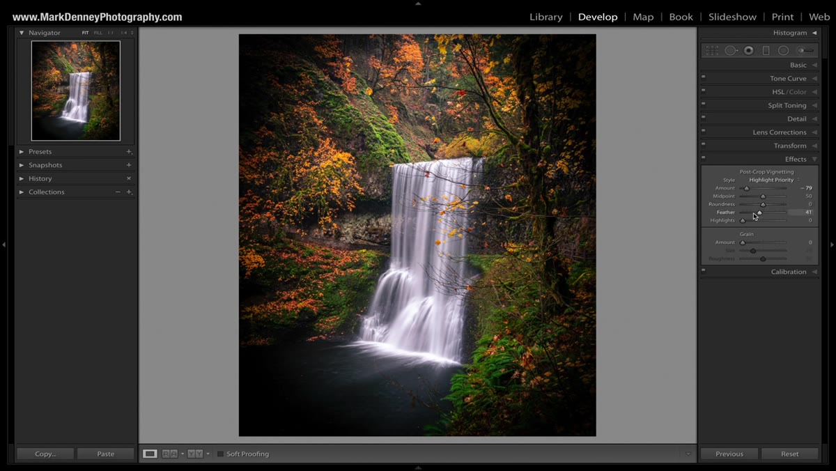
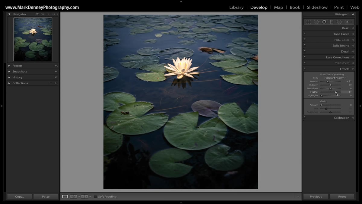
A hard vignette edge looks like a mistake. The Feather slider controls how gradually the darkening transitions into the brighter center, and Denney recommends keeping it between 50 and 80 for most landscape work. He occasionally takes it all the way to 100 for a particularly soft look. I rarely go below 60. When I first started using vignettes years ago, I kept the feather too low and wondered why my prints looked like they had a shadow frame around them. High feather values are what separate a natural-looking vignette from one that distracts on its own.
Feather slider being moved right, softening the vignette edge on screen
A hard vignette edge looks like a mistake. The Feather slider controls how gradually the darkening transitions into the brighter center, and Denney recommends keeping it between 50 and 80 for most landscape work. He occasionally takes it all the way to 100 for a particularly soft look. I rarely go below 60. When I first started using vignettes years ago, I kept the feather too low and wondered why my prints looked like they had a shadow frame around them. High feather values are what separate a natural-looking vignette from one that distracts on its own.
Step 5: Adjust Roundness to Match Your Composition
 Roundness slider at zero and moved left/right showing shape change
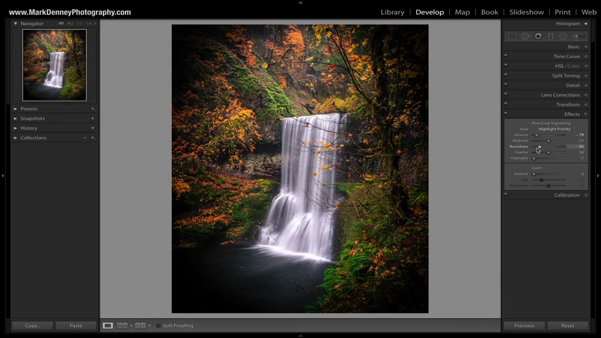
The Roundness slider shifts the vignette shape between a near-square and a near-circle. The default sits at zero, which gives you something in between. Denney typically leaves it there. For images with strong horizontal lines, like a long coastal exposure with a flat horizon, I sometimes push roundness slightly negative to let the dark corners stretch a bit more along the top and bottom edges. For images centered on a single circular or vertical subject, a rounder setting keeps things from looking lopsided.
Roundness slider at zero and moved left/right showing shape change
The Roundness slider shifts the vignette shape between a near-square and a near-circle. The default sits at zero, which gives you something in between. Denney typically leaves it there. For images with strong horizontal lines, like a long coastal exposure with a flat horizon, I sometimes push roundness slightly negative to let the dark corners stretch a bit more along the top and bottom edges. For images centered on a single circular or vertical subject, a rounder setting keeps things from looking lopsided.
Step 6: Use a Radial Filter for an Off-Center Subject
 Radial filter drawn around an off-center subject in Lightroom
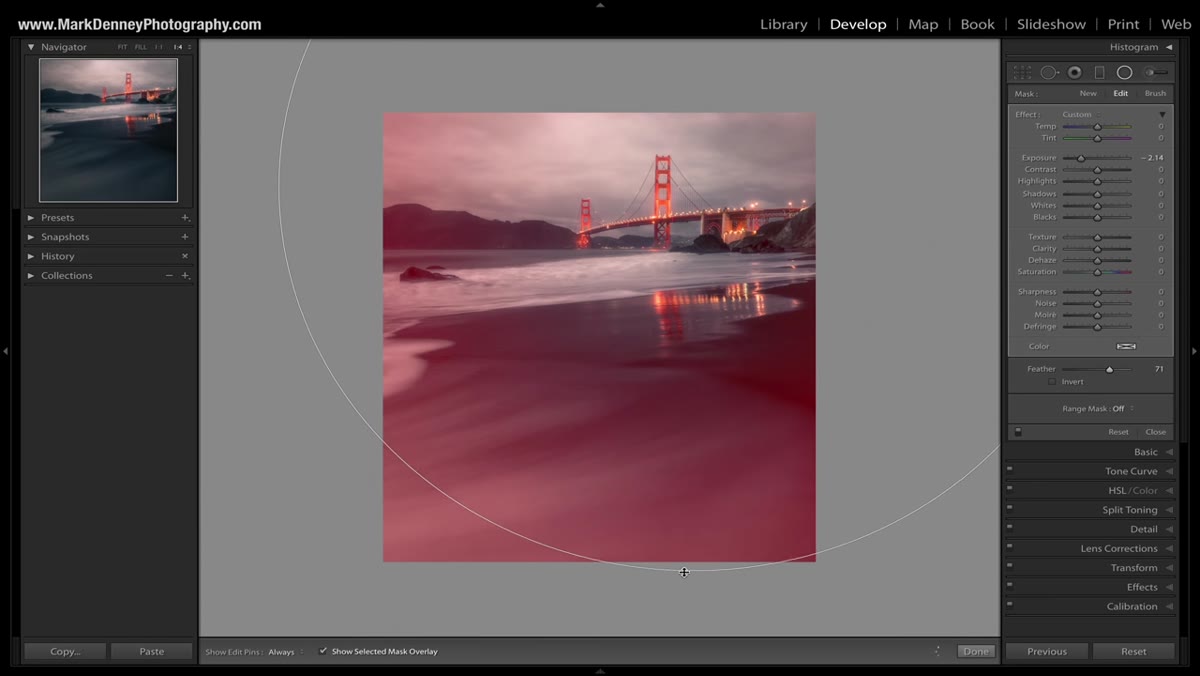
This is where Denney’s tutorial moves from basic to genuinely useful for working photographers. The Post-Crop Vignetting tool always centers on the middle of the frame. But your subject often isn’t in the middle, and if it is every time, that’s a composition problem worth addressing separately. The Radial Filter gives you a vignette you can position anywhere. Draw the filter around your subject, invert the mask so the adjustment affects everything outside the ellipse, and then lower the exposure on that outer region. You’ve just created a custom vignette built around where your subject actually lives in the frame.
Radial filter drawn around an off-center subject in Lightroom
This is where Denney’s tutorial moves from basic to genuinely useful for working photographers. The Post-Crop Vignetting tool always centers on the middle of the frame. But your subject often isn’t in the middle, and if it is every time, that’s a composition problem worth addressing separately. The Radial Filter gives you a vignette you can position anywhere. Draw the filter around your subject, invert the mask so the adjustment affects everything outside the ellipse, and then lower the exposure on that outer region. You’ve just created a custom vignette built around where your subject actually lives in the frame.
Step 7: Use the Adjustment Brush for Irregular Shapes
 Adjustment brush being painted along image edges in Lightroom
Some images don’t cooperate with circular or rectangular tools. A winding river, a coastal cliff face, a forest path that curves through the frame. For those, Denney recommends the Adjustment Brush set to a negative exposure value, painting darkness manually along the edges and into areas that compete with the subject. This takes longer but gives you exact control. I use this approach most often when I’ve shot a scene where one corner has a distractingly bright rock or a patch of overexposed sky that cropping won’t fix. Paint it down carefully with a low flow setting and a high feather, and it disappears into the image naturally.
Adjustment brush being painted along image edges in Lightroom
Some images don’t cooperate with circular or rectangular tools. A winding river, a coastal cliff face, a forest path that curves through the frame. For those, Denney recommends the Adjustment Brush set to a negative exposure value, painting darkness manually along the edges and into areas that compete with the subject. This takes longer but gives you exact control. I use this approach most often when I’ve shot a scene where one corner has a distractingly bright rock or a patch of overexposed sky that cropping won’t fix. Paint it down carefully with a low flow setting and a high feather, and it disappears into the image naturally.
A Note From Twenty Years of Vignetting
The technique Denney teaches is sound, and his Radial Filter approach in particular changed how I handle off-center compositions in post. The one thing I’d add from my own practice is this: apply your vignette last, after all your exposure and color work is done. I spent an embarrassing stretch of time wondering why my vignettes looked slightly wrong on my final prints, and it was because I was vignetting before tonal adjustments and then changing the overall brightness, which threw off the balance. Lock in your exposure first. Then add the vignette as a final directional layer.
Also, toggle the effect on and off before you export. Every time, without exception. The eye adjusts to what it’s been staring at, and what felt subtle ten minutes ago sometimes turns out to be heavier than you realized. A fresh look catches that before the image is out of your hands.
Vignetting isn’t glamorous technique. It won’t get you the same reaction as a conversation about lens filters or camera bodies. But it’s the one edit I apply to nearly every landscape image I sell, every print that goes out of my workshop, every photo I’m proud of. It works because it works with how people actually see, not against it.
Watch the full tutorial on YouTube to see Denney demonstrate each method side by side on a real image. Watching the before and after on his waterfall shot makes the subtle power of this technique click in a way that description alone can’t quite match.
Comments
Leave a Comment