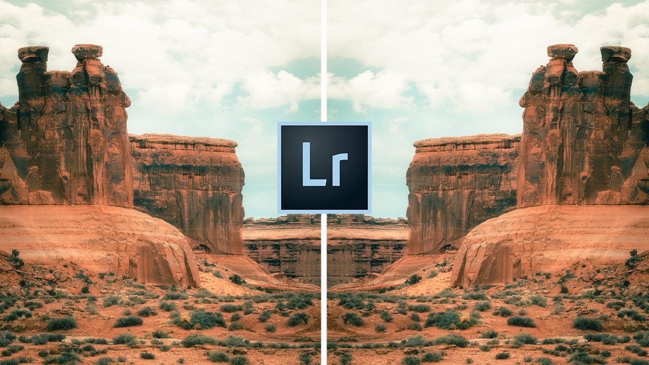
There’s a particular kind of photograph that stops people mid-scroll. It doesn’t shout. It pulls you in slowly, like early morning fog settling into a canyon. That quality, which most of us loosely call “cinematic,” has become one of the most sought-after looks in landscape photography over the last several years. The trouble is that chasing it without a clear framework usually results in something that looks muddy and overdone rather than moody and intentional.
I’ve been making landscape images for two decades, and I’ll admit I spent a long time applying heavy edits by feel alone, with mixed results. So when I came across this Mark Denney tutorial on creating a cinematic look in Lightroom, I sat up straight. Watch the full tutorial on YouTube before or after reading this breakdown. Mark has a clean, methodical approach that mirrors the way I try to think about editing: start with intention, work systematically, and let the image tell you when to stop.
What follows is my step-by-step breakdown of the technique, with some notes from my own editing practice folded in. You don’t need Lightroom specifically. Any serious post-processing application handles everything covered here.
Step 1: Identify the Common Traits of Cinematic Images Before You Edit
 Google image search results for “cinematic photography” on screen
Before touching a single slider, Mark does something I genuinely respect: he looks at reference images to reverse-engineer what “cinematic” actually means visually. Pull up a search for cinematic photography and study what those images share. You’ll notice three consistent qualities almost immediately. They run darker than a standard exposure, leaning toward moody rather than bright. They carry a cooler color temperature, often with a blue or teal cast. And their color palettes are muted and desaturated rather than punchy and vivid.
Google image search results for “cinematic photography” on screen
Before touching a single slider, Mark does something I genuinely respect: he looks at reference images to reverse-engineer what “cinematic” actually means visually. Pull up a search for cinematic photography and study what those images share. You’ll notice three consistent qualities almost immediately. They run darker than a standard exposure, leaning toward moody rather than bright. They carry a cooler color temperature, often with a blue or teal cast. And their color palettes are muted and desaturated rather than punchy and vivid.
This is the target. Having a mental model before you start editing keeps you from wandering through sliders hoping something clicks. Know where you’re going, then drive there.
Step 2: Cool Down the White Balance
 White balance temperature slider being pulled toward cooler tones
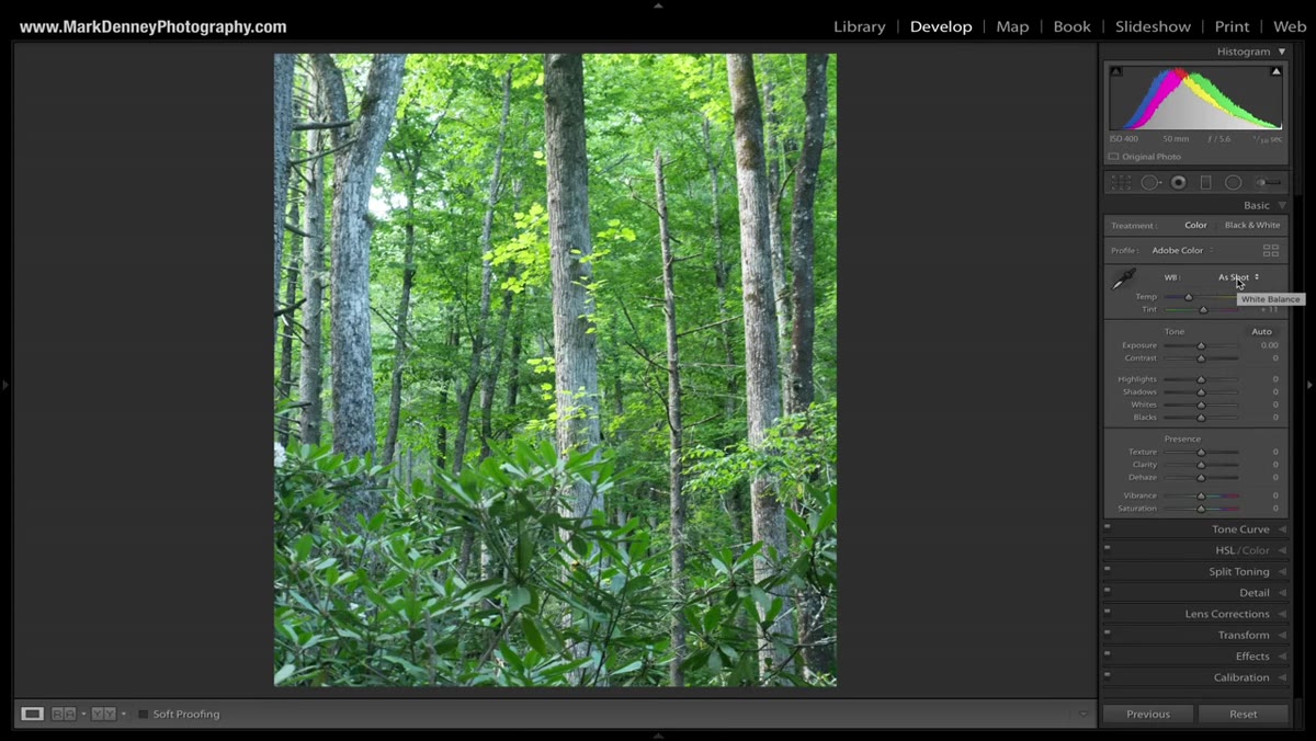
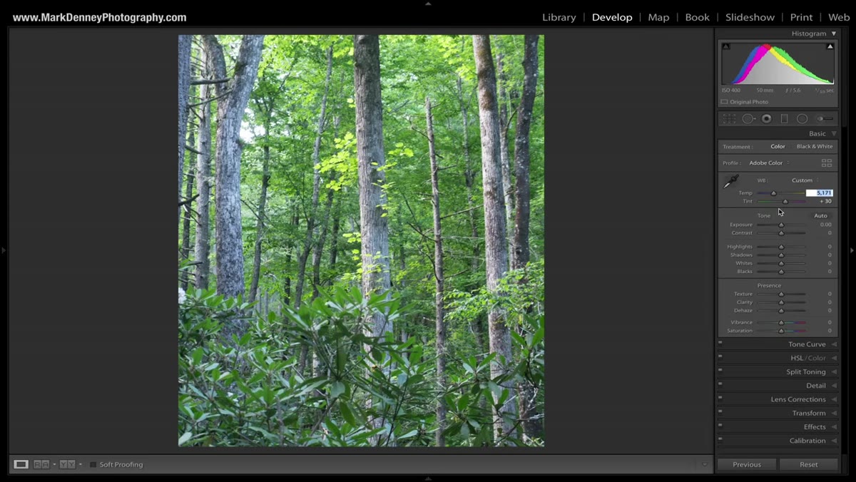
The first slider Mark reaches for is color temperature, and he moves it in the opposite direction from what most photographers default to. Rather than warming an image up for that golden-hour feel, he pulls the temperature toward the cooler end of the scale. The exact value depends on your image, but the goal is a distinctly cool, slightly blue cast that reads as atmospheric rather than clinical.
White balance temperature slider being pulled toward cooler tones
The first slider Mark reaches for is color temperature, and he moves it in the opposite direction from what most photographers default to. Rather than warming an image up for that golden-hour feel, he pulls the temperature toward the cooler end of the scale. The exact value depends on your image, but the goal is a distinctly cool, slightly blue cast that reads as atmospheric rather than clinical.
Avoid going so far that the image looks like a freezer. The sweet spot gives you cool without making skin tones or natural earth colors look wrong. If your scene includes warm anchor colors like red rock or autumn foliage, the contrast between those warm tones and a cool overall temperature is actually part of what makes cinematic edits feel so dynamic.
Step 3: Pull Down Exposure and Lift the Blacks Slightly
 Exposure and tone panel adjustments being applied in Lightroom develop module
Cinematic images are almost always underexposed relative to what we’d consider a “correct” exposure. Mark brings the overall exposure down to introduce that darker, more dramatic quality. But here’s the nuance that separates a cinematic look from a photo that just looks underexposed: he lifts the blacks slightly rather than crushing them to pure black.
Exposure and tone panel adjustments being applied in Lightroom develop module
Cinematic images are almost always underexposed relative to what we’d consider a “correct” exposure. Mark brings the overall exposure down to introduce that darker, more dramatic quality. But here’s the nuance that separates a cinematic look from a photo that just looks underexposed: he lifts the blacks slightly rather than crushing them to pure black.
This lifted-black technique is borrowed directly from cinema color grading, where true black is rarely used. Instead, shadow areas retain a slight gray or color cast. The result is an image that feels rich and deep without losing all shadow detail. Try pulling your blacks up just enough to notice a faint color in your darkest areas. That color will interact with your tone curve work in the next steps.
Step 4: Reduce Whites and Pull Highlights
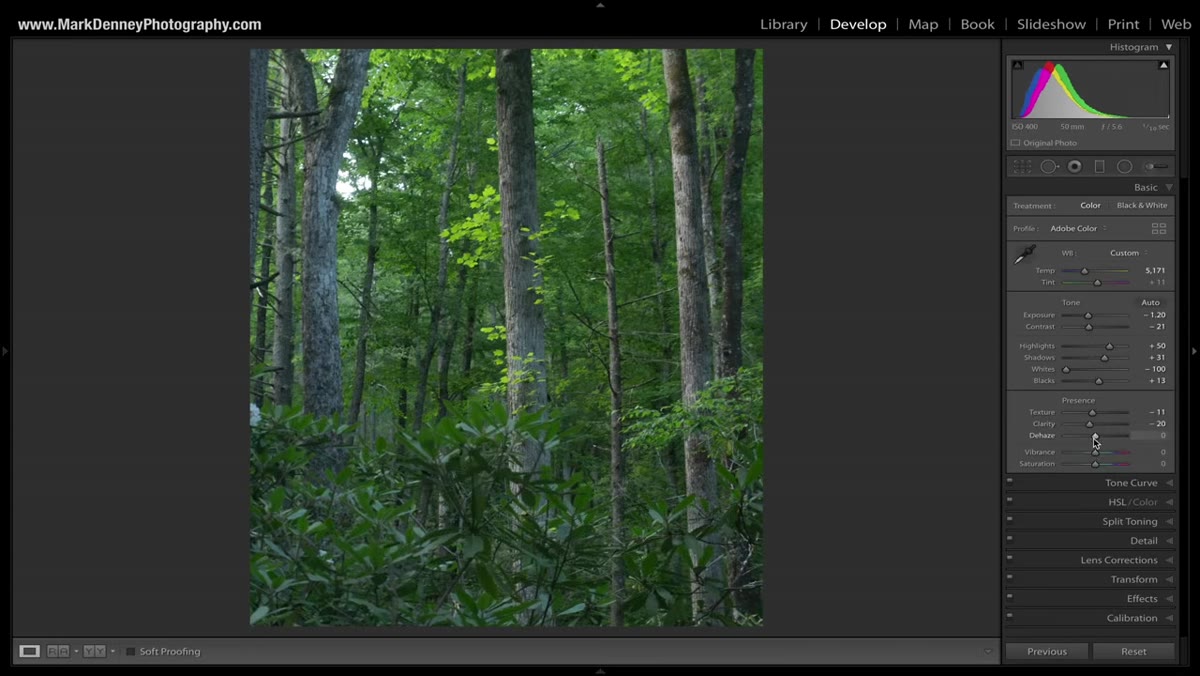
 Highlights and whites sliders being reduced in the tone panel
Bright highlights are the enemy of the cinematic look. Mark brings both the whites and the highlights down, reducing the overall luminance range of the image and keeping the mood consistent from shadow to highlight. This is what creates that compressed, almost velvet quality you see in movie stills.
Highlights and whites sliders being reduced in the tone panel
Bright highlights are the enemy of the cinematic look. Mark brings both the whites and the highlights down, reducing the overall luminance range of the image and keeping the mood consistent from shadow to highlight. This is what creates that compressed, almost velvet quality you see in movie stills.
A common mistake here is pulling highlights without touching whites, which leaves a blown or clipped ceiling that fights everything else you’re doing. Bring both down together. Think of it as putting a ceiling on the image’s energy rather than letting the brightest areas blow outward.
Step 5: Desaturate the Overall Color Palette
 Vibrance and saturation sliders being reduced in the presence panel
This step is where many photographers balk, because we’re trained to make colors pop. The cinematic approach goes the other direction. Mark reduces vibrance and saturation to mute the color palette, removing that oversaturated digital look and replacing it with something that feels more analog and restrained.
Vibrance and saturation sliders being reduced in the presence panel
This step is where many photographers balk, because we’re trained to make colors pop. The cinematic approach goes the other direction. Mark reduces vibrance and saturation to mute the color palette, removing that oversaturated digital look and replacing it with something that feels more analog and restrained.
The difference between vibrance and saturation matters here. Vibrance is smarter, protecting already-muted tones while pulling back on oversaturated ones. Reducing vibrance first gives you a more natural desaturation. Then you can dial saturation down further if the image still reads as too colorful. Go until it looks slightly too muted, then back off just a touch.
Step 6: Use the Tone Curve to Lock in the Cinematic Grade
 S-curve adjustment on the tone curve panel in Lightroom
The tone curve is where the cinematic edit really locks in. Mark uses it to add contrast back selectively after the flat exposure work above, and also to introduce that lifted-shadow quality more precisely. A gentle S-curve adds midtone contrast. But equally important is what happens at the bottom-left anchor of the curve: instead of leaving it at true black, he pulls the shadow anchor point up and slightly to the right.
S-curve adjustment on the tone curve panel in Lightroom
The tone curve is where the cinematic edit really locks in. Mark uses it to add contrast back selectively after the flat exposure work above, and also to introduce that lifted-shadow quality more precisely. A gentle S-curve adds midtone contrast. But equally important is what happens at the bottom-left anchor of the curve: instead of leaving it at true black, he pulls the shadow anchor point up and slightly to the right.
This is the same lifted-black technique from Step 3, but applied with more precision through the curve. It creates a characteristic look where shadows feel gray-to-blue rather than black, which is the signature quality of serious cinematic grading. Spend time here. The tone curve rewards patience.
Step 7: Shift the Color Grading Toward Teal and Orange
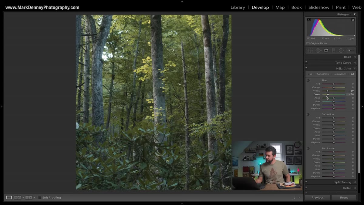 HSL panel or color grading wheels with teal and orange shifts applied
Teal and orange is the dominant color pairing in cinematic work, from Hollywood blockbusters to moody landscape photography. Mark uses the color grading tools to push shadows toward teal and midtones or highlights toward warmth. The result is a two-tone palette that feels intentional and cohesive even when the subject itself has many competing colors.
HSL panel or color grading wheels with teal and orange shifts applied
Teal and orange is the dominant color pairing in cinematic work, from Hollywood blockbusters to moody landscape photography. Mark uses the color grading tools to push shadows toward teal and midtones or highlights toward warmth. The result is a two-tone palette that feels intentional and cohesive even when the subject itself has many competing colors.
Not every image benefits equally from this treatment. Scenes that already contain both cool and warm elements, like coastal rock with green water or desert stone under a blue sky, take the teal and orange grade particularly well. Scenes with a dominant single color, like dense green forest, may need a lighter hand.
What I’d Add From My Own Practice
Mark’s framework is clean and reliable, and I use versions of it regularly. The one thing I’d emphasize that the tutorial touches on briefly but deserves its own moment: apply this technique to images you’re struggling with, not just your strongest ones.
My best-selling print came from a trip where I sat in fog for two days and came home with almost nothing. The one shot I did get looked flat and quiet straight out of camera. A cinematic grade gave it the weight the fog itself had denied it in person. The edit didn’t save a bad photo. It finally revealed what was actually there. That’s the honest job of post-processing.
The most important idea in this entire approach is also the simplest: cinematic doesn’t mean dramatic. It means deliberate. Dark tones, cool temperatures, and muted color work together as a system, not as individual heavy-handed moves. Push any one of them too far without the others, and the image breaks. Apply them in proportion, and the photograph starts to breathe differently.
Watch the full tutorial on YouTube to see Mark walk through three separate images with three slightly different cinematic treatments. Seeing him make real-time adjustments and course-correct as he goes is worth more than any static breakdown, including this one.
Comments
Leave a Comment