There’s a particular kind of disappointment I know too well. You’re out before dawn, boots wet, hat pulled low, watching a sky that looks like it was painted by someone who really meant it. You fire off dozens of frames. You drive home buzzing. Then you pull the files up on your monitor and the magic just… isn’t there. The colors look thin. The warmth you felt standing in that field didn’t make the trip. After twenty years of doing this for a living, I still get blindsided by that gap between what I saw and what the camera recorded.
The fix, more often than not, lives in a panel most photographers scroll right past. In this Mark Denney tutorial on split toning, Denney makes the case that this is probably the single most underrated tool inside Lightroom. Having spent years ignoring it myself, I can’t argue with that. Split toning lets you assign a specific color to the highlights of your image and a different color to the shadows. That’s the whole concept. But what it does for a landscape that came back from the field looking washed out is something no basic exposure or vibrance slider can replicate.
What follows is a step-by-step breakdown of the technique Denney walks through, written so you can follow along in your own Lightroom develop module without needing to pause and rewind.
Step 1: Make Sure Split Toning Is Visible in Your Develop Panel
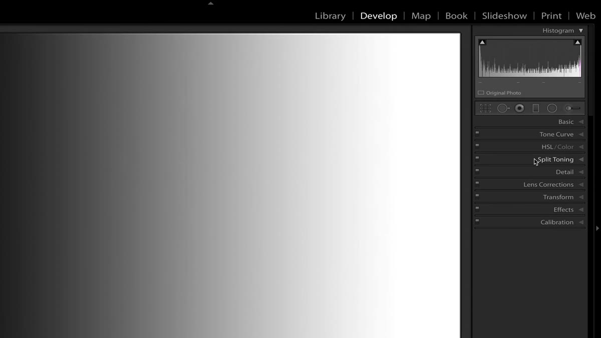 Right-clicking the develop panel to access Customize menu
Before anything else, confirm that the split toning section is actually showing in your develop module. If you don’t see it listed in the right-hand panel, right-click anywhere on the panel header area and select “Customize Develop Panel.” A checklist of available sections appears. Make sure Split Toning is checked. While you’re there, you can also hide any sections you never use and reorder them to match your editing workflow. It’s a small thing, but cleaning up that panel saves real time on a morning when you’re working through a hundred sunrise frames.
Right-clicking the develop panel to access Customize menu
Before anything else, confirm that the split toning section is actually showing in your develop module. If you don’t see it listed in the right-hand panel, right-click anywhere on the panel header area and select “Customize Develop Panel.” A checklist of available sections appears. Make sure Split Toning is checked. While you’re there, you can also hide any sections you never use and reorder them to match your editing workflow. It’s a small thing, but cleaning up that panel saves real time on a morning when you’re working through a hundred sunrise frames.
Step 2: Understand What Split Toning Actually Does
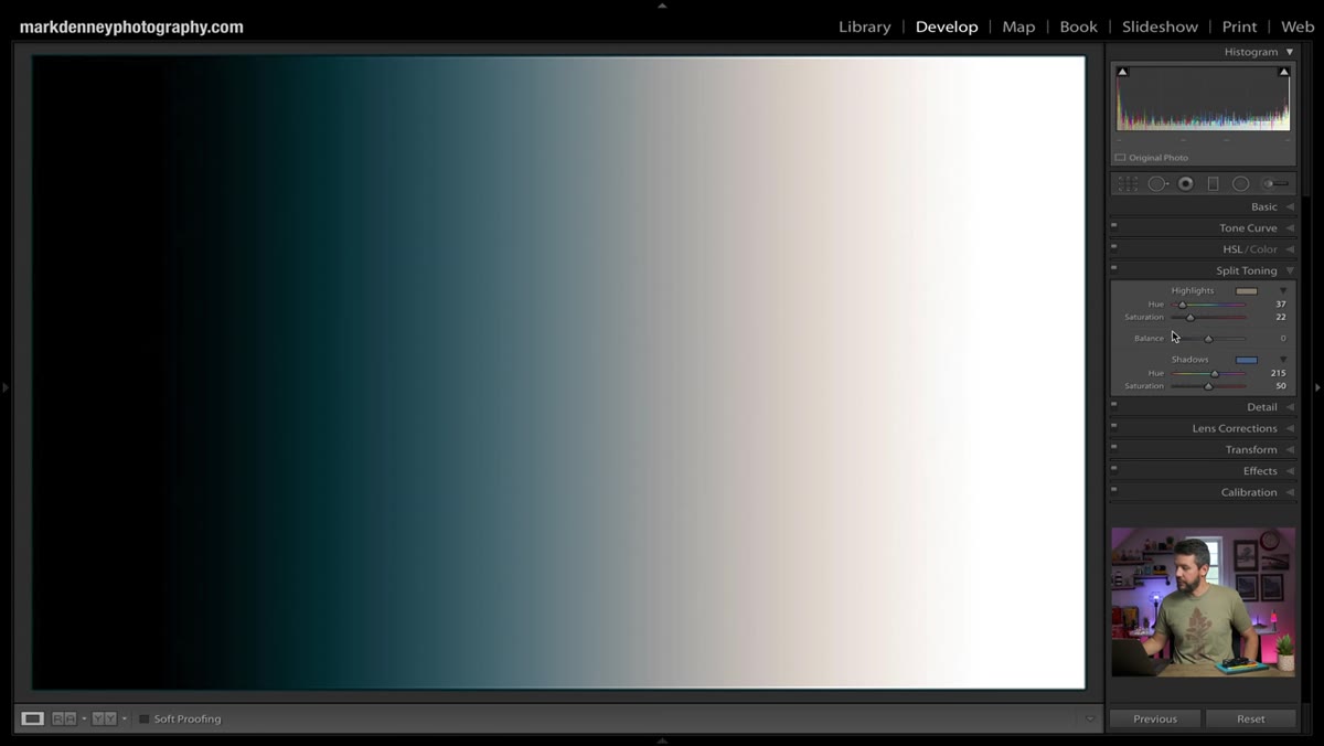
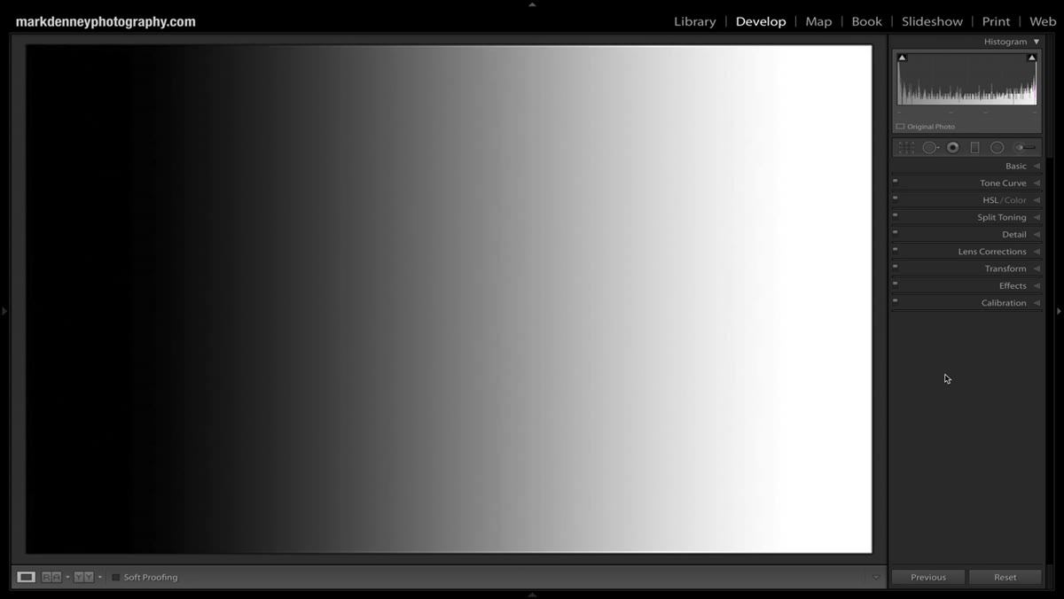 Black to white gradient showing shadow and highlight regions
Denney uses a simple black-to-white gradient image to demonstrate the concept, and it’s a genuinely useful mental model. Think of your histogram laid out horizontally. The far left is pure black, your deep shadows. Moving right, you pass through dark midtones, neutral midtones, light midtones, and then into highlights and pure whites at the far right. Split toning works by letting Lightroom apply one color across the highlight end of that range and a separate color across the shadow end. Nothing about your exposure or contrast changes. You’re adding a color cast selectively, based entirely on luminosity.
Black to white gradient showing shadow and highlight regions
Denney uses a simple black-to-white gradient image to demonstrate the concept, and it’s a genuinely useful mental model. Think of your histogram laid out horizontally. The far left is pure black, your deep shadows. Moving right, you pass through dark midtones, neutral midtones, light midtones, and then into highlights and pure whites at the far right. Split toning works by letting Lightroom apply one color across the highlight end of that range and a separate color across the shadow end. Nothing about your exposure or contrast changes. You’re adding a color cast selectively, based entirely on luminosity.
Step 3: Set Your Highlight Color
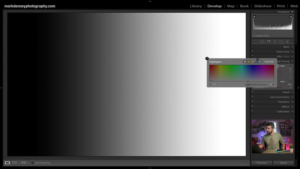 Highlight color picker open in split toning panel
Open the Split Toning panel and click the color swatch next to Highlights. A color picker opens. For most warm-light landscape situations, you’ll be reaching for something in the orange, amber, or golden-yellow range. The color picker shows a large hue-and-saturation square with a vertical hue strip on the right. Click to place your highlight color, but keep one thing in mind: at this point, you may see almost nothing happen on your image. That’s expected. The Saturation slider for highlights is sitting at zero by default. Drag the Saturation slider up to somewhere between 10 and 30 to actually see the toning take effect. Go higher temporarily just to see what’s happening, then dial it back to something that feels natural.
Highlight color picker open in split toning panel
Open the Split Toning panel and click the color swatch next to Highlights. A color picker opens. For most warm-light landscape situations, you’ll be reaching for something in the orange, amber, or golden-yellow range. The color picker shows a large hue-and-saturation square with a vertical hue strip on the right. Click to place your highlight color, but keep one thing in mind: at this point, you may see almost nothing happen on your image. That’s expected. The Saturation slider for highlights is sitting at zero by default. Drag the Saturation slider up to somewhere between 10 and 30 to actually see the toning take effect. Go higher temporarily just to see what’s happening, then dial it back to something that feels natural.
Step 4: Set Your Shadow Color
 Shadow color picker with blue selected
Click the shadow color swatch and choose your shadow tone. For landscape work, cooler colors tend to feel natural here because shadows in nature read as cool, particularly in open shade or foreground elements that aren’t catching direct light. A muted blue or slightly desaturated teal works well in most cases. Again, push the Saturation slider up to see the effect clearly, then lower it once you understand what it’s doing. The shadow color doesn’t need to be dramatic. A subtle cool shift in the shadows can do more for a sunset image than cranking the orange saturation in the highlights ever will.
Shadow color picker with blue selected
Click the shadow color swatch and choose your shadow tone. For landscape work, cooler colors tend to feel natural here because shadows in nature read as cool, particularly in open shade or foreground elements that aren’t catching direct light. A muted blue or slightly desaturated teal works well in most cases. Again, push the Saturation slider up to see the effect clearly, then lower it once you understand what it’s doing. The shadow color doesn’t need to be dramatic. A subtle cool shift in the shadows can do more for a sunset image than cranking the orange saturation in the highlights ever will.
Step 5: Dial In Saturation for Both Channels
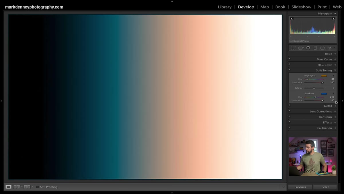 Saturation sliders adjusted for highlights and shadows
With both colors chosen, go back and set your final saturation values for each channel independently. This is where most of the creative control lives. Denney’s approach leans conservative, and after years of over-processing shots in my early career, I do too. For a sunrise or golden-hour image, highlight saturation somewhere between 10 and 25 is usually enough. Shadow saturation often needs even less, somewhere between 5 and 20. What you’re after is the feeling that the color was always there, not the appearance that you added something.
Saturation sliders adjusted for highlights and shadows
With both colors chosen, go back and set your final saturation values for each channel independently. This is where most of the creative control lives. Denney’s approach leans conservative, and after years of over-processing shots in my early career, I do too. For a sunrise or golden-hour image, highlight saturation somewhere between 10 and 25 is usually enough. Shadow saturation often needs even less, somewhere between 5 and 20. What you’re after is the feeling that the color was always there, not the appearance that you added something.
Step 6: Use the Balance Slider to Shift Emphasis
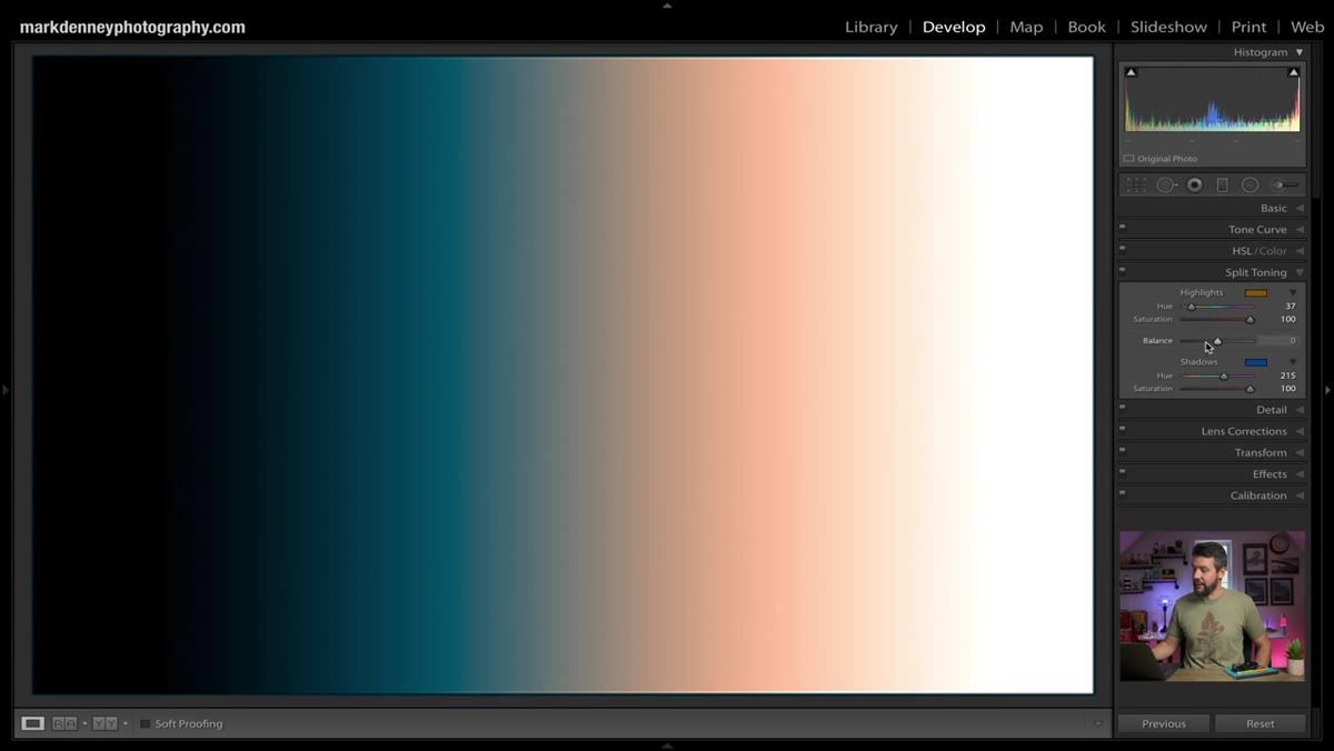 Balance slider being moved left and right across zero
The Balance slider sits between the Highlights and Shadows sections and is easy to overlook. It ranges from -100 to +100, with zero as the default. Sliding toward the negative end tells Lightroom to extend more of the shadow color influence across the image. Sliding toward positive gives more reach to the highlight color. For most images, staying within a range of about -20 to +20 keeps things feeling grounded. Denney typically leaves it near zero. I’ll often nudge it a few points toward the shadows when shooting forest interiors or heavily shaded foregrounds, because that’s where the cool color does the most structural work.
Balance slider being moved left and right across zero
The Balance slider sits between the Highlights and Shadows sections and is easy to overlook. It ranges from -100 to +100, with zero as the default. Sliding toward the negative end tells Lightroom to extend more of the shadow color influence across the image. Sliding toward positive gives more reach to the highlight color. For most images, staying within a range of about -20 to +20 keeps things feeling grounded. Denney typically leaves it near zero. I’ll often nudge it a few points toward the shadows when shooting forest interiors or heavily shaded foregrounds, because that’s where the cool color does the most structural work.
Step 7: Compare Before and After
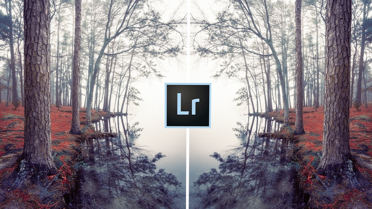
 Landscape image showing before and after split toning applied
Toggle the before-and-after view using the backslash key. What you’re looking for isn’t a dramatic transformation. If split toning is working correctly, the before image should look slightly flat by comparison and the after should feel like the light made sense from the moment you took the shot. If the after image looks processed, the saturation values are likely too high. Reduce them until the change feels inevitable rather than applied.
Landscape image showing before and after split toning applied
Toggle the before-and-after view using the backslash key. What you’re looking for isn’t a dramatic transformation. If split toning is working correctly, the before image should look slightly flat by comparison and the after should feel like the light made sense from the moment you took the shot. If the after image looks processed, the saturation values are likely too high. Reduce them until the change feels inevitable rather than applied.
One Thing I’d Add From the Field
Denney’s tutorial focuses on correcting images that looked better in person than they rendered on screen, which is the most common use case. But I’ve found split toning equally useful as a unifying step when I’m building a series of images from the same shoot. Mornings where the light shifted quickly can leave a set of frames that feel tonally inconsistent. Applying a consistent split tone as a sync setting across the batch pulls them back into the same visual register without making them feel identical. It’s not something I use on every image. But when a client orders a set of prints for a wall arrangement, that tonal consistency is what keeps the series from feeling chaotic when the frames are hanging side by side.
Split toning sits in Lightroom mostly ignored while photographers spend extra time pushing sliders that can’t do what this one quiet panel does: bring warmth and depth to an image by working with the actual light structure of the photograph rather than against it. If your sunrises keep coming home looking thinner than they felt, this is the place to start.
Watch the full tutorial on YouTube to see Denney walk through the real image examples and the specific problems split toning solves in context.
Comments (1)
The before and after really sells it. Incredible difference.
Leave a Comment