There’s a particular kind of humility that comes from having another photographer look at your work and quietly point out what you couldn’t see yourself. I’ve sat on both sides of that table over the years, and I’ll tell you honestly, the critique session is where real growth happens. Not in the field, not in the edit, but in that uncomfortable moment when someone you respect says, “What if you cropped here instead?” That question has changed more of my images than any gear upgrade ever has.
I came across this William Patino tutorial while looking for something to share with students in my upcoming workshop. What struck me immediately was how William approaches the critique not as a verdict but as a conversation, walking through a friend’s Fiordland images from New Zealand with a generous eye and a sharp technical sense. Watch the full tutorial on YouTube and then come back here, because I want to unpack each step with the context I think will help it stick.
The images in question are classic South Island scenes, big dynamic ranges, moody shadows, complementary greens and blues. The problems William identifies, heavy foregrounds, overcooled shadows, local adjustments that slightly overdo it, are not mistakes unique to this photographer. I see them constantly in workshop submissions. The fixes he demonstrates translate directly to your own work, wherever you shoot.
Step 1: Evaluate the Starting Exposure Before Touching Anything
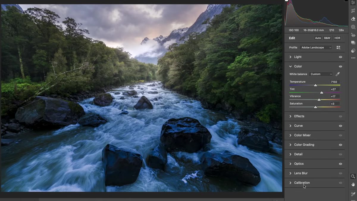 Raw file reset showing crushed shadows and protected highlights
Before you judge an edit, look at the raw file on its own. In Adobe Camera Raw, you can reset all edits to their defaults and see exactly what the camera captured. What you’ll often find in high-contrast landscape scenes is that the photographer exposed to protect the highlights, which leaves the shadows looking very dark or even blocked up. That’s not a flaw. That’s the reality of shooting a scene with a wide dynamic range.
Raw file reset showing crushed shadows and protected highlights
Before you judge an edit, look at the raw file on its own. In Adobe Camera Raw, you can reset all edits to their defaults and see exactly what the camera captured. What you’ll often find in high-contrast landscape scenes is that the photographer exposed to protect the highlights, which leaves the shadows looking very dark or even blocked up. That’s not a flaw. That’s the reality of shooting a scene with a wide dynamic range.
Once you understand what the file started as, you can properly evaluate what the edit accomplished. In this case, the photographer had done solid work pulling detail out of both ends of the tonal range and recovering the colors in the scene. The assessment isn’t “this is wrong” but rather “here’s what’s working and where we can push further.”
Step 2: Question How Much Foreground the Frame Actually Needs
 Viewing large boulders dominating the lower frame portion
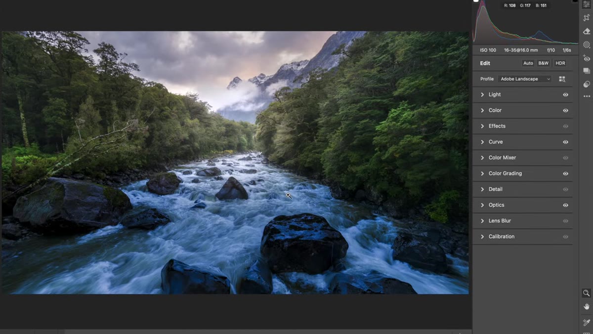
This is the one I come back to more than almost any other compositional question. Strong foreground elements can anchor a landscape image beautifully, but they can also compete with your actual subject. In this Fiordland scene, a cluster of large boulders fills a significant portion of the lower frame, and the visual weight they carry is pulling the eye down and holding it there when it should be moving toward the mountain in the background.
Viewing large boulders dominating the lower frame portion
This is the one I come back to more than almost any other compositional question. Strong foreground elements can anchor a landscape image beautifully, but they can also compete with your actual subject. In this Fiordland scene, a cluster of large boulders fills a significant portion of the lower frame, and the visual weight they carry is pulling the eye down and holding it there when it should be moving toward the mountain in the background.
Ask yourself: is the foreground serving the image or fighting it? Here, the subject is clearly that snowcapped peak wrapped in atmosphere. The boulders provide texture and context, but in their current proportion they’re competing. This is the moment to seriously consider your crop before you spend another hour in local adjustments.
Step 3: Try a Panoramic Crop to Improve Eye Flow
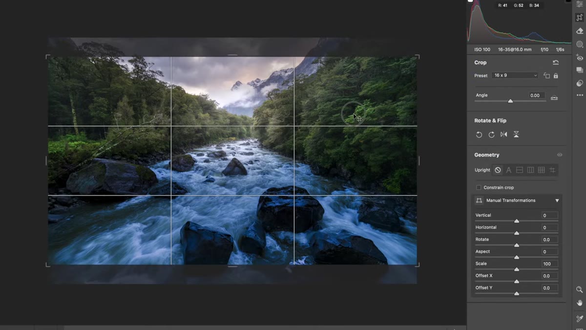 Applying 16x9 crop and repositioning frame toward mountain
William’s solution here is elegant and worth practicing deliberately. He applies a 16:9 or roughly 2:1 panoramic crop and shifts the frame upward. This does two things at once. It removes the heaviest portion of the lower foreground, and it also clips a distracting sliver of mountain in the upper left corner that was drawing attention away from the main peak.
Applying 16x9 crop and repositioning frame toward mountain
William’s solution here is elegant and worth practicing deliberately. He applies a 16:9 or roughly 2:1 panoramic crop and shifts the frame upward. This does two things at once. It removes the heaviest portion of the lower foreground, and it also clips a distracting sliver of mountain in the upper left corner that was drawing attention away from the main peak.
The crop isn’t about losing information. It’s about directing attention. When you reduce the real estate given to the foreground, the viewer’s eye follows the converging lines of the river or valley more efficiently and arrives at the background with more purpose. Try this yourself next time you have a strong leading line but feel like the image is still sluggish, crop panoramically and watch the composition snap into focus.
Step 4: Identify Overcooled Shadows in the Color Grading Panel
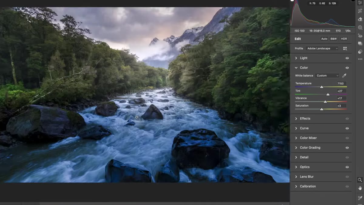 Color grading tab showing shadow hue pushed toward blue
Open the Color Grading panel in Lightroom or ACR and look at where the shadows are sitting. In this image, the shadows had been deliberately cooled, pushed toward blue, which is a common and often beautiful technique in landscape work. The problem is when it goes too far, the shadows start reading as artificial rather than atmospheric.
Color grading tab showing shadow hue pushed toward blue
Open the Color Grading panel in Lightroom or ACR and look at where the shadows are sitting. In this image, the shadows had been deliberately cooled, pushed toward blue, which is a common and often beautiful technique in landscape work. The problem is when it goes too far, the shadows start reading as artificial rather than atmospheric.
William resets the shadow color wheel to neutral and the image immediately reads as more natural. Blue shadows do exist in the real world, especially in overcast or open shade conditions. But when the color grading is adding more than the scene already contains, it tips into processing that calls attention to itself. The goal is usually for the viewer to feel the mood, not notice the treatment.
Step 5: Use a Local Adjustment Brush to Warm and Neutralize Problem Areas
 Brush tool active, warming and desaturating shadow regions in river
Rather than a global fix, William goes to the local adjustment brush to target the shadowed areas of the river specifically. He warms the temperature slightly and pulls the saturation back a touch, which neutralizes the blue cast without affecting the rest of the image.
Brush tool active, warming and desaturating shadow regions in river
Rather than a global fix, William goes to the local adjustment brush to target the shadowed areas of the river specifically. He warms the temperature slightly and pulls the saturation back a touch, which neutralizes the blue cast without affecting the rest of the image.
This is precise, controlled work. The keyboard shortcut K opens your brush panel, and from there you can see any existing local adjustments the photographer has already applied. Build on what’s there rather than scrapping everything. A light hand with warmth and a modest desaturation pass in problem areas can bring a shadow region back to life without making it look like you stamped over the issue.
One Thing I’d Add from My Own Experience
William’s critique focuses on what’s in the frame, which is exactly right. But I’d add one upstream habit that prevents most of these issues before you’re ever sitting at a screen. When I’m in the field setting up a shot, I physically crouch down and look at the lower third of my frame in isolation. I ask: if this were the only thing in the photo, would it be worth showing? If the answer is no and it’s not actively leading the eye somewhere, I either reposition or accept that I’ll crop it later.
I learned this the slow way, standing in a freezing river at 5am with a great mountain behind me and a frame full of muddy water in front. The image didn’t work until I made a tighter crop, and I’ve wasted exactly zero sunrises on that mistake since. Seeing the foreground as a separate editorial decision, not just a default inclusion, changes how you compose in the moment.
The single most important idea in this tutorial is that composition doesn’t end when you press the shutter. The crop you apply in post is every bit as much a compositional decision as where you placed your tripod. Treat it that way, evaluate it deliberately, and let it serve the image rather than simply preserve pixels.
Watch the full tutorial on YouTube to see William walk through these edits live, including the before-and-after comparisons that make the shadow color discussion especially clear.
Comments
Leave a Comment