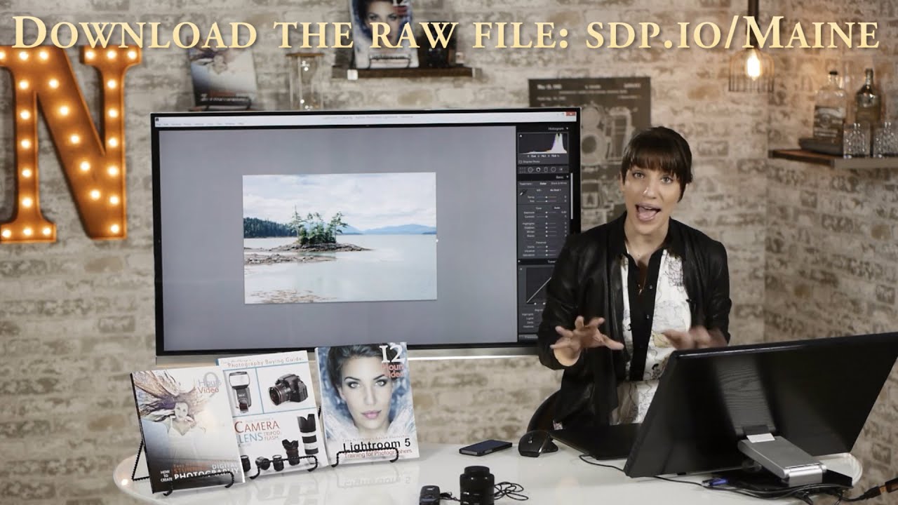
There’s a particular kind of frustration that comes from standing at the edge of a alpine lake at 5am, nailing the light, and then coming home to a flat RAW file that looks nothing like what you felt in that moment. After twenty years of landscape work, I still feel it. The capture is only half the job. The edit is where you close the distance between what the sensor recorded and what your eyes actually saw.
I came across this tutorial from Chelsea Northrup of Tony & Chelsea Northrup and found myself nodding along at almost every step. Watch the full tutorial on YouTube - Chelsea walks through a complete landscape edit in Lightroom, and while the image she’s working with is specific, the workflow maps cleanly onto almost any scene involving sky, land, and water. What follows is my breakdown of her process, with some notes from my own shooting life in the high desert out here in central Oregon.
The thing I appreciate most about her approach is the sequencing. She doesn’t chase one slider around the panel hoping everything works out. She builds the edit in layers, global corrections first, then targeted adjustments, then color. That discipline matters. It keeps you from overcooking an image before you even get to the interesting decisions.
Step 1: Level the Horizon
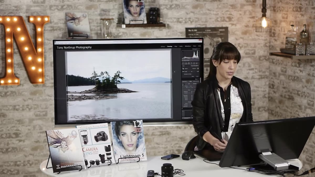 Horizon waterline aligned with Lightroom grid overlay
The first thing Chelsea does is check the horizon, and she makes a point of it. A tilted horizon in a landscape photograph reads as careless, even to viewers who can’t articulate why something feels off. In Lightroom, you can eyeball it against the crop grid overlay, or you can use the angle tool inside the crop panel - drag along a reference line like a waterline or ridgeline and Lightroom sets the rotation for you. The second method is more precise, especially when your horizon is partially obscured by mountains or trees. I always crop and level before touching a single tonal slider. It changes the composition, and I want to be working on the final frame.
Horizon waterline aligned with Lightroom grid overlay
The first thing Chelsea does is check the horizon, and she makes a point of it. A tilted horizon in a landscape photograph reads as careless, even to viewers who can’t articulate why something feels off. In Lightroom, you can eyeball it against the crop grid overlay, or you can use the angle tool inside the crop panel - drag along a reference line like a waterline or ridgeline and Lightroom sets the rotation for you. The second method is more precise, especially when your horizon is partially obscured by mountains or trees. I always crop and level before touching a single tonal slider. It changes the composition, and I want to be working on the final frame.
Step 2: Set the Global Tone - Exposure, Contrast, Highlights, Shadows
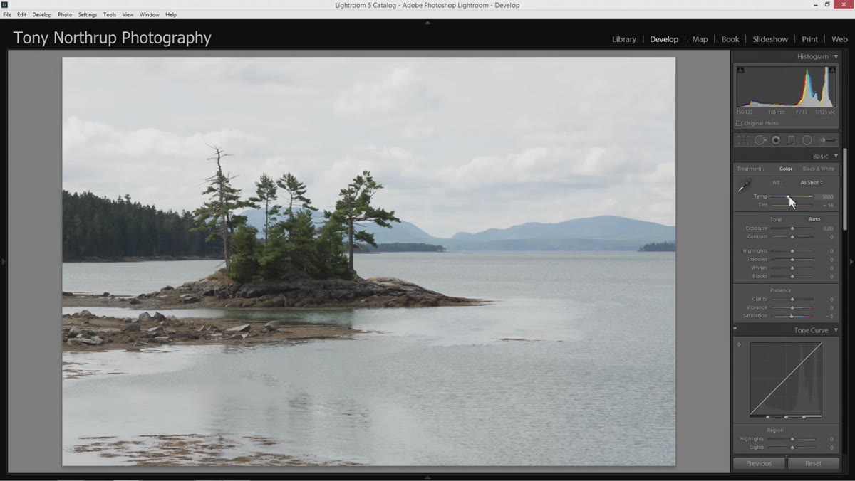 Basic panel sliders being adjusted, exposure and contrast highlighted
Chelsea’s global pass covers the core Basic panel adjustments: a slight warming of the white balance, a modest exposure bump, and a careful spread between highlights and shadows. She pulls highlights down to recover cloud detail and lifts shadows to open up the foreground. This highlight-shadow push-pull is something I do on nearly every landscape file - the sky and the ground almost never meter the same, and this is your first, lightest attempt at reconciling them.
Basic panel sliders being adjusted, exposure and contrast highlighted
Chelsea’s global pass covers the core Basic panel adjustments: a slight warming of the white balance, a modest exposure bump, and a careful spread between highlights and shadows. She pulls highlights down to recover cloud detail and lifts shadows to open up the foreground. This highlight-shadow push-pull is something I do on nearly every landscape file - the sky and the ground almost never meter the same, and this is your first, lightest attempt at reconciling them.
For whites and blacks, she uses a technique worth building into muscle memory. Hold Alt (Option on Mac) while dragging the Whites slider and your screen goes black, showing only the pixels that are clipping to pure white. Do the same with Blacks, and you’ll see clipped shadows appear as colored speckles. The goal is to find the threshold - just a hair of clipping on each end gives the image a full tonal range without blowing out meaningful detail.
Step 3: Clarity, Vibrance, and the Tone Curve
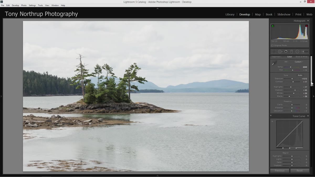 Clarity and vibrance sliders being raised in Basic panel
A small clarity boost adds midtone contrast and brings out texture in rocks, water, and clouds without the crunchy look you get from overapplying it. Chelsea keeps it restrained, and that’s right. On landscape images I typically sit between 10 and 25. Above that, skin would look terrible - but we don’t have skin here, and foliage starts to feel painted if you push past 30.
Clarity and vibrance sliders being raised in Basic panel
A small clarity boost adds midtone contrast and brings out texture in rocks, water, and clouds without the crunchy look you get from overapplying it. Chelsea keeps it restrained, and that’s right. On landscape images I typically sit between 10 and 25. Above that, skin would look terrible - but we don’t have skin here, and foliage starts to feel painted if you push past 30.
She follows this with a light vibrance and saturation increase, then moves to the tone curve for a gentle S-curve - lifting the midtones slightly to add a sense of luminosity. It’s a subtle move but it lifts the image off the flat RAW baseline in a way that pure exposure adjustment can’t quite replicate.
Step 4: Bring Out the Sky with a Graduated Filter
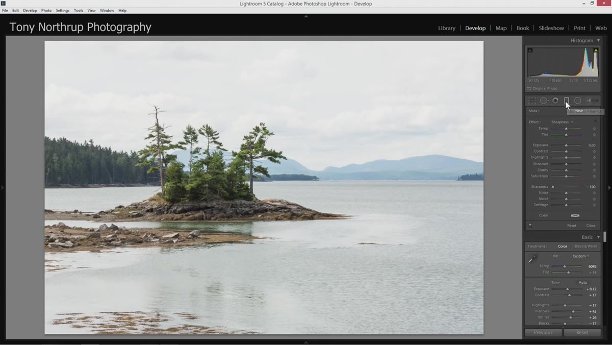 Graduated filter applied from top of frame down to mountain ridgeline
This is where the edit gets targeted. Chelsea draws a graduated filter from the top of the frame down to roughly the mountain ridgeline. Within that gradient, she drops exposure and highlights to pull cloud detail back into view, adds clarity to sharpen the cloud edges, and nudges saturation to deepen the sky color. She also drops shadows slightly, which adds dimension and keeps the clouds from looking flat.
Graduated filter applied from top of frame down to mountain ridgeline
This is where the edit gets targeted. Chelsea draws a graduated filter from the top of the frame down to roughly the mountain ridgeline. Within that gradient, she drops exposure and highlights to pull cloud detail back into view, adds clarity to sharpen the cloud edges, and nudges saturation to deepen the sky color. She also drops shadows slightly, which adds dimension and keeps the clouds from looking flat.
The graduated filter is one of the most useful tools in landscape editing because light genuinely falls differently across different parts of a scene. You’re not fabricating drama - you’re correcting for what the sensor couldn’t hold. I use graduated filters on probably 80 percent of my landscape edits, often stacking two or three with different intensities.
Step 5: Work the HSL Panel - Color by Color
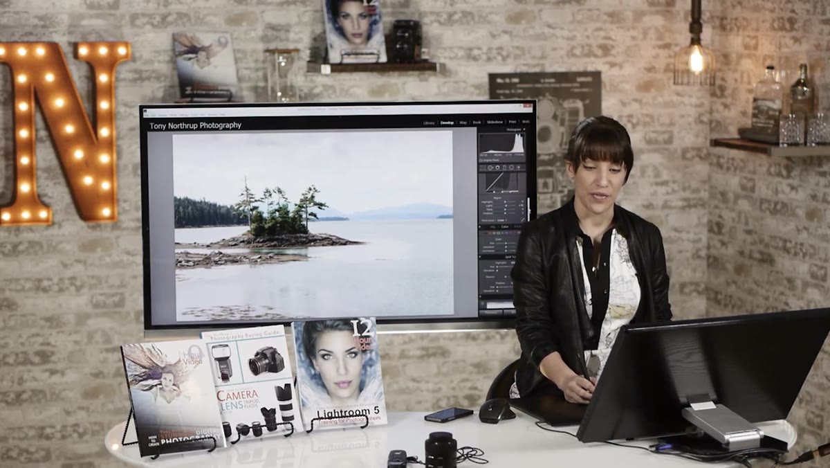 HSL panel open, orange luminance and saturation being adjusted
Chelsea’s color work is methodical. She moves through the HSL panel color by color, checking where each hue lives in the actual image before deciding whether to adjust it. She lifts green luminance to brighten the vegetation, boosts orange luminance and saturation for warm tones in the land, and shifts the orange hue slightly toward red to add richness. Yellow luminance and saturation get a small lift as well.
HSL panel open, orange luminance and saturation being adjusted
Chelsea’s color work is methodical. She moves through the HSL panel color by color, checking where each hue lives in the actual image before deciding whether to adjust it. She lifts green luminance to brighten the vegetation, boosts orange luminance and saturation for warm tones in the land, and shifts the orange hue slightly toward red to add richness. Yellow luminance and saturation get a small lift as well.
For blues, she drops the luminance to deepen the sky and make the cloud whites read as brighter by contrast. She flags an important caveat here: push blue luminance too far and you’ll get a haloing effect around foreground objects that sit against the sky. It’s an unnatural brightening at the edges where the dark foreground meets the overprocessed light sky. Zoom in to check before committing.
Step 6: Add a Second Graduated Filter from the Bottom
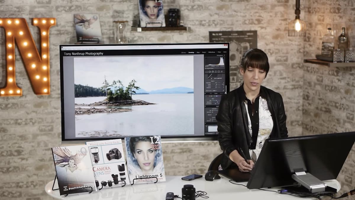 Second graduated filter drawn upward from bottom of frame
The second gradient comes from the bottom of the frame upward to reintroduce some color and life to the water and foreground. Chelsea uses it to bring back a touch of the green-blue cast in the water that earlier adjustments had muted. This kind of counter-gradient is something a lot of beginners skip, but foregrounds often go flat when you’ve been focused on the sky. A gentle gradient from below with a small saturation or color temperature adjustment can rebalance the whole image.
Second graduated filter drawn upward from bottom of frame
The second gradient comes from the bottom of the frame upward to reintroduce some color and life to the water and foreground. Chelsea uses it to bring back a touch of the green-blue cast in the water that earlier adjustments had muted. This kind of counter-gradient is something a lot of beginners skip, but foregrounds often go flat when you’ve been focused on the sky. A gentle gradient from below with a small saturation or color temperature adjustment can rebalance the whole image.
What I’d Add From My Own Work
Chelsea’s workflow is tight and repeatable, which is what makes it worth studying. The one thing I’d layer on top is a noise check before you finalize anything. In the high-contrast landscapes I shoot out here - sunrises over the Cascades, long exposures of the Deschutes at dusk - the shadow regions I lift in step two often reveal luminance noise that wasn’t visible at first. I make it a habit to zoom to 100 percent in the darker midtones after raising shadows, and dial in noise reduction in the Detail panel before calling the edit done. It saves me from prints that look clean on screen and gritty at 24 inches.
Editing a landscape file is really an act of translation. You’re converting a sensor’s literal reading of photons into something closer to what it felt like to stand in that place. Chelsea’s workflow gives you a clear, ordered path from flat RAW to finished image without ever asking you to fake something the light didn’t actually give you. The sequencing alone is worth the watch.
Watch the full tutorial on YouTube and work through it with one of your own recent landscape files. The difference between reading about a workflow and running your own images through it is where the learning actually happens.
Comments
Leave a Comment