
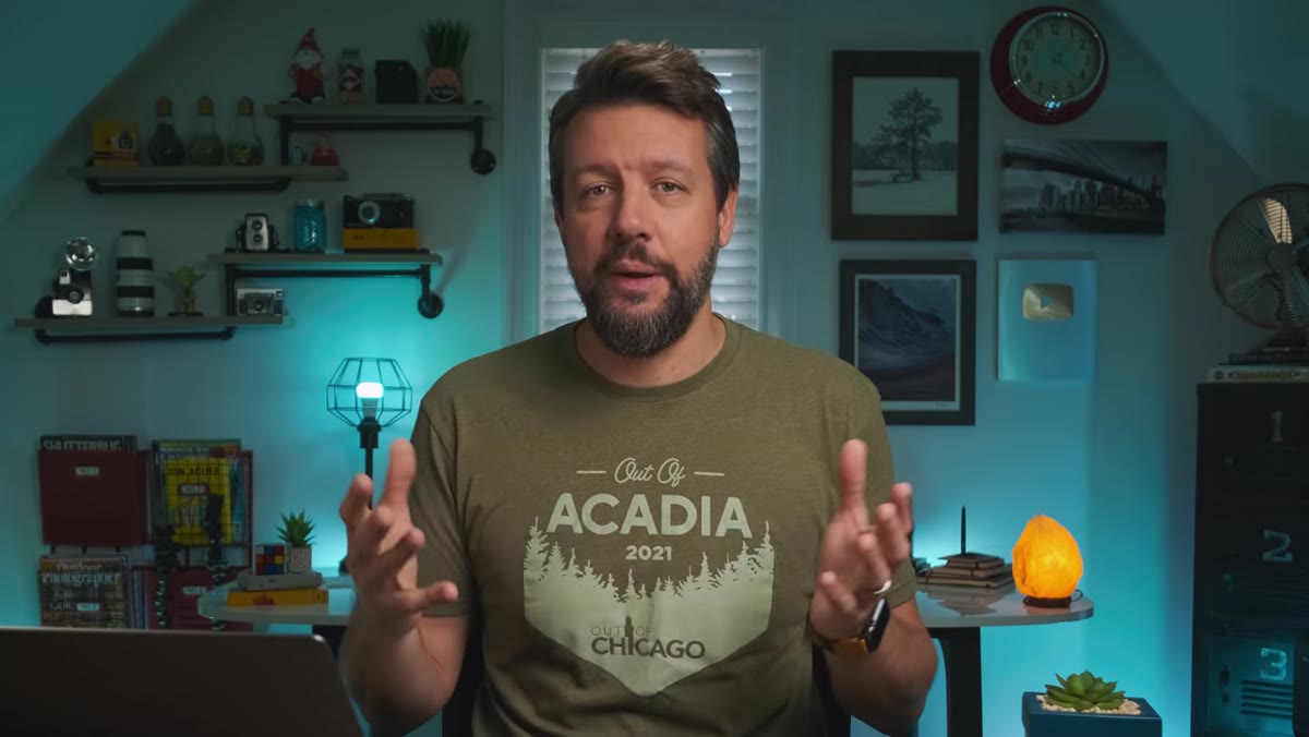
There is a particular kind of disappointment I know well. You drive hours into the dark, set up in a river at first light, wait for the fog to lift off the mountains, and come home with a technically perfect photograph that somehow feels dead. Sharp as a razor. Detailed to the point of exhaustion. It looks like a specification sheet, not a landscape. After twenty years of doing this work full time, I still fight that problem every single time I sit down at my editing desk.
What I found genuinely useful in this Watch the full tutorial on YouTube by Mark Denney is how directly he names the problem before he solves it. Modern camera sensors are extraordinary pieces of engineering, and that is precisely what makes them dangerous for the kind of work I care about. The hyper-sharp, hyper-detailed rendering they produce can strip the atmosphere right out of an image. What Denney describes as the “crunchy, lifeless digital look” is something I have been quietly battling for years, and his fix is elegant in its simplicity.
The technique centers on two Lightroom sliders, Clarity and Texture, used in the negative direction. That’s it. But understanding how they interact, and how lightly to apply them, is where most people go wrong. Here is how the process actually works.
Step 1: Start With a Strong Base Edit
 Photographer reflecting on 2021 edits, single landscape image on screen
Before you touch Clarity or Texture, your image should already have its tonal and color work in a good place. Denney makes this point implicitly by working from a photo he considers among his best of the year. The painterly softening effect is a finishing layer, not a rescue operation. If the exposure, white balance, and basic contrast are already working, the final step of softening will feel like a natural exhale rather than a patch job.
Photographer reflecting on 2021 edits, single landscape image on screen
Before you touch Clarity or Texture, your image should already have its tonal and color work in a good place. Denney makes this point implicitly by working from a photo he considers among his best of the year. The painterly softening effect is a finishing layer, not a rescue operation. If the exposure, white balance, and basic contrast are already working, the final step of softening will feel like a natural exhale rather than a patch job.
This matters practically because negative Clarity affects how midtone contrast reads. If your image is already a bit flat, pulling Clarity negative will make it feel muddy rather than soft. Get the structure right first.
Step 2: Create a Virtual Copy for Comparison
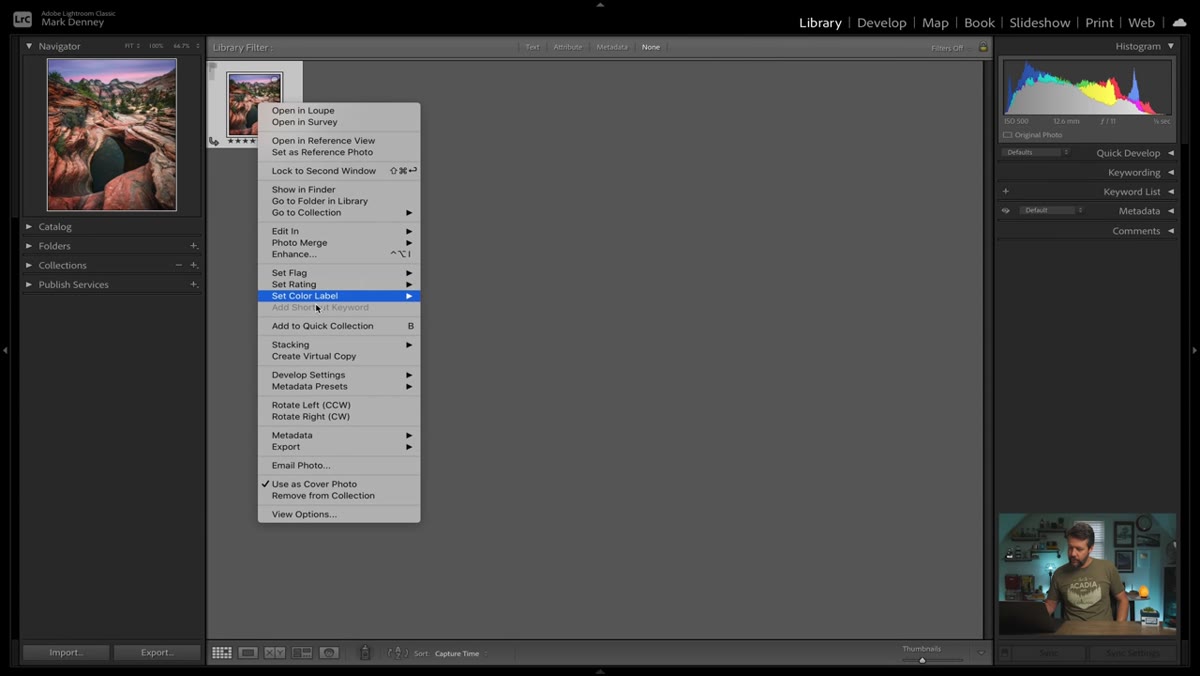 Creating a virtual copy in Lightroom’s filmstrip
In Lightroom, right-click your image in the filmstrip and select “Create Virtual Copy.” This gives you two versions of the same file to work with simultaneously. Denney uses this to compare his 2021 approach against how he would have edited the same image a few years earlier.
Creating a virtual copy in Lightroom’s filmstrip
In Lightroom, right-click your image in the filmstrip and select “Create Virtual Copy.” This gives you two versions of the same file to work with simultaneously. Denney uses this to compare his 2021 approach against how he would have edited the same image a few years earlier.
This is a habit I have adopted for any significant stylistic choice. The virtual copy costs you nothing and gives you an honest side-by-side reference. It is far easier to evaluate a subtle effect when you can flip between the treated and untreated versions at full resolution rather than relying on memory or before-and-after toggles.
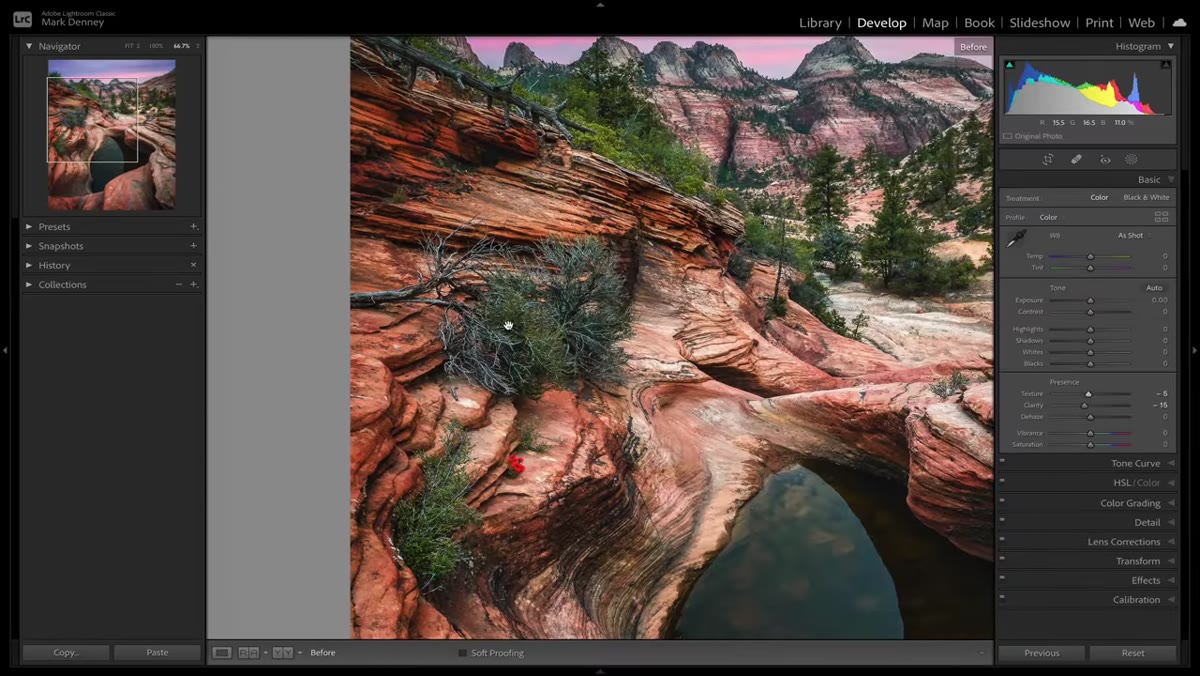
Step 3: Reduce Clarity to Around Negative 15
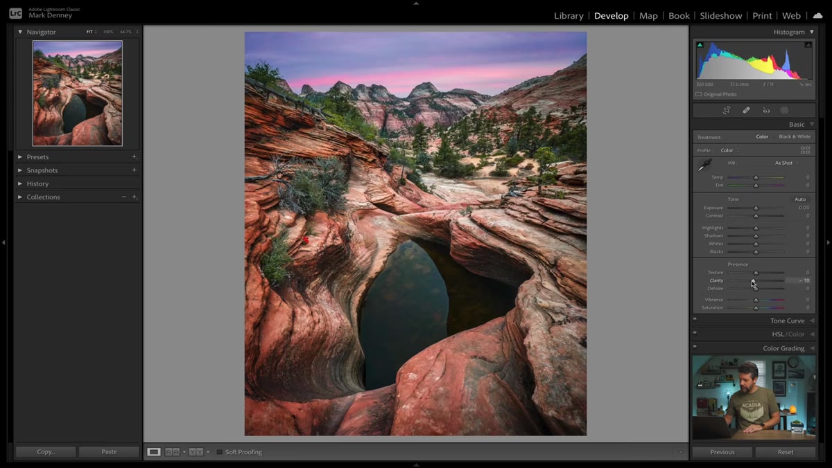 Clarity slider being pulled to approximately negative 15
In the Basic panel, locate the Clarity slider and bring it down to roughly negative 15. Clarity in Lightroom works on medium to large areas of local contrast, essentially the structural edges and transitions that give an image its sense of three-dimensional “punch.” Reducing it doesn’t blur the image the way a Gaussian blur would. It smooths the harder transitions between tonal regions, which is exactly what takes the edge off that over-rendered digital appearance.
Clarity slider being pulled to approximately negative 15
In the Basic panel, locate the Clarity slider and bring it down to roughly negative 15. Clarity in Lightroom works on medium to large areas of local contrast, essentially the structural edges and transitions that give an image its sense of three-dimensional “punch.” Reducing it doesn’t blur the image the way a Gaussian blur would. It smooths the harder transitions between tonal regions, which is exactly what takes the edge off that over-rendered digital appearance.
Negative 15 is a conservative starting point, and that is intentional. The goal is a quality that a viewer might not be able to name but will feel. You are not trying to make the image look soft, you are trying to make it stop looking mechanical.
Step 4: Reduce Texture to Around Negative 5
 Texture slider pulled to negative 5 in the Basic panel
Texture operates at a finer scale than Clarity, targeting the smallest surface details in the frame. Things like individual blades of grass, bark patterns, rock grain, and water ripples are all in Texture’s territory. For images with very high fine-detail density, a small negative Texture adjustment complements what Clarity is doing at the larger scale.
Texture slider pulled to negative 5 in the Basic panel
Texture operates at a finer scale than Clarity, targeting the smallest surface details in the frame. Things like individual blades of grass, bark patterns, rock grain, and water ripples are all in Texture’s territory. For images with very high fine-detail density, a small negative Texture adjustment complements what Clarity is doing at the larger scale.
Denney settles around negative 5 for this particular image, which is loaded with fine detail throughout. Don’t over-apply it. Negative Texture can start to look waxy or artificially smooth if pushed too far. Think of it as quietly turning down the noise of the image rather than visibly softening it.
Step 5: Zoom In and Use the Backslash Key to Evaluate
 Zoomed-in view with before/after backslash toggle active
Zoom into a detail-heavy area of the frame and use the backslash key to toggle between your edited version and the unedited original. This is where the effect becomes legible at the pixel level. What you are looking for is a very subtle reduction in that sandpaper-like micro-texture that makes digital files feel clinical.
Zoomed-in view with before/after backslash toggle active
Zoom into a detail-heavy area of the frame and use the backslash key to toggle between your edited version and the unedited original. This is where the effect becomes legible at the pixel level. What you are looking for is a very subtle reduction in that sandpaper-like micro-texture that makes digital files feel clinical.
The change is modest when viewed this way, and that is the point. The cumulative effect across the entire image is what matters, not whether you can see it dramatically in a small crop. If the before-and-after difference looks dramatic at 100%, you have pushed too far.
Step 6: Compare the Virtual Copies at Full View
 Side-by-side comparison of 2021 edit vs earlier editing approach
Return to your full-image view and switch between your virtual copies. The version with negative Clarity and Texture adjustments should read as warmer in character without being warmer in color. It should feel more like a photograph that was made rather than rendered. Denney describes this as a “softer, painterly, soulful” quality, and while those words can sound vague in isolation, the comparison makes them concrete.
Side-by-side comparison of 2021 edit vs earlier editing approach
Return to your full-image view and switch between your virtual copies. The version with negative Clarity and Texture adjustments should read as warmer in character without being warmer in color. It should feel more like a photograph that was made rather than rendered. Denney describes this as a “softer, painterly, soulful” quality, and while those words can sound vague in isolation, the comparison makes them concrete.
I often show both versions to workshop students without labeling them. Almost everyone prefers the softened version and many can’t immediately say why. That’s the right result.
A Note From the Field: Selective Application Matters
The one thing I would add from my own practice is that global Clarity and Texture reductions are not always the right delivery method. When I am working with images that have a sky I want to retain some drama in, or foreground elements like water that benefit from a little surface tension, I will often apply negative Clarity and Texture locally using a mask rather than globally.
Lightroom’s masking tools let you paint these adjustments into midground foliage or background atmosphere while leaving a dramatic sky or a sharp foreground rock face untouched. The technique Denney outlines is the foundation. Learning to apply it with precision through masking is where it becomes a real tool rather than a blanket filter.
Still shoots film occasionally because it forces him to think before pressing the shutter. That discipline applies here too. The question before pulling a slider is always: what specifically am I trying to change, and where does it live in this image?
The single most important thing I took from this tutorial is permission to treat sharpness as a variable rather than a goal. The default assumption in digital photography is that more detail is always better. Denney’s approach, and mine now, is that the right amount of detail is what serves the image’s emotional temperature. Pulling back just slightly on Clarity and Texture is one of the lowest-effort, highest-impact adjustments I make in every serious edit.
Watch the full tutorial on YouTube to see Mark walk through the before-and-after comparison on his own image. The visual difference is subtle enough that seeing it in motion, on a real photograph, makes the concept stick in a way that description alone cannot.
Comments (2)
This saved me so much time on my last edit. Wish I'd found this sooner.
Tried this technique this morning. Game changer for real.
Leave a Comment