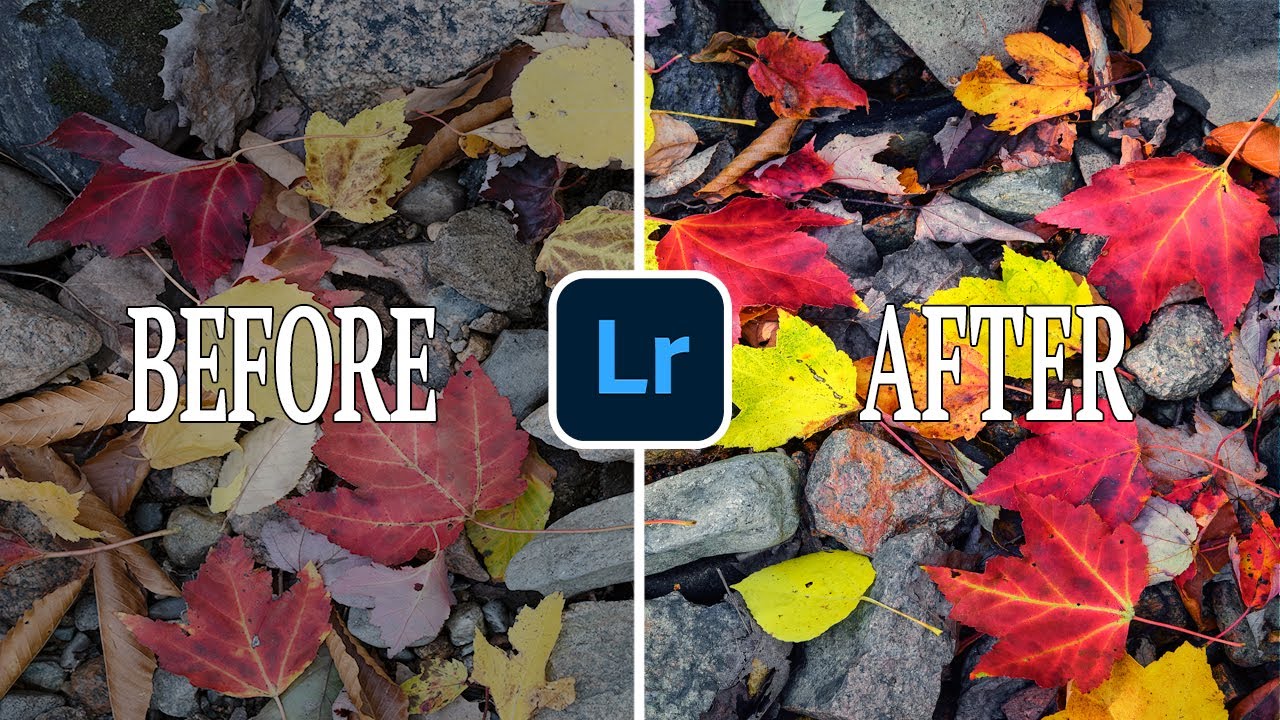
Color has always been the thing I lose sleep over. Not composition, not exposure, not even the light itself, though all three matter enormously. After twenty years of making landscape photographs, I’ve come to believe that the emotional weight of an image lives in its color. A technically perfect shot with flat, lifeless color will sit in a folder forever. The same frame with rich, coherent tones becomes the print someone hangs above their fireplace.
For a long time, Lightroom’s Split Toning panel was my primary tool for shaping that color story. It worked, but it always felt like painting a room with a brush that was slightly too small. You could get somewhere, but the control was coarse. When Adobe rolled out what became Lightroom 10, I heard rumblings about a new color panel, watched a few tutorials, and landed on this one from Mark Denney. Watch the full tutorial on YouTube. Denney shoots landscapes with the kind of intentionality I respect, and his walkthrough of the Color Grading panel was the clearest explanation I found. Here’s what I pulled from it, along with how I’ve folded these tools into my own workflow.
Step 1: Update Lightroom and Locate the Color Grading Panel
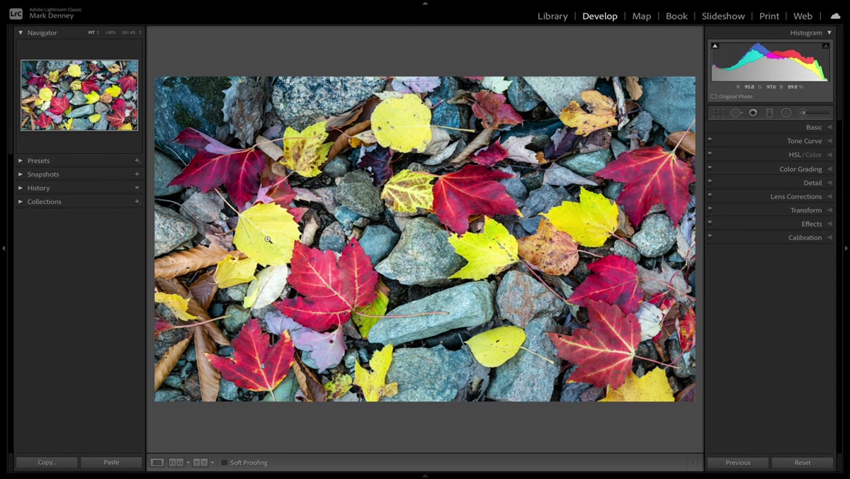
 Lightroom panel showing Color Grading replacing Split Toning
Before anything else, make sure you’re running Lightroom 10 or later. The change isn’t subtle. You’ll open the Develop module and find that Split Toning is simply gone. In its place sits a section labeled Color Grading. If you’ve been using Split Toning for years, the first instinct is to panic, but give it sixty seconds and you’ll realize Adobe gave you something considerably more powerful. The new panel breaks the tonal range into three distinct zones: shadows, midtones, and highlights. Each zone gets its own color wheel, and that separation is the entire point.
Lightroom panel showing Color Grading replacing Split Toning
Before anything else, make sure you’re running Lightroom 10 or later. The change isn’t subtle. You’ll open the Develop module and find that Split Toning is simply gone. In its place sits a section labeled Color Grading. If you’ve been using Split Toning for years, the first instinct is to panic, but give it sixty seconds and you’ll realize Adobe gave you something considerably more powerful. The new panel breaks the tonal range into three distinct zones: shadows, midtones, and highlights. Each zone gets its own color wheel, and that separation is the entire point.
Step 2: Understand the Three-Zone Structure
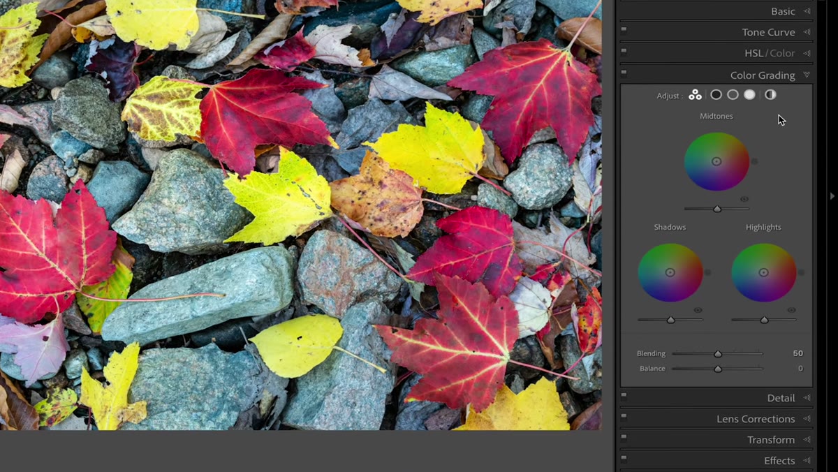 Three color wheels for shadows, midtones, and highlights displayed
Split Toning let you push color into highlights and shadows independently, but midtones were largely untouched unless you were blending sliders with a lot of patience. Color Grading hands you a dedicated wheel for each zone, meaning you can now build a complete tonal color story rather than just a two-point gradient. Think of it like the color correction process used in cinema, where colorists treat each tonal range as a separate layer of mood. For landscape work, this matters because the sky, the land, and the shadow detail often need entirely different color treatments to feel cohesive and natural rather than slapped with a filter.
Three color wheels for shadows, midtones, and highlights displayed
Split Toning let you push color into highlights and shadows independently, but midtones were largely untouched unless you were blending sliders with a lot of patience. Color Grading hands you a dedicated wheel for each zone, meaning you can now build a complete tonal color story rather than just a two-point gradient. Think of it like the color correction process used in cinema, where colorists treat each tonal range as a separate layer of mood. For landscape work, this matters because the sky, the land, and the shadow detail often need entirely different color treatments to feel cohesive and natural rather than slapped with a filter.
Step 3: Start with the Midtones Wheel
 Midtone color wheel with cursor demonstrating adjustment
Denney’s approach, and one I’ve since adopted, is to start with the midtones rather than the highlights. Midtones carry the bulk of visual information in most landscape photographs. The foliage, the rock faces, the water in open shade, all of that lives in the mid-range. Grab the center point of the midtone wheel and drag it toward a hue that supports your scene’s mood. For fall images with warm foliage, a gentle push toward amber or ochre in the midtones will unify the color palette without forcing it. Keep the adjustment subtle at first. A little movement on these wheels goes further than you expect.
Midtone color wheel with cursor demonstrating adjustment
Denney’s approach, and one I’ve since adopted, is to start with the midtones rather than the highlights. Midtones carry the bulk of visual information in most landscape photographs. The foliage, the rock faces, the water in open shade, all of that lives in the mid-range. Grab the center point of the midtone wheel and drag it toward a hue that supports your scene’s mood. For fall images with warm foliage, a gentle push toward amber or ochre in the midtones will unify the color palette without forcing it. Keep the adjustment subtle at first. A little movement on these wheels goes further than you expect.
Step 4: Shape the Highlights with Intention
 Highlights wheel being adjusted with visible color shift in bright areas
Highlights in a landscape photograph are usually your sky, your reflected light on water, or the bright edges of clouds. The highlights wheel lets you cool those areas down or push them warmer completely independently of what you’ve done to your midtones. In a classic golden-hour image, I’ll often nudge the highlights toward a slightly warmer gold while keeping the midtones neutral or leaning slightly cool. This creates a natural gradient of warmth that mirrors what actually happens when late light hits a scene. The effect feels real because light actually behaves that way.
Highlights wheel being adjusted with visible color shift in bright areas
Highlights in a landscape photograph are usually your sky, your reflected light on water, or the bright edges of clouds. The highlights wheel lets you cool those areas down or push them warmer completely independently of what you’ve done to your midtones. In a classic golden-hour image, I’ll often nudge the highlights toward a slightly warmer gold while keeping the midtones neutral or leaning slightly cool. This creates a natural gradient of warmth that mirrors what actually happens when late light hits a scene. The effect feels real because light actually behaves that way.
Step 5: Use the Shadows Wheel to Anchor the Image
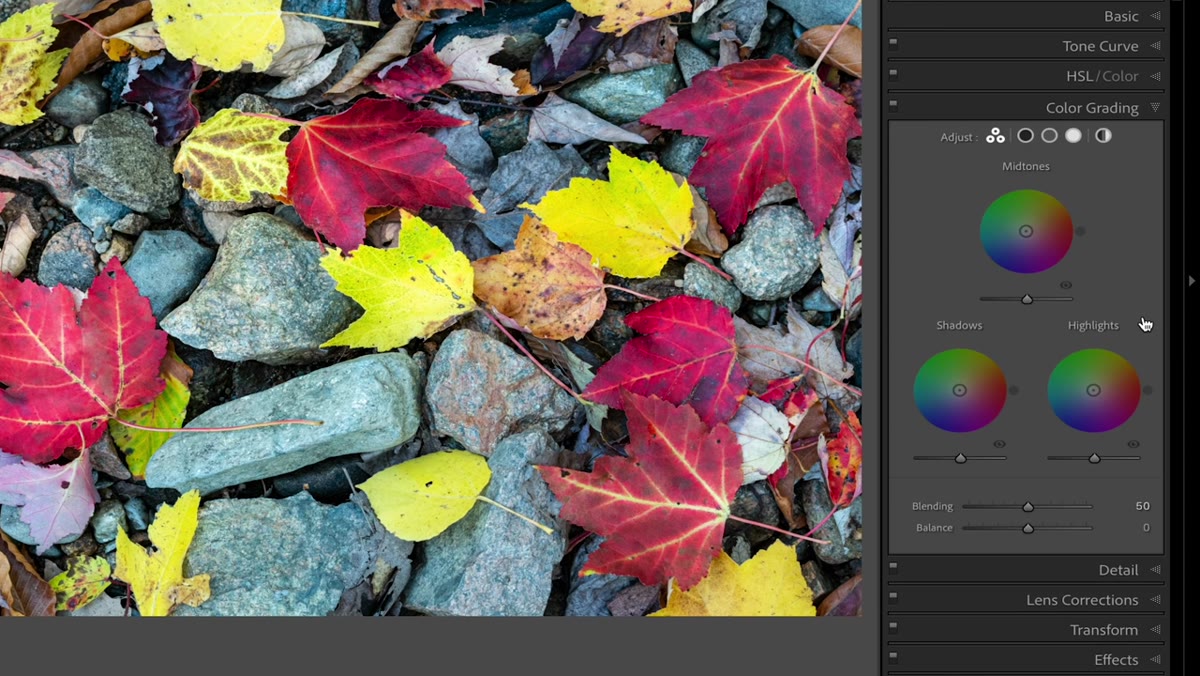 Shadows wheel showing deep tonal color adjustment
Shadow color is where a lot of photographers leave significant mood on the table. Our eyes naturally perceive shadows in landscape scenes as having a slight blue or purple cast, particularly in open shade under a blue sky. Leaning the shadows wheel toward a cool blue-violet will honor that optical reality and make your image feel grounded in actual atmospheric conditions. Alternatively, for warmer scenes shot at magic hour, a subtle push toward a warm brown or amber in the shadows can make the entire image feel like it was lit from within. The key word throughout all three wheels is subtle. These are not Instagram sliders. Small moves, evaluated at 1:1 view, produce the best results.
Shadows wheel showing deep tonal color adjustment
Shadow color is where a lot of photographers leave significant mood on the table. Our eyes naturally perceive shadows in landscape scenes as having a slight blue or purple cast, particularly in open shade under a blue sky. Leaning the shadows wheel toward a cool blue-violet will honor that optical reality and make your image feel grounded in actual atmospheric conditions. Alternatively, for warmer scenes shot at magic hour, a subtle push toward a warm brown or amber in the shadows can make the entire image feel like it was lit from within. The key word throughout all three wheels is subtle. These are not Instagram sliders. Small moves, evaluated at 1:1 view, produce the best results.
Step 6: Use the New Zoom Tool to Check Your Work
 Shift-key magnifying glass cursor demonstrated on canvas
Denney also covers a zooming improvement in Lightroom 10 that sounds minor until you’re actually using it. Holding Shift transforms your cursor into a scrubbing magnifier. Sliding right zooms in, sliding left zooms out, and the motion is fluid rather than jumping between fixed percentages. On a Mac, holding Command lets you draw a selection box directly on the image and zoom to exactly that region. For color work specifically, this matters because you need to check how your color grading is affecting critical areas like skin tones in foreground elements, the detail in shadow regions, and highlight transitions in the sky. The old click-to-zoom approach always felt like guessing. This feels like control.
Shift-key magnifying glass cursor demonstrated on canvas
Denney also covers a zooming improvement in Lightroom 10 that sounds minor until you’re actually using it. Holding Shift transforms your cursor into a scrubbing magnifier. Sliding right zooms in, sliding left zooms out, and the motion is fluid rather than jumping between fixed percentages. On a Mac, holding Command lets you draw a selection box directly on the image and zoom to exactly that region. For color work specifically, this matters because you need to check how your color grading is affecting critical areas like skin tones in foreground elements, the detail in shadow regions, and highlight transitions in the sky. The old click-to-zoom approach always felt like guessing. This feels like control.
What I’ve Learned After Running This Through My Own Library
I went back through about three months of images after watching Denney’s tutorial and reworked a handful of prints using the Color Grading panel instead of my old Split Toning presets. The difference that surprised me most was in fall foliage images shot here in Central Oregon, particularly scenes with both direct sunlight and deep shadow in the same frame. With Split Toning, any color I added to the shadows would bleed into the midtones in ways I couldn’t fully control. The dedicated midtone wheel fixed that completely. I could warm the foliage without muddying the shadows, and cool the shadows without pulling the warmth out of the leaves.
One honest caveat: the Color Grading panel rewards patience and a calibrated monitor. I run my display through a regular calibration cycle, and I still do a final check on a second screen before any print order. The wheels are sensitive enough that what looks right on an uncalibrated display can look oversaturated on print or on a client’s screen. Build your adjustments slowly, and export a test JPEG to a second device before you commit.
The single most important idea I took from Denney’s tutorial is this: color grading is not a finishing step you apply after the real editing is done. It is part of the edit. The mood of a landscape photograph, the feeling of cold dawn air or warm afternoon light on stone, lives as much in deliberate color decisions as it does in exposure or composition. The Color Grading panel gives you a precise enough tool to make those decisions consciously rather than accidentally.
Watch the full tutorial on YouTube and watch it with Lightroom open. The best way to learn these wheels is to move them while Denney explains why.
Comments
Leave a Comment