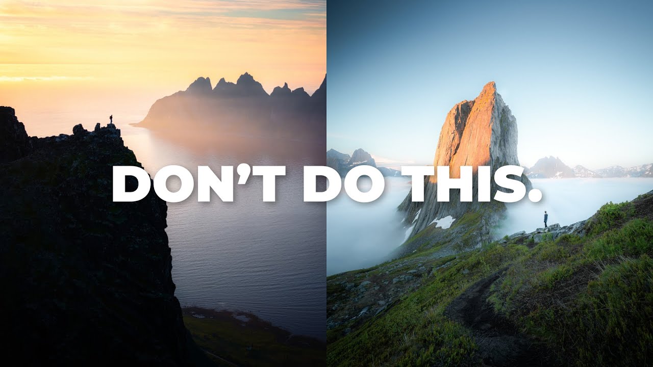
I’ve been waking up before 4am and driving to dark trailheads for twenty years. In that time I’ve made technically solid images that nobody remembers, and a handful of photographs that people still write to me about years later. For a long time I couldn’t fully articulate the difference. Sharp is sharp. Exposed is exposed. So why do some images stick and others evaporate the moment the viewer scrolls past?
That question is exactly what photographer Hugo Korhonen tackles in a tutorial that stopped me mid-coffee last week. Watch the full tutorial on YouTube before or after reading this, because the visual examples he walks through add real weight to the framework. What I want to do here is break down his core concept, the story triangle, and translate it into field-ready thinking you can use on your next shoot.
The central argument is uncomfortable because it’s true: most landscape photos fail not because of bad technique, but because they don’t tell a story. Gear channels dominate photography content because sharpness and settings are easy to quantify. Story is harder to teach and harder to sell. But it’s the variable that actually separates a forgettable record shot from something that lands in someone’s chest.
Step 1: Understand the Three-Part Framework Before You Pick Up Your Camera
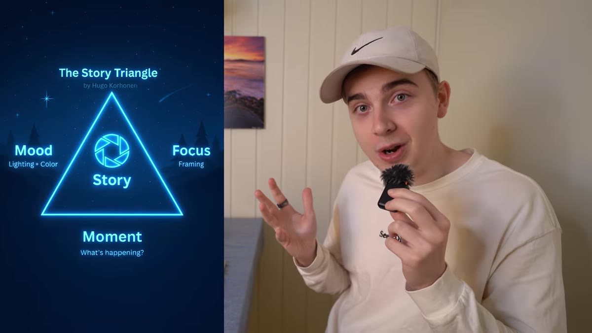 Diagram of the story triangle with three labeled points
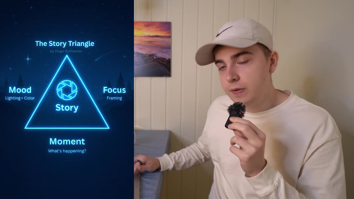
Hugo introduces what he calls the story triangle, a three-element model where every memorable landscape photograph needs to succeed across all three points simultaneously. Miss any single one and the image collapses. The three elements are mood, focus, and story. Think of them not as a checklist you work through after the fact, but as three lenses you’re constantly looking through from the moment you arrive at a location. Before I even set up my tripod now, I run through all three mentally. It takes about thirty seconds and it has changed what I come home with.
Diagram of the story triangle with three labeled points
Hugo introduces what he calls the story triangle, a three-element model where every memorable landscape photograph needs to succeed across all three points simultaneously. Miss any single one and the image collapses. The three elements are mood, focus, and story. Think of them not as a checklist you work through after the fact, but as three lenses you’re constantly looking through from the moment you arrive at a location. Before I even set up my tripod now, I run through all three mentally. It takes about thirty seconds and it has changed what I come home with.
Step 2: Build Mood Through Lighting Decisions, Not Luck
 Example landscape image showing dramatic directional lighting
Mood, in Hugo’s framework, is the combination of lighting and color working together to produce a specific emotional response in the viewer. This is where most photographers are passive when they should be active. Waiting for golden hour is a start, but it’s the minimum. The real question is what quality of light are you seeking and why. Hard sidelight on a ridgeline creates tension. Soft, diffused light in a forest evokes quiet. Backlit fog reads as mystery. I once drove six hours to photograph a granite peak only to sit in fog for two full days. I almost left. On the morning of day three the fog lifted just enough to catch the first light at a single gap in the clouds, and the resulting image became my best-selling print. That wasn’t luck. That was understanding what the light was doing emotionally and waiting for it to say the right thing.
Example landscape image showing dramatic directional lighting
Mood, in Hugo’s framework, is the combination of lighting and color working together to produce a specific emotional response in the viewer. This is where most photographers are passive when they should be active. Waiting for golden hour is a start, but it’s the minimum. The real question is what quality of light are you seeking and why. Hard sidelight on a ridgeline creates tension. Soft, diffused light in a forest evokes quiet. Backlit fog reads as mystery. I once drove six hours to photograph a granite peak only to sit in fog for two full days. I almost left. On the morning of day three the fog lifted just enough to catch the first light at a single gap in the clouds, and the resulting image became my best-selling print. That wasn’t luck. That was understanding what the light was doing emotionally and waiting for it to say the right thing.
Step 3: Use Color Intentionally to Reinforce the Emotional Tone
 Lightroom panel with color grading adjustments visible
Color isn’t decoration. It’s emotional instruction. Hugo makes a strong point here that mishandled color doesn’t just look bad aesthetically, it actively works against the viewer. Oversaturated oranges create anxiety. Clashing hues pull the eye in competing directions. Muddy shadows kill atmosphere. In Lightroom, the HSL panel and color grading tools are where I do most of my mood work. For cool, isolated winter scenes I pull the luminance down on blues and shift the hue slightly toward cyan. For warm evening shots I’ll often mute the saturation of secondary colors so the gold in the scene reads as intentional rather than accidental. Every color decision should be answering the question: does this support what I want the viewer to feel?
Lightroom panel with color grading adjustments visible
Color isn’t decoration. It’s emotional instruction. Hugo makes a strong point here that mishandled color doesn’t just look bad aesthetically, it actively works against the viewer. Oversaturated oranges create anxiety. Clashing hues pull the eye in competing directions. Muddy shadows kill atmosphere. In Lightroom, the HSL panel and color grading tools are where I do most of my mood work. For cool, isolated winter scenes I pull the luminance down on blues and shift the hue slightly toward cyan. For warm evening shots I’ll often mute the saturation of secondary colors so the gold in the scene reads as intentional rather than accidental. Every color decision should be answering the question: does this support what I want the viewer to feel?
Step 4: Define the Focus of the Image Before You Compose
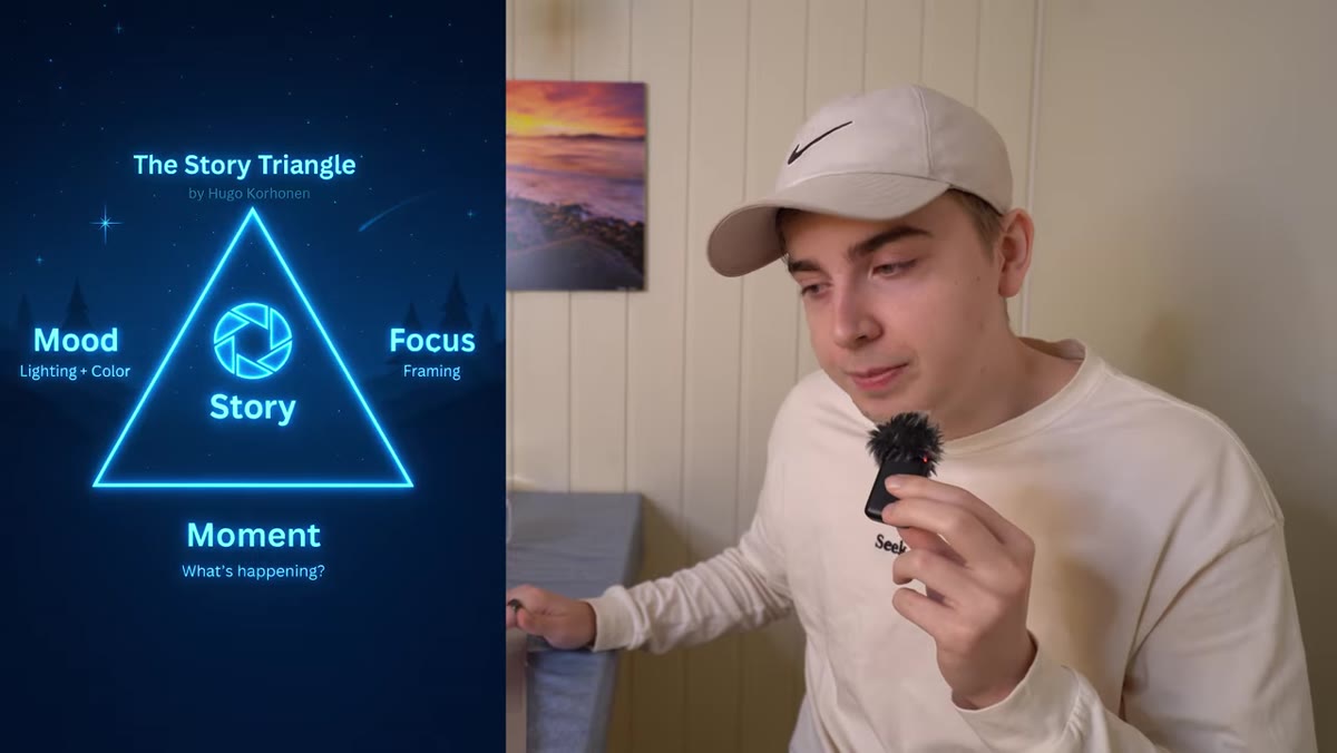 Side-by-side comparison of photos with clear vs. unclear subject
Hugo uses the word “focus” here not to mean autofocus points but to mean subject clarity. What is this photograph about? This sounds obvious but it’s the step most photographers skip in the field. When I’m standing in front of a scene I find myself tempted to include everything because everything looks stunning. A mentor once told me the mountain doesn’t care about your schedule, meaning the mountain will wait. The scene is not going anywhere. What I need to do is slow down and decide what single thing the viewer should walk away having seen. That decision then drives every other choice: where I stand, what focal length I use, what I include and what I cut.
Side-by-side comparison of photos with clear vs. unclear subject
Hugo uses the word “focus” here not to mean autofocus points but to mean subject clarity. What is this photograph about? This sounds obvious but it’s the step most photographers skip in the field. When I’m standing in front of a scene I find myself tempted to include everything because everything looks stunning. A mentor once told me the mountain doesn’t care about your schedule, meaning the mountain will wait. The scene is not going anywhere. What I need to do is slow down and decide what single thing the viewer should walk away having seen. That decision then drives every other choice: where I stand, what focal length I use, what I include and what I cut.
Step 5: Use Composition as a Storytelling Tool, Not a Rule System
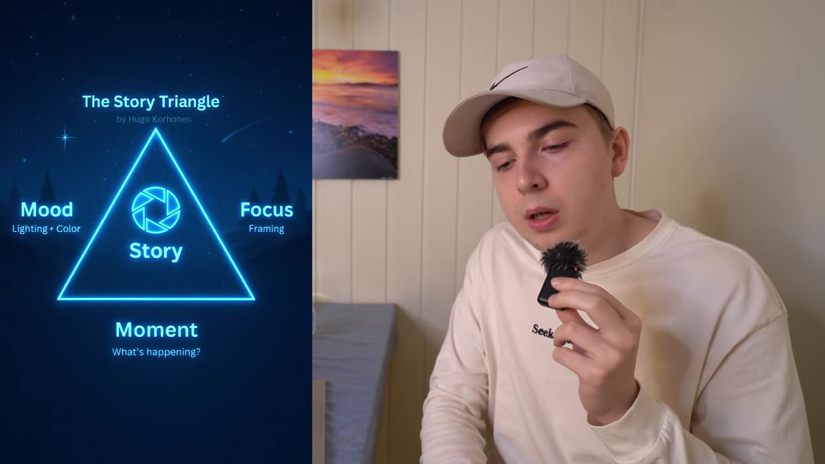 Photographer’s position in the field affecting foreground elements
Once you know what the photo is about, composition becomes the delivery mechanism for that story. Hugo walks through how your physical position in the landscape, your angle, your height, and your distance to foreground elements all shape what the image communicates emotionally. Low angles with strong foreground compress the space between viewer and subject, creating intimacy and scale. High angles with a wide vista create a sense of expansiveness and solitude. These aren’t aesthetic preferences. They’re emotional arguments you’re making to the viewer. I shoot everything on manual, including focus, because it forces me to make conscious decisions at every stage. The constraint slows me down in the best possible way.
Photographer’s position in the field affecting foreground elements
Once you know what the photo is about, composition becomes the delivery mechanism for that story. Hugo walks through how your physical position in the landscape, your angle, your height, and your distance to foreground elements all shape what the image communicates emotionally. Low angles with strong foreground compress the space between viewer and subject, creating intimacy and scale. High angles with a wide vista create a sense of expansiveness and solitude. These aren’t aesthetic preferences. They’re emotional arguments you’re making to the viewer. I shoot everything on manual, including focus, because it forces me to make conscious decisions at every stage. The constraint slows me down in the best possible way.
Step 6: Check All Three Triangle Points Before You Press the Shutter
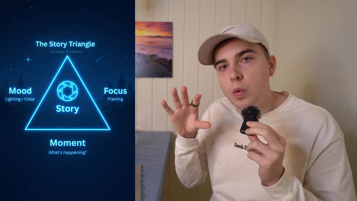 Return to story triangle diagram with all three elements highlighted
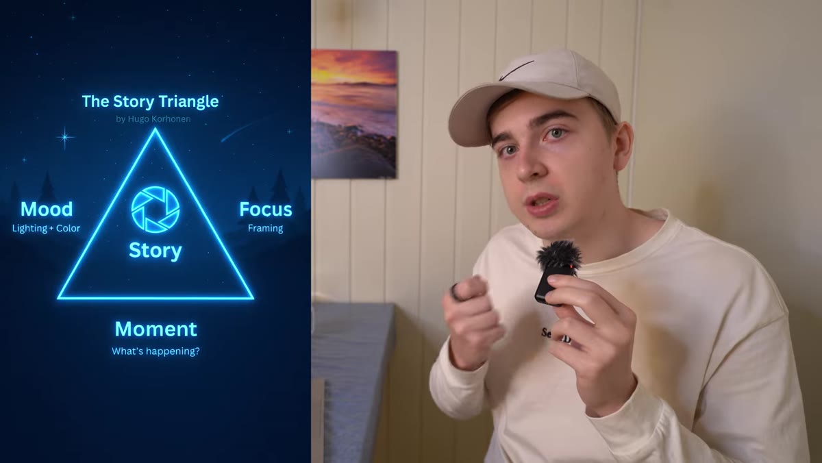
The practical application of the story triangle happens in the field, not in post. Before triggering the shutter, run through all three: Does this image have the right mood? Is the lighting doing something emotionally specific? Is my color situation supportable in editing? Is the subject clear? Would someone looking at this image for the first time know immediately what it’s about? And does the composition serve the story, or is it just filling the frame? When all three align, you feel it. There’s a confidence in the setup that’s different from just hoping it works.
Return to story triangle diagram with all three elements highlighted
The practical application of the story triangle happens in the field, not in post. Before triggering the shutter, run through all three: Does this image have the right mood? Is the lighting doing something emotionally specific? Is my color situation supportable in editing? Is the subject clear? Would someone looking at this image for the first time know immediately what it’s about? And does the composition serve the story, or is it just filling the frame? When all three align, you feel it. There’s a confidence in the setup that’s different from just hoping it works.
What I’d Add From Twenty Years in the Field
The story triangle works best when you’ve done the pre-visualization before you arrive. Hugo’s framework applies at the scene, but the strongest images I’ve made came from spending time with a location beforehand, either through research, previous visits, or simply sitting with it in the dark before shooting. The story you want to tell should start forming before the light even changes. Know what you’re looking for emotionally and the triangle gives you the tools to recognize it when it arrives.
The single most important idea in this tutorial is that technical competence is the floor, not the ceiling. Sharpness and exposure are the price of entry. Story is what separates a photograph from a snapshot of something beautiful. If you’ve been wondering why your images aren’t connecting with viewers the way you hoped, this framework is worth your full attention.
Watch the full tutorial on YouTube to see Hugo’s visual examples and the complete story triangle breakdown.
Comments
Leave a Comment