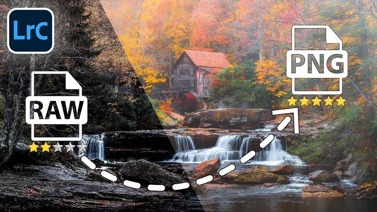
There’s a particular kind of frustration I know well. You’ve driven hours before dawn, set up in the dark, waited for the light to come up, and the scene is genuinely beautiful. But it’s missing that one intangible thing. Mist. A breath of fog rolling through the valley. Just enough atmosphere to make the image feel like it was pulled from a dream rather than a parking lot overlook. I’ve stood in more perfect-but-flat scenes than I can count, thinking the exact same thing: a little fog would change everything here.
The problem, of course, is that fog doesn’t follow a schedule. It doesn’t care that you blocked out this Tuesday morning, drove three hours, and wore your lucky hat. What it does mean is that the editing room becomes an important part of finishing a photograph, not just cleaning it up. When I came across Watch the full tutorial on YouTube from Mark Denney, I recognized it immediately as the kind of technique that earns a permanent place in your workflow. It’s subtle, it’s grounded in how atmosphere actually behaves optically, and it works across a wide range of landscape subjects. Here’s how to do it, step by step.
Step 1: Open the Develop Module and Draw a Linear Gradient
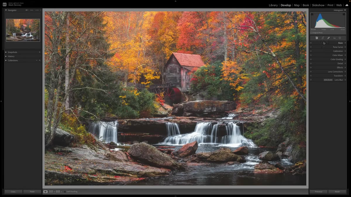 Linear gradient being dragged from top of image downward
Start in Lightroom’s Develop module with your image open. Navigate to the masking tools and select the Linear Gradient. Click at the very top of your image and drag downward, stopping roughly three-quarters of the way down the frame. Denney notes that the gradient doesn’t need to be perfectly vertical. In fact, putting it on a slight angle often looks more natural, because real fog rarely hugs a perfectly horizontal line. The gradient should cover the majority of the frame, with the effect fading out before it reaches the foreground in a heavy-handed way.
Linear gradient being dragged from top of image downward
Start in Lightroom’s Develop module with your image open. Navigate to the masking tools and select the Linear Gradient. Click at the very top of your image and drag downward, stopping roughly three-quarters of the way down the frame. Denney notes that the gradient doesn’t need to be perfectly vertical. In fact, putting it on a slight angle often looks more natural, because real fog rarely hugs a perfectly horizontal line. The gradient should cover the majority of the frame, with the effect fading out before it reaches the foreground in a heavy-handed way.
The positioning here matters more than the values you’ll set next. Think about where actual fog would sit in the scene. It typically collects in mid-ground and background areas, not at your feet. Use that logic to guide your gradient placement, and don’t be afraid to re-draw it a few times before moving forward.
Step 2: Reduce Texture and Clarity, Then Pull Down Dehaze
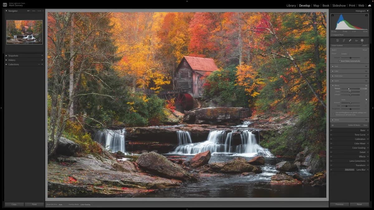 Texture, clarity, and dehaze sliders being adjusted in Effects panel
With the gradient selected, scroll to the Effects section of the masking panel. Bring Texture down to around -20, and do the same with Clarity. These two adjustments work together to soften fine detail and micro-contrast in the area covered by the gradient, which mimics the way fog actually scatters light and diffuses sharp edges in a scene. Then add negative Dehaze, pulling it down to around -5. That small amount of haze adds back a milky atmospheric quality without making the effect look like a blurry mistake.
Texture, clarity, and dehaze sliders being adjusted in Effects panel
With the gradient selected, scroll to the Effects section of the masking panel. Bring Texture down to around -20, and do the same with Clarity. These two adjustments work together to soften fine detail and micro-contrast in the area covered by the gradient, which mimics the way fog actually scatters light and diffuses sharp edges in a scene. Then add negative Dehaze, pulling it down to around -5. That small amount of haze adds back a milky atmospheric quality without making the effect look like a blurry mistake.
At full image view, the change looks modest. That’s intentional. Toggle the mask on and off while zoomed into the mid-ground of your photo and you’ll see the cumulative effect clearly. The trees or hills in that region should look softer, quieter, and a bit more distant. If the difference is dramatic at full view, you’ve pushed too far.
Step 3: Lower Saturation Slightly Within the Gradient
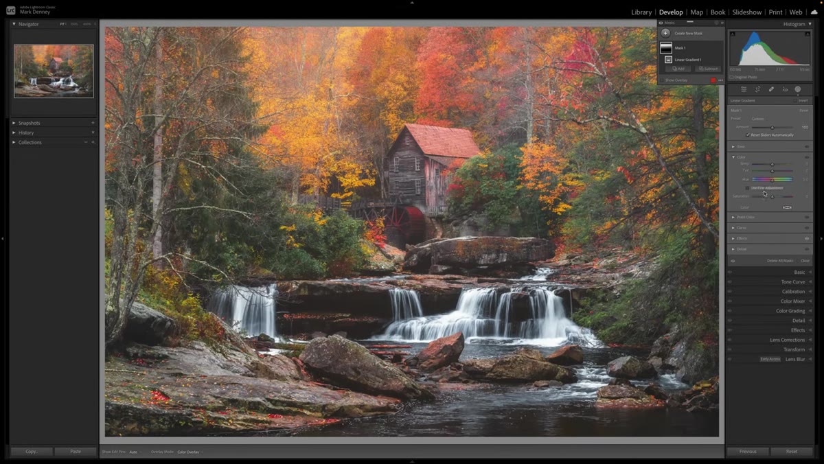 Saturation slider reduced in the Color section of the mask panel
Still inside the same linear gradient mask, open the Color section and reduce Saturation by a small amount, somewhere around -2. This is an easy step to skip, but it’s one of the most perceptually important ones. Fog doesn’t just soften edges. It also mutes color. Anything seen through a layer of mist loses some of its vibrancy because the water particles in the air scatter and dilute the light carrying that color information. By pulling saturation down just slightly within the gradient, you’re honoring that physical reality.
Saturation slider reduced in the Color section of the mask panel
Still inside the same linear gradient mask, open the Color section and reduce Saturation by a small amount, somewhere around -2. This is an easy step to skip, but it’s one of the most perceptually important ones. Fog doesn’t just soften edges. It also mutes color. Anything seen through a layer of mist loses some of its vibrancy because the water particles in the air scatter and dilute the light carrying that color information. By pulling saturation down just slightly within the gradient, you’re honoring that physical reality.
The adjustment is small enough that it won’t register consciously for most viewers. But take it out and compare, and you’ll notice the fog effect reads as slightly artificial without it. Small values, real impact.
Step 4: Lift the Black Point in the Tone Curve
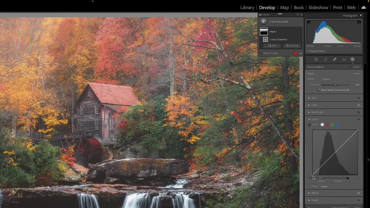 Tone curve black point being lifted, output value around 65
Next, open the Tone Curve section within the same gradient mask. Find the lower-left anchor point of the curve, which controls the Black Point, and lift it upward. Denney targets an output value somewhere between 50 and 80, with 65 as a reasonable middle ground. What this does is raise the luminosity floor inside the gradient, preventing the shadows from getting too deep. Fog is, at its core, a brightening agent. Dark shadows don’t survive fog. By lifting the blacks, you ensure that the shadowed areas inside your gradient are carrying some of that lifted, hazy quality rather than staying rich and deep.
Tone curve black point being lifted, output value around 65
Next, open the Tone Curve section within the same gradient mask. Find the lower-left anchor point of the curve, which controls the Black Point, and lift it upward. Denney targets an output value somewhere between 50 and 80, with 65 as a reasonable middle ground. What this does is raise the luminosity floor inside the gradient, preventing the shadows from getting too deep. Fog is, at its core, a brightening agent. Dark shadows don’t survive fog. By lifting the blacks, you ensure that the shadowed areas inside your gradient are carrying some of that lifted, hazy quality rather than staying rich and deep.
Watch the output value number as you drag, and use that as your guide rather than going purely by feel. The range of 50 to 80 gives you room to adjust based on the specific tonality of your image.
Step 5: Check the Overall Effect and Fine-Tune
 Before and after toggle showing the full gradient mask effect
Step back to a full-image view and toggle the entire mask on and off a few times. The fog effect should feel like it belongs to the scene, not like it was painted on afterward. If the transition from foggy to clear looks too abrupt, try dragging the gradient endpoints to widen the feather zone. If the effect feels too heavy overall, reduce the strength of any individual slider rather than deleting and starting over.
Before and after toggle showing the full gradient mask effect
Step back to a full-image view and toggle the entire mask on and off a few times. The fog effect should feel like it belongs to the scene, not like it was painted on afterward. If the transition from foggy to clear looks too abrupt, try dragging the gradient endpoints to widen the feather zone. If the effect feels too heavy overall, reduce the strength of any individual slider rather than deleting and starting over.
Every photograph will respond differently to these values. A high-contrast autumn scene will need a lighter hand than a soft, overcast mountain shot. Treat Denney’s numbers as a calibrated starting point and move from there based on what the specific image is asking for.
A Note From My Own Experience With Artificial Atmosphere
I’ve been adding artificial atmosphere to landscape images for years, usually using luminosity masks and layer blends in Photoshop. What I appreciate about Denney’s approach is how efficiently it’s contained within a single Lightroom mask. That said, my one caution is about foreground elements. Rocks, flowers, grasses, anything close to the camera that falls inside your gradient will pick up the fog effect, and it almost never looks right. Fog in the foreground feels wrong to the eye because we’re standing in it, and the ground beneath us looks normal.
If your gradient bleeds into a strong foreground, use the Subtract brush to paint the fog effect out of those close elements. It adds maybe two minutes to the process and makes the difference between a believable atmospheric image and one that just looks soft in a way you can’t quite explain.
The single most transferable idea from this technique is that atmosphere is as much about what you take away as what you add. Reducing texture, pulling clarity, lifting blacks, muting color slightly: these are all subtractive moves, and together they construct the feeling of air and moisture between the camera and the scene. That’s what fog actually is.
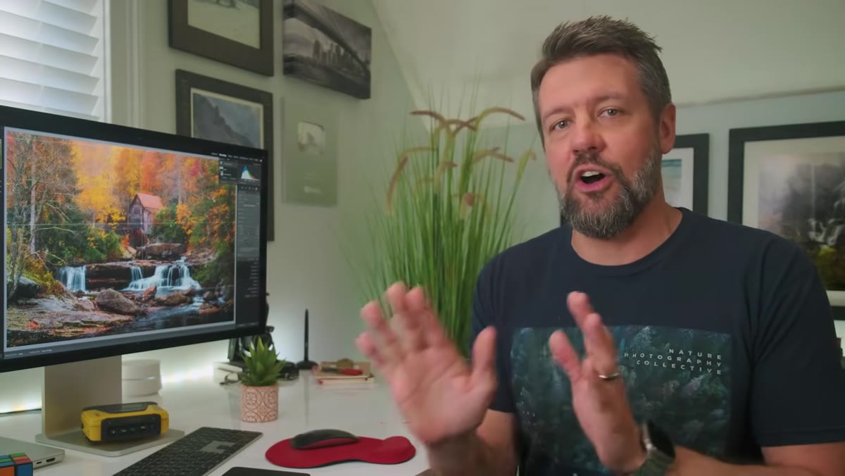
Watch the full tutorial on YouTube to see Mark Denney walk through the technique live on one of his West Virginia fall images, including the free PDF guide he’s made available with the exact values used.
Comments
Leave a Comment