There is a specific kind of disappointment that hits when you get home from a shoot, pull up your RAW files, and realize the image on your screen looks nothing like what you saw with your own eyes. I’ve been doing this for twenty years, and it still stings. You were in the right place. The light was doing something extraordinary. The composition felt alive. And now you’re staring at a flat, muddy file wondering where it all went. The editing phase is where a lot of photographers quietly undo the work they did in the field, especially with sunrise and sunset images where the dynamic range is brutal and the margin for error is narrow.
That’s why I kept coming back to this tutorial by William Patino. Watch the full tutorial on YouTube. His approach is grounded, methodical, and honest about the mistakes most of us make. What he teaches isn’t a look or a preset style. It’s a way of thinking about light that respects how nature actually behaves. I want to walk through his method step by step, add some context from my own practice, and give you something you can apply the next time you’re sitting in front of a golden hour file that isn’t cooperating.
Step 1: Understand What Your Histogram Is Actually Telling You
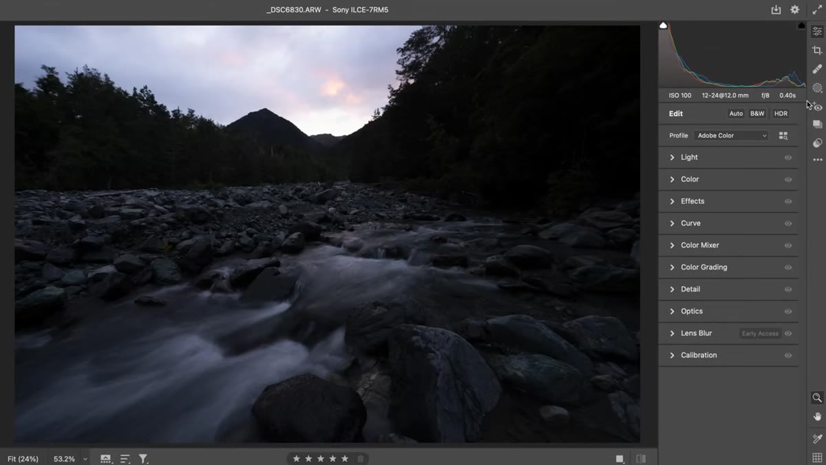 Histogram showing clipped highlights and dense shadows in a backlit scene
Before you touch a single slider, look at your histogram. In a backlit sunrise or sunset scene, you’ll typically see data piling up on both ends. Patino’s example image shows exactly this: he exposed to protect the highlights, which meant everything else fell into shadow. That’s the right call in the field. The mistake comes when you try to fix it by going straight for the Shadows and Highlights sliders and cranking them both to their extremes.
Histogram showing clipped highlights and dense shadows in a backlit scene
Before you touch a single slider, look at your histogram. In a backlit sunrise or sunset scene, you’ll typically see data piling up on both ends. Patino’s example image shows exactly this: he exposed to protect the highlights, which meant everything else fell into shadow. That’s the right call in the field. The mistake comes when you try to fix it by going straight for the Shadows and Highlights sliders and cranking them both to their extremes.
That “fix” creates what Patino calls the radioactive landscape. You’ve technically recovered the data, but the image looks like a video game render. The reason is simple: in nature, shadows are supposed to be dark and highlights are supposed to glow. Full recovery strips the scene of that natural luminance relationship.
Step 2: Use Exposure First, Not Shadows
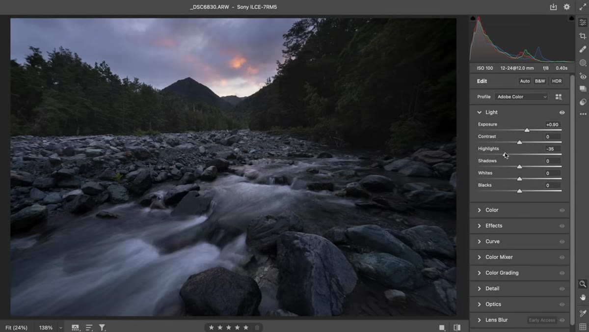
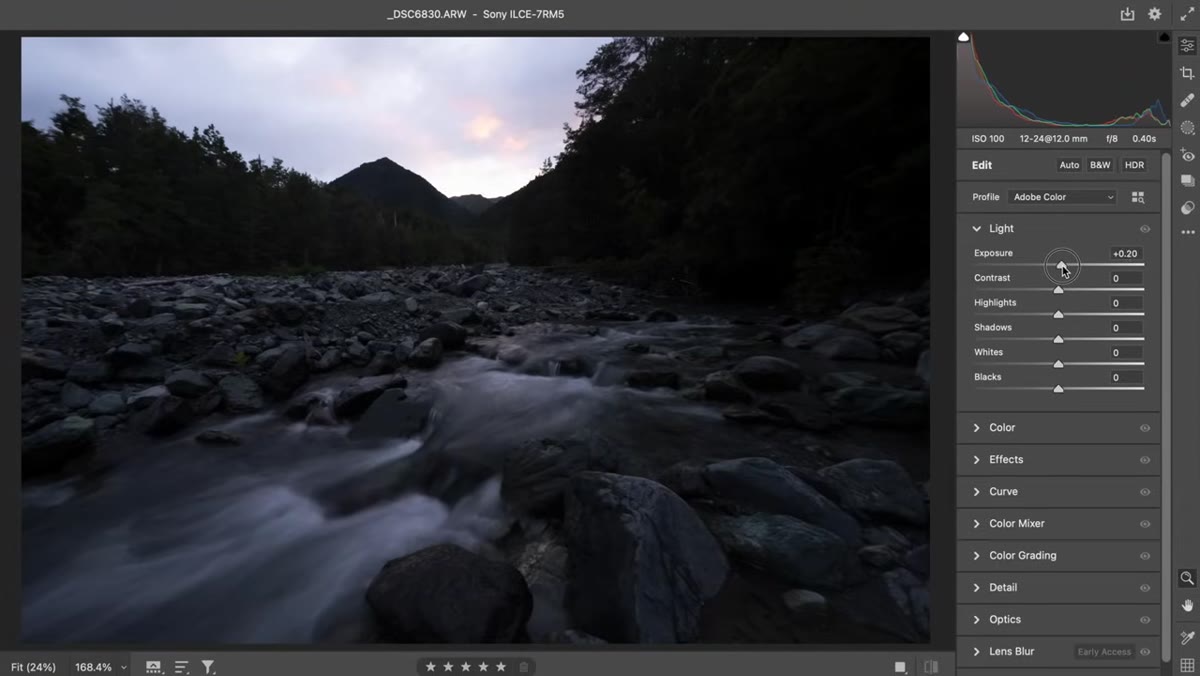 Exposure slider being increased to lift the entire tonal range
The instinct is to grab Shadows and drag it up because that’s the area that needs help. Patino’s advice is to reach for the Exposure slider first. Exposure lifts every tone in the file simultaneously, which preserves the relative relationships between tones rather than stretching just one part of the range. The image starts to feel more like what you saw in the field rather than a composite of two separate brightness zones.
Exposure slider being increased to lift the entire tonal range
The instinct is to grab Shadows and drag it up because that’s the area that needs help. Patino’s advice is to reach for the Exposure slider first. Exposure lifts every tone in the file simultaneously, which preserves the relative relationships between tones rather than stretching just one part of the range. The image starts to feel more like what you saw in the field rather than a composite of two separate brightness zones.
Bring Exposure up until the midtones feel natural. You’re going to overbrighten the sky in the process, and that’s fine. You’ll deal with the sky separately. This order of operations matters because it gives you a more honest foundation to work from before any targeted adjustments come in.
Step 3: Bring the Sky Back Down With a Local Brush Adjustment
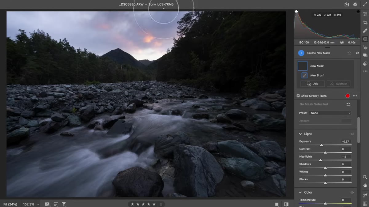 Adjustment brush darkening the sky while leaving the foreground untouched
Once your overall exposure feels close, the sky will likely be too bright. Rather than pulling the global Highlights slider all the way down and flattening the entire image, Patino uses the Adjustment Brush (press K in Adobe Camera Raw or use the Masking tools in Lightroom) to bring Exposure down selectively in the sky. Paint across the sky area using the edge of the brush near the treeline so you get a soft, gradual transition rather than a hard line where the darkening begins.
Adjustment brush darkening the sky while leaving the foreground untouched
Once your overall exposure feels close, the sky will likely be too bright. Rather than pulling the global Highlights slider all the way down and flattening the entire image, Patino uses the Adjustment Brush (press K in Adobe Camera Raw or use the Masking tools in Lightroom) to bring Exposure down selectively in the sky. Paint across the sky area using the edge of the brush near the treeline so you get a soft, gradual transition rather than a hard line where the darkening begins.
The goal here is a balanced histogram, not a perfectly even one. The sky should retain its luminosity and warmth. You’re not trying to make it the same brightness as the foreground. You’re just pulling it back from the clipping point so the color and detail are intact and the scene reads as believable.
Step 4: Selectively Lift Shadows in the Midground, Not the Foreground
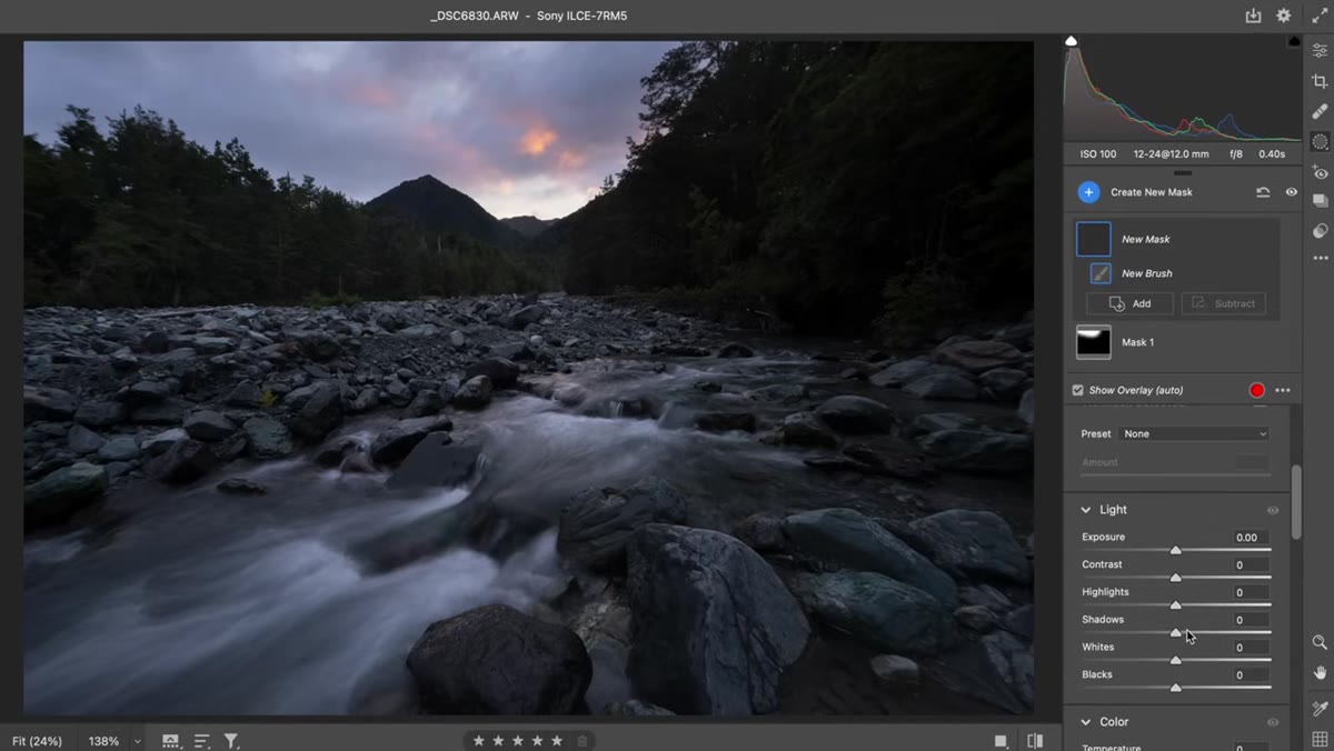 Brush lifting shadow detail in the middle distance between trees and sky
Here’s where I see a lot of photographers make the second major error. They brighten the shadows in the foreground, which kills the sense of depth and grounding that makes a landscape feel three-dimensional. Patino is specific about this: the foreground is supposed to be darker. It anchors the image. The natural phenomenon of atmospheric haze means that tones progressively lighten as they recede into the distance. Reproduce that, and your image will feel like a place rather than a flat picture.
Brush lifting shadow detail in the middle distance between trees and sky
Here’s where I see a lot of photographers make the second major error. They brighten the shadows in the foreground, which kills the sense of depth and grounding that makes a landscape feel three-dimensional. Patino is specific about this: the foreground is supposed to be darker. It anchors the image. The natural phenomenon of atmospheric haze means that tones progressively lighten as they recede into the distance. Reproduce that, and your image will feel like a place rather than a flat picture.
Use the Adjustment Brush to gently lift Shadows and Blacks in the middle distance only. This brings out detail in the areas where the eye naturally travels through the frame without flattening the base of the image. Keep the adjustments subtle. A few points of shadow recovery in the right zone will do more than a heavy-handed global lift.
Step 5: Handle Contrast With a Surgeon’s Touch
 Global contrast slider pushed high, showing blown highlights and heavy saturation
Patino’s note on contrast is one of the most important things in the tutorial. The global Contrast slider in Lightroom and Camera Raw is seductive because it makes images look punchy almost immediately. But what it’s actually doing is pushing your darks darker and your brights brighter simultaneously, which often means you’re re-clipping highlights you just recovered and adding artificial color saturation to the shadows.
Global contrast slider pushed high, showing blown highlights and heavy saturation
Patino’s note on contrast is one of the most important things in the tutorial. The global Contrast slider in Lightroom and Camera Raw is seductive because it makes images look punchy almost immediately. But what it’s actually doing is pushing your darks darker and your brights brighter simultaneously, which often means you’re re-clipping highlights you just recovered and adding artificial color saturation to the shadows.
The better approach is to use Texture, Clarity, and the Tone Curve to shape contrast more precisely. Texture adds midtone definition without blowing out bright areas. Clarity adds edge contrast. The Tone Curve lets you build contrast into the specific tonal range where your image actually lives. For a sunrise or sunset scene, you typically want that contrast living in the midtones and lower highlights, not across the full range.
A Note From My Own Workflow
I’d add one thing Patino doesn’t get into in this segment, which is the danger of editing on a screen that isn’t calibrated. I used to wonder why prints from my best files looked flat or too saturated. The images looked great on my laptop. The problem was my laptop. A calibrated monitor with the right brightness for your editing environment changes everything. I set mine to around 100 to 120 nits for daytime editing and dimmer for evening sessions. If your screen is too bright, you’ll underexpose your edits and the prints suffer. If it’s too dim, you’ll push brightness too far. The technical work Patino describes only holds up if what you’re seeing on screen is accurate.
The single most important idea from this tutorial is one I’ve been telling workshop students for years: nature doesn’t do full dynamic range recovery. Shadows fall off. Highlights glow. Your job as an editor is to honor the physics of light that were present in the scene, not to democratize every tone in the file until nothing has weight. When your edits feel like they’re fighting the image, that’s usually the signal to pull back rather than push harder.
Watch the full tutorial on YouTube to see Patino demonstrate every one of these adjustments in real time. The visual reference is worth the twenty minutes.
Comments
Leave a Comment