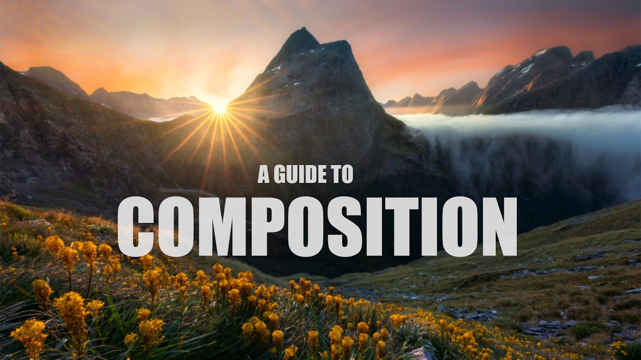
There’s a particular kind of paralysis that sets in when you’re standing in a beautiful place with a camera in your hands. The light is doing something extraordinary, the scene is alive, and you have absolutely no idea where to point the lens. After two decades of doing this work, I still feel it. The difference now is that I’ve built a repeatable process for working through it, and that process maps almost perfectly onto what William Patino demonstrates in his forest composition tutorial. Watch the full tutorial on YouTube before or after reading this breakdown. It’s short, it’s shot in the field in real light, and it’s worth your time.
What Patino does well is show composition as a sequence of decisions rather than a single instinct. He’s standing in a forest, light filtering through the canopy, and he works through the scene methodically. Subject first. Structure second. Light third. Focal length last. That order matters more than most photographers realize, and it’s exactly what I’d teach in one of my own workshops. The trap most beginners fall into is reaching for the camera before they’ve answered the first question.
The other thing worth noting before we get into the steps: composition has a subjective layer that no tutorial can fully dissolve. Patino acknowledges this honestly. What he’s offering, and what I’m expanding on here, is a framework. A set of questions to ask yourself in the field. What you do with the answers is yours.
Step 1: Identify Your Main Subject Before You Touch the Camera
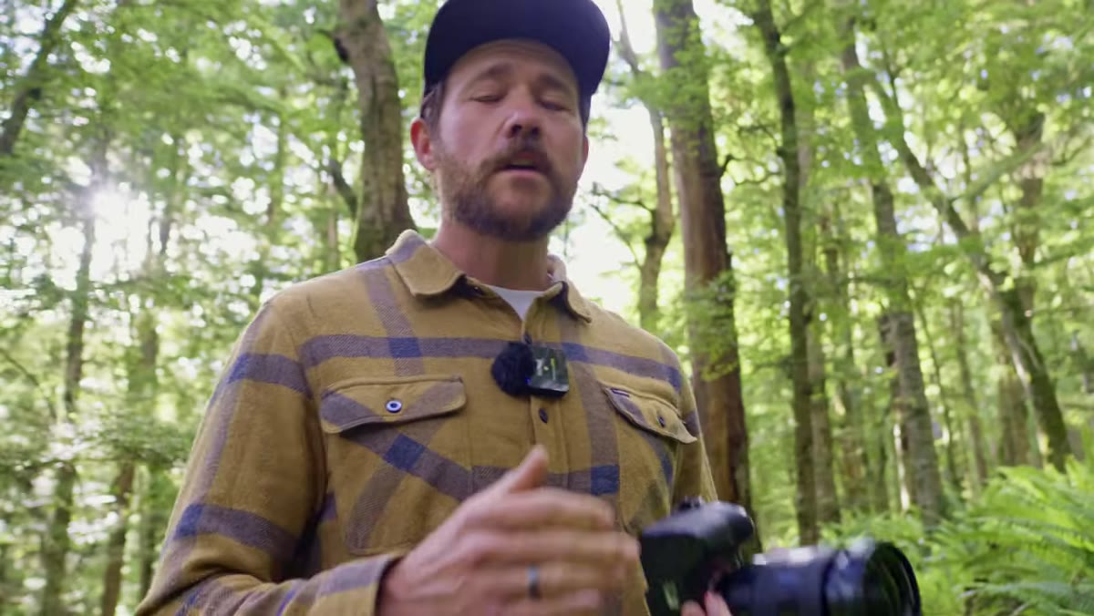 Patino pointing toward distant fern tree in forest
Before you raise the camera to your eye, stop and ask yourself what actually matters in this scene. Not what’s pretty. Not what’s everywhere. What is the one element that made you stop walking? In Patino’s example, it’s a fern tree set deeper in the forest, visually distinct from everything surrounding it. It has presence. It pulls the eye. He commits to it immediately.
Patino pointing toward distant fern tree in forest
Before you raise the camera to your eye, stop and ask yourself what actually matters in this scene. Not what’s pretty. Not what’s everywhere. What is the one element that made you stop walking? In Patino’s example, it’s a fern tree set deeper in the forest, visually distinct from everything surrounding it. It has presence. It pulls the eye. He commits to it immediately.
This sounds simple, but most missed compositions happen right here. Photographers react to the whole scene instead of identifying the anchor. When I’m working a new location, I’ll sometimes spend ten or fifteen minutes just walking and looking before I ever unpack a bag. The subject reveals itself if you give it space to. Once you know what you’re building toward, every other decision has a reference point.
Step 2: Build Depth With Deliberate Layers
 Two foreground trees framing the distant subject
A flat image is the enemy of immersion. Patino’s antidote is layering, placing visual elements at progressive distances from the camera so the eye travels through the frame rather than landing on it. In his forest scene, two trees in the near-middle distance create a natural frame around the more distant fern tree. Foreground, midground, background. Three distinct planes.
Two foreground trees framing the distant subject
A flat image is the enemy of immersion. Patino’s antidote is layering, placing visual elements at progressive distances from the camera so the eye travels through the frame rather than landing on it. In his forest scene, two trees in the near-middle distance create a natural frame around the more distant fern tree. Foreground, midground, background. Three distinct planes.
When you’re scouting, look for elements that can occupy each zone. In forest photography this often happens naturally with understory plants, mid-canopy trunks, and a feature tree or clearing in the distance. In open landscapes you might use rocks or grasses as foreground mass, a ridgeline as your midground, and peaks or sky behind that. The goal is to give the eye a journey. The viewer should feel like they could step into the frame and walk toward something.
Step 3: Use Balance to Keep the Eye Inside the Frame
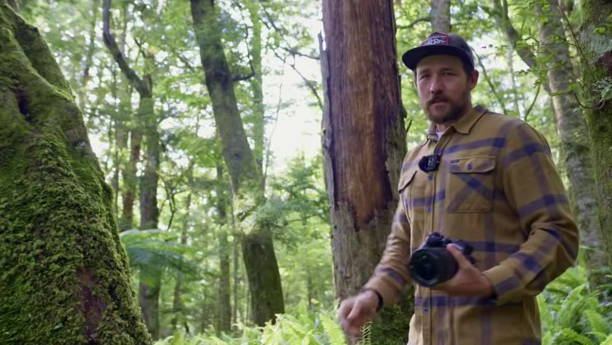 Wide framing showing even spacing between two trees and subject
Balance in composition isn’t about symmetry. It’s about preventing the eye from being thrown out of the frame by visual weight that accumulates too heavily on one side. Patino demonstrates this directly by shifting his framing left until the image becomes unbalanced. Suddenly one side of the frame is crowded with detail and the other is thin. The tension is uncomfortable. He recenters, and the image settles.
Wide framing showing even spacing between two trees and subject
Balance in composition isn’t about symmetry. It’s about preventing the eye from being thrown out of the frame by visual weight that accumulates too heavily on one side. Patino demonstrates this directly by shifting his framing left until the image becomes unbalanced. Suddenly one side of the frame is crowded with detail and the other is thin. The tension is uncomfortable. He recenters, and the image settles.
In practice, look at the edges of your composition as carefully as the center. Even spacing between your structural elements, whether those are trees, rocks, or gaps in a treeline, tells the viewer’s eye where to rest and where to travel. If something in the frame is fighting for attention and losing, it becomes a distraction. Either include it properly or exclude it entirely.
Step 4: Let Light Do the Work of Leading
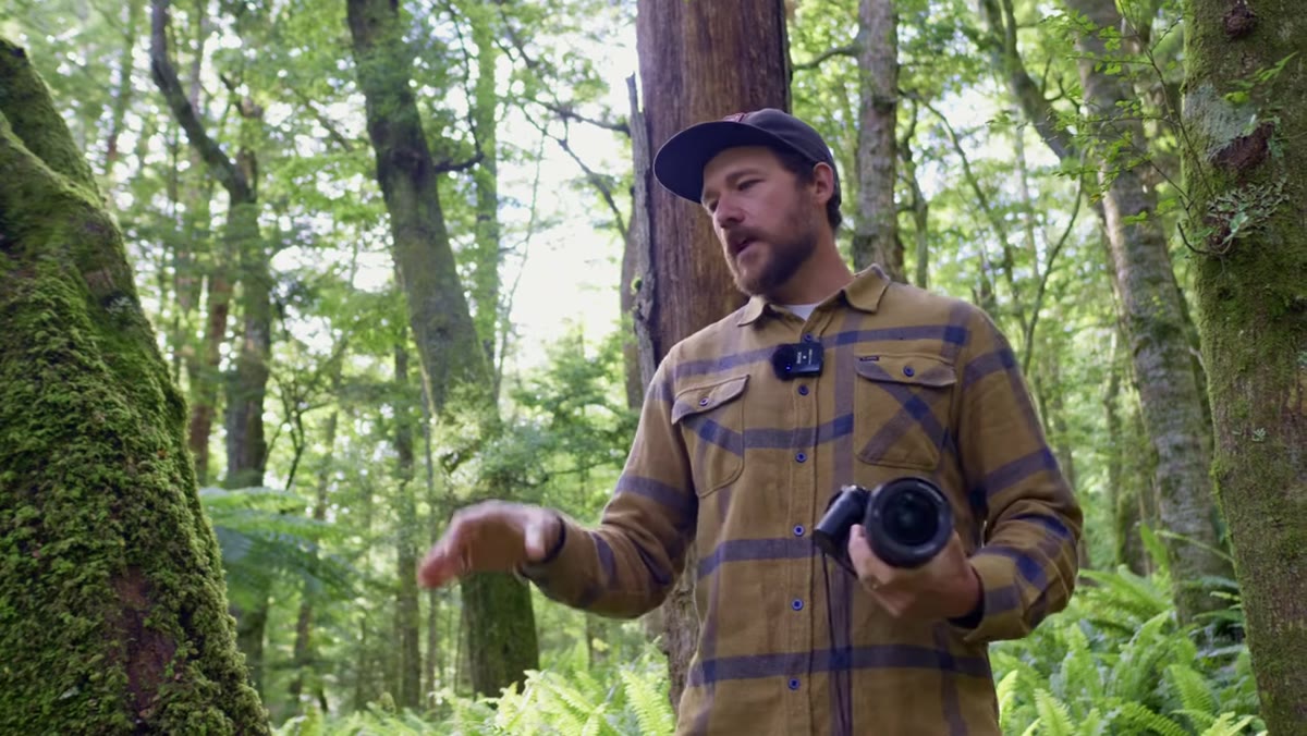 Bright light visible through trees illuminating the background subject
Patino makes a point that I’d underline twice: shade is not the absence of light, it’s a tool for directing attention toward the light. In his forest scene, the foreground trees are in shadow. The fern tree in the background is touched by open light. That contrast is doing compositional work. It’s pulling the viewer through the darker foreground toward the brightness behind it.
Bright light visible through trees illuminating the background subject
Patino makes a point that I’d underline twice: shade is not the absence of light, it’s a tool for directing attention toward the light. In his forest scene, the foreground trees are in shadow. The fern tree in the background is touched by open light. That contrast is doing compositional work. It’s pulling the viewer through the darker foreground toward the brightness behind it.
This is why golden hour and overcast light work differently in forests. Overcast light flattens everything and removes that shade-to-light pathway. Direct early morning or late afternoon light creates pools of illumination you can position your subject inside. When I’m reading a scene, I ask myself where the light is landing, and then I ask whether I can use the darker areas to frame it. If the answer is yes, I’m already most of the way to a composition.
Step 5: Choose Focal Length to Give Your Subject Its Due
 Patino adjusting focal length from 16mm through 28mm on camera
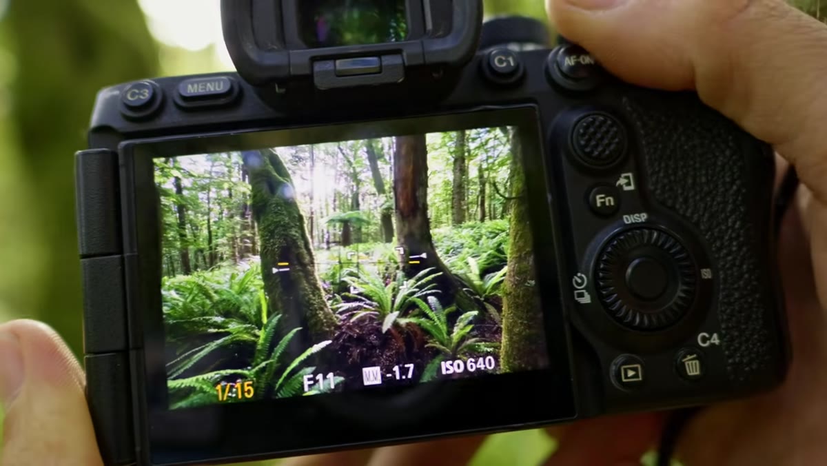
This step surprises people because focal length is usually discussed in terms of physics. Wide angle for sweeping scenes, telephoto for compression. What Patino is talking about is simpler and more useful: does your main subject have enough real estate in the frame to actually matter? At 16mm, his fern tree nearly disappears. At 28mm, it holds its weight.
Patino adjusting focal length from 16mm through 28mm on camera
This step surprises people because focal length is usually discussed in terms of physics. Wide angle for sweeping scenes, telephoto for compression. What Patino is talking about is simpler and more useful: does your main subject have enough real estate in the frame to actually matter? At 16mm, his fern tree nearly disappears. At 28mm, it holds its weight.
He shoots multiple focal lengths, 24mm, 28mm, 35mm, to give himself options in post. I do the same thing, especially when I’m uncertain about the final crop. The wider shots give you more environmental context. The tighter shots give your subject authority. In a finished series, you might use both. But start by asking what focal length makes the subject feel inevitable rather than incidental, and work outward from there.
A Note From 20 Years in the Field
The framework Patino teaches here is sound, and I’d stack it against any composition course I’ve taken or taught. But there’s one thing I’d add from my own experience: stay longer than you think you need to. The initial composition you find is usually just the handshake. The actual image comes when you commit to the scene long enough for the light to shift, for an element to change, for your own eye to settle and sharpen.
I’ve stood in places for two hours waiting for a shaft of light to move three feet to the left. It sounds excessive until that moment arrives and the whole image locks into place. The forest Patino is working in has a dozen compositions living inside it at any given time. The one he finds is excellent. The one he might have found an hour later could have been completely different.
The single most transferable idea from this tutorial is to lead with subject, not setting. Know what you’re building toward before you build. Everything else, layering, balance, light, focal length, is in service of that one decision.
Watch the full tutorial on YouTube and watch how Patino moves through the scene in real time. Reading about composition helps. Watching someone make real decisions in real light is a different kind of lesson.
Comments (1)
Printing this out and pinning it next to my monitor. That good.
Leave a Comment