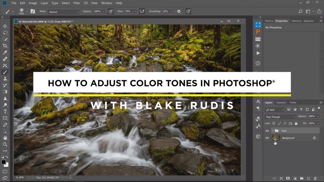
There’s a moment every landscape photographer knows. You’ve nailed the composition, the light was exactly what you drove four hours into the dark to find, and then you open the file and the colors just… sit there. Technically present, emotionally absent. The reds in the canyon wall look muddy. The warm light that made you catch your breath at the trailhead looks flat on screen. I’ve spent twenty years chasing that gap between what my eyes registered and what my sensor recorded, and I still find myself hunting for better tools to close it.
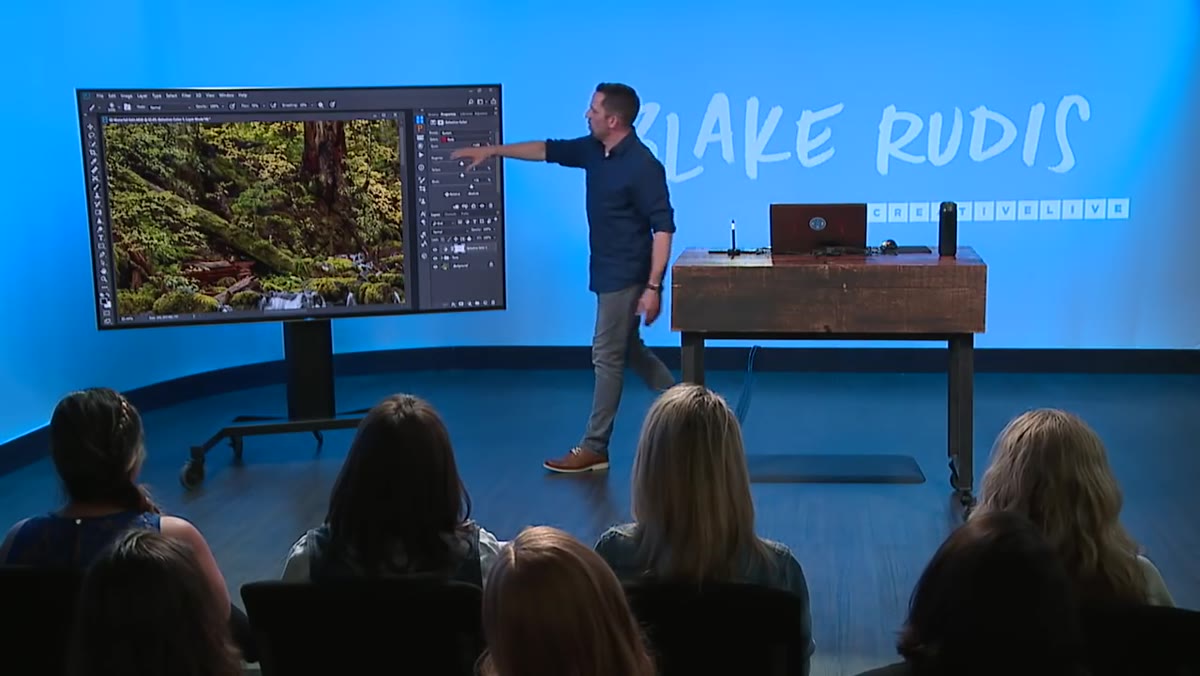
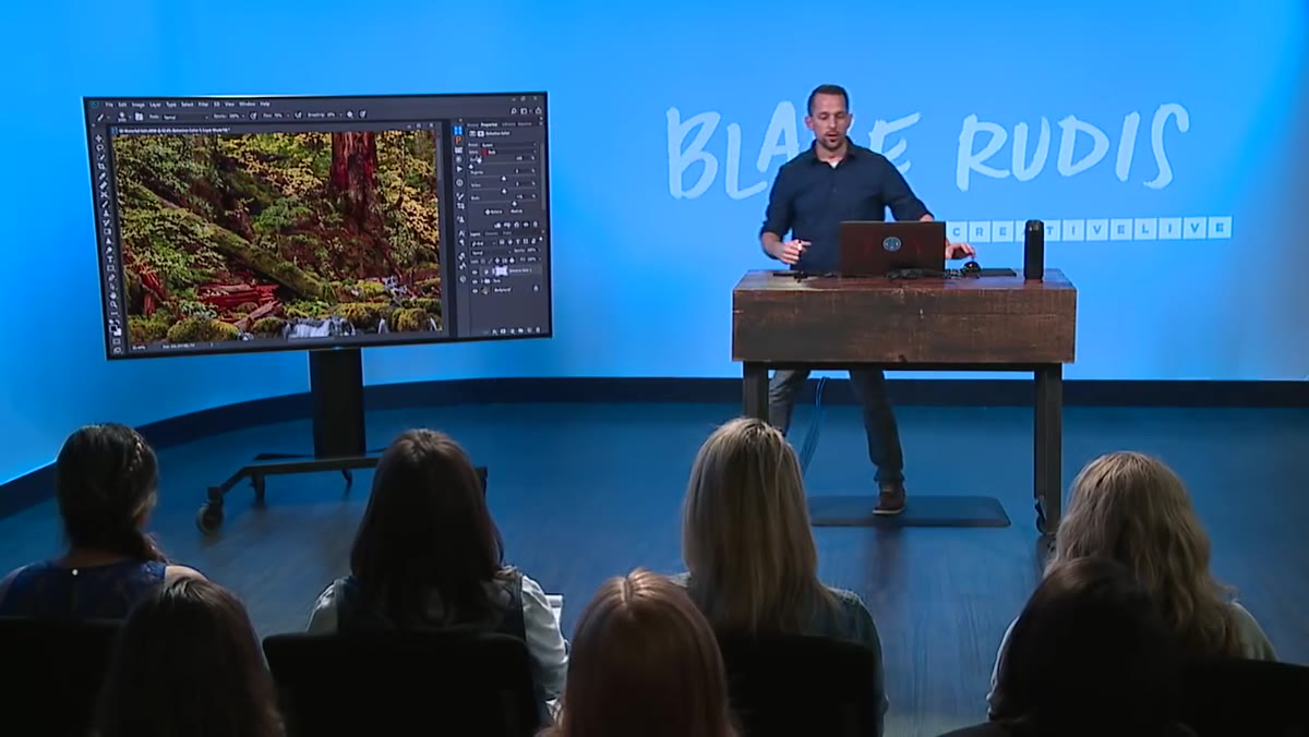
Most of us default to the HSL panel in Lightroom or Adobe Camera Raw when we want to push colors around. It’s fast, it’s familiar, and it gets you most of the way there most of the time. But “most of the way” isn’t where I want to live. In this CreativeLive tutorial, the instructor walks through Photoshop’s Selective Color adjustment layer, and the explanation of why it works differently from HSL finally clicked something into place for me. Watch the full tutorial on YouTube if you want to follow along with a live demonstration. Below, I’ve broken it down into steps you can follow in your own workspace.
Step 1: Add a Selective Color Adjustment Layer
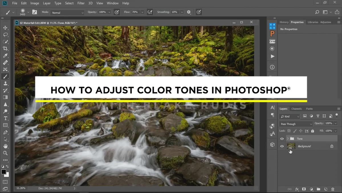 Photoshop color adjustment options panel open
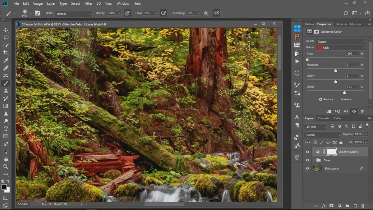
In Photoshop, go to your Adjustments panel and choose Selective Color. This creates a non-destructive layer you can dial back or mask at any time. The panel gives you a dropdown at the top where you choose which color family you want to affect. Start with Reds, since that’s where the tutorial focuses and it’s also one of the most common problem areas in warm-light landscape work.
Photoshop color adjustment options panel open
In Photoshop, go to your Adjustments panel and choose Selective Color. This creates a non-destructive layer you can dial back or mask at any time. The panel gives you a dropdown at the top where you choose which color family you want to affect. Start with Reds, since that’s where the tutorial focuses and it’s also one of the most common problem areas in warm-light landscape work.
What makes this tool immediately different from anything in Lightroom is that you’re not moving a color around the wheel. You’re working with the ink-like components that make up a color: cyan, magenta, yellow, and black. Think of it less like painting and more like mixing pigment.
Step 2: Use the Black Slider First to Find What’s There
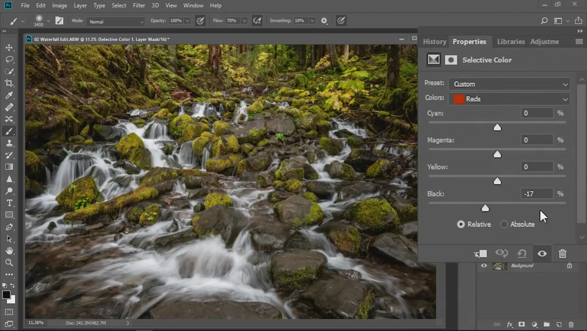 Black slider being moved to reveal red tones in image
Before touching cyan or magenta, drag the Black slider back and forth aggressively. This is a diagnostic move, not a final adjustment. Watch the image as you do it. The areas that shift visibly are the areas that contain the color you’ve selected in the dropdown. In the tutorial, doing this with Reds selected immediately reveals which parts of the landscape actually hold red tones, which isn’t always obvious at a glance.
Black slider being moved to reveal red tones in image
Before touching cyan or magenta, drag the Black slider back and forth aggressively. This is a diagnostic move, not a final adjustment. Watch the image as you do it. The areas that shift visibly are the areas that contain the color you’ve selected in the dropdown. In the tutorial, doing this with Reds selected immediately reveals which parts of the landscape actually hold red tones, which isn’t always obvious at a glance.
Pulling the Black slider toward positive values makes those reds darker and richer. Pulling it negative lightens and brightens them. Once you’ve identified where your reds live, reset the slider to zero and start making intentional adjustments.
Step 3: Understand the Cyan-Red Relationship Before Moving Anything
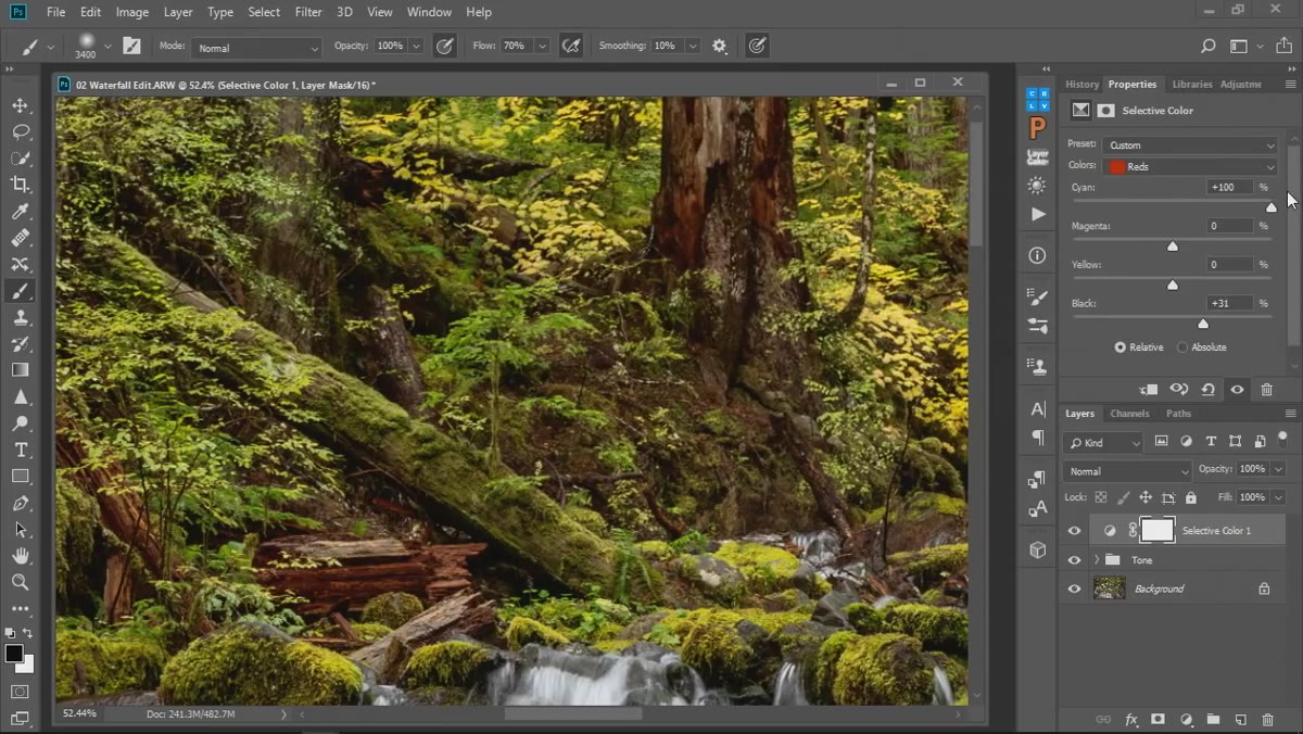 Cyan slider adjusted showing reduction in red saturation
This is where the tutorial earns its keep. The instructor explains that red, in the CMYK model, is defined partly by the absence of cyan. Adding cyan to the reds doesn’t turn those areas teal. It just reduces how much red can express itself, because you’re adding back the complement that was holding it in check. Remove cyan, and the red becomes more saturated, more itself, because you’ve taken away the thing that was diluting it.
Cyan slider adjusted showing reduction in red saturation
This is where the tutorial earns its keep. The instructor explains that red, in the CMYK model, is defined partly by the absence of cyan. Adding cyan to the reds doesn’t turn those areas teal. It just reduces how much red can express itself, because you’re adding back the complement that was holding it in check. Remove cyan, and the red becomes more saturated, more itself, because you’ve taken away the thing that was diluting it.
The analogy used is darkness and light: darkness isn’t a thing, it’s the absence of light. Red works the same way in this model. Once that lands, the whole panel starts making intuitive sense. You’re not adding colors so much as you’re adjusting what’s being suppressed.
Step 4: Adjust Cyan to Saturate or Neutralize Your Reds
 Cyan slider pulled negative, reds becoming more vivid
With that understanding in hand, pull the Cyan slider left (toward negative values) to intensify your reds. The reds in the image will deepen and become more vivid without changing their fundamental character. Push it right and they’ll cool and soften. This gives you a level of control that Lightroom’s Saturation slider inside HSL can’t match, because you’re not just turning up the volume on the whole color. You’re adjusting one specific dimension of it.
Cyan slider pulled negative, reds becoming more vivid
With that understanding in hand, pull the Cyan slider left (toward negative values) to intensify your reds. The reds in the image will deepen and become more vivid without changing their fundamental character. Push it right and they’ll cool and soften. This gives you a level of control that Lightroom’s Saturation slider inside HSL can’t match, because you’re not just turning up the volume on the whole color. You’re adjusting one specific dimension of it.
The key is restraint. A small move here has a bigger visual impact than you’d expect. I usually work in increments of 5 to 10 and zoom in on the most critical area of the frame before committing to a value.
Step 5: Use Yellow to Warm Reds Without Triggering the HDR Effect
 Yellow slider boosted slightly within Reds selection
If you want your reds to read warmer, reach for the Yellow slider, not the magenta or the hue adjustment in Lightroom. The tutorial makes a pointed comment here: adding blue into reds creates that over-processed, heavy HDR look that defined a certain era of landscape photography nobody wants to revisit. I know exactly what he means. I’ve produced my share of images that looked like oil paintings left in the rain.
Yellow slider boosted slightly within Reds selection
If you want your reds to read warmer, reach for the Yellow slider, not the magenta or the hue adjustment in Lightroom. The tutorial makes a pointed comment here: adding blue into reds creates that over-processed, heavy HDR look that defined a certain era of landscape photography nobody wants to revisit. I know exactly what he means. I’ve produced my share of images that looked like oil paintings left in the rain.
Boosting yellow within the Reds selection nudges those warm tones toward amber and gold, which is usually where you want a sunrise or canyon wall to land. It stays photographic. It stays honest to the light.
Step 6: Repeat the Process for Every Color Family That Matters in the Image
 Color dropdown showing full list of selectable color ranges
Switch the dropdown to Yellows, then Greens, then work through whatever color families matter to your specific image. Each one has its own set of cyan, magenta, yellow, and black sliders that affect only pixels the panel identifies as belonging to that family. A green hillside and a red rock formation get treated completely independently, with no bleed between them.
Color dropdown showing full list of selectable color ranges
Switch the dropdown to Yellows, then Greens, then work through whatever color families matter to your specific image. Each one has its own set of cyan, magenta, yellow, and black sliders that affect only pixels the panel identifies as belonging to that family. A green hillside and a red rock formation get treated completely independently, with no bleed between them.
The instructor points out that this is precisely where Selective Color outpaces the HSL panel in Lightroom, which only lets you shift hue in fixed 30-degree increments to keep you from making catastrophic mistakes. Selective Color doesn’t have a safety net like that, which means it demands more care but rewards more precision.
What I’d Add from My Own Practice
After a shoot in eastern Oregon last fall, I started pairing Selective Color adjustments with luminosity masks. The Selective Color tool treats all reds equally regardless of their brightness. But in a scene with both deeply shadowed red rock and brightly lit red foliage, I usually don’t want to treat them the same way. Running a luminosity mask on the adjustment layer lets me confine my color tweaks to the highlights, the shadows, or the midtones within that color family. It’s an extra step, but for print work where I need the colors to hold up at 30 inches, that specificity matters.
Also: visit this tool on a calibrated monitor with soft proofing active if you’re printing. What looks right on screen can shift more than you’d expect in the reds and yellows when paper profiles enter the picture.
The single most important idea in this tutorial is the CMYK logic behind why these sliders behave the way they do. Once you stop thinking about color as something you add and start thinking about it as something you reveal by removing its complement, the whole panel becomes readable in a way it never was before. That shift in mental model is worth more than any specific slider value.
Watch the full tutorial on YouTube to see the adjustments demonstrated live on an actual landscape image. It’s worth watching the cyan explanation twice.
Comments
Leave a Comment