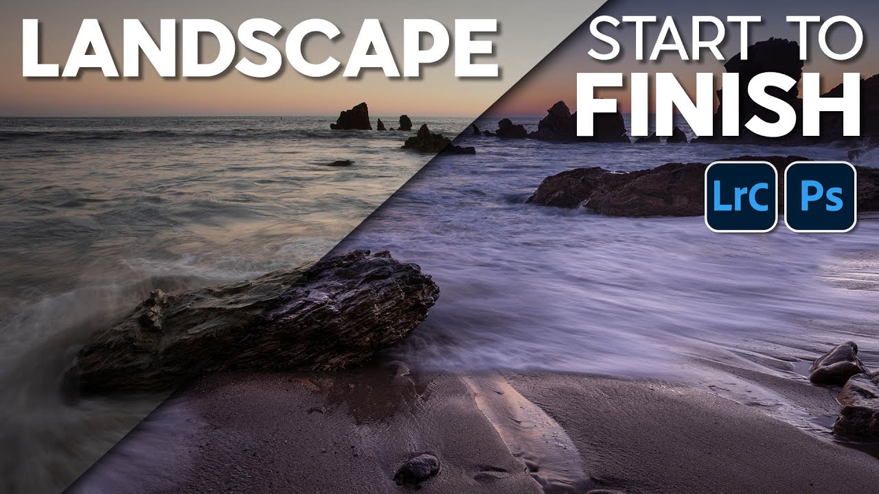
There is a particular kind of frustration that comes from standing on a California coastal bluff at golden hour, watching the light do something genuinely spectacular, and then sitting down at your desk the next morning to find that your raw file looks like a faded postcard. The camera captured the exposure. It did not capture the feeling. Closing that gap is almost entirely an editing problem, and it’s one I’ve spent twenty years working through, sometimes well and sometimes badly.
Watch the full tutorial on YouTube
In this Matt Kloskowski tutorial, he takes a Sony raw file shot on the Southern California coast and walks through a complete start-to-finish edit in Lightroom Classic, with a note that Photoshop’s Camera Raw follows the exact same logic. The original is a quarter-second exposure, ISO 100, f/16 – a technically solid coastal shot with blown-out sky, underexposed foreground rocks, and a tilted horizon. What he builds from it is moody, blue-shifted, and distinctly intentional. The workflow is clean enough to transplant onto almost any landscape edit, which is why I keep coming back to it.
Step 1: Straighten the Horizon Before Anything Else
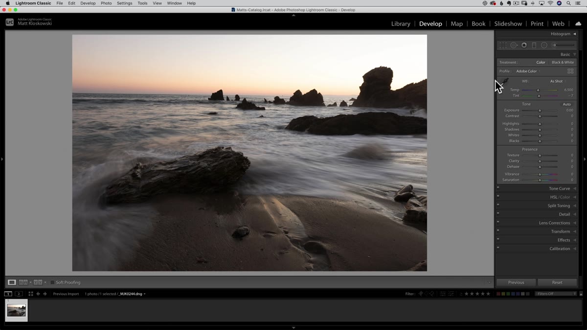 Matt opening the crop tool to fix a tilted horizon line
A crooked horizon is the kind of thing you stop noticing after staring at an image for twenty minutes, which is exactly why it destroys your photo. Matt handles this immediately, before touching a single tone slider. Inside the crop tool, he uses the Straighten Angle option – you click and drag along the horizon itself, and Lightroom rotates the canvas to match. It takes about five seconds and it resets your perception of the whole frame. I make this my own first move on every coastal or seascape shot because the water surface is an unforgiving reference line. If it tilts, nothing else you do will feel right.
Matt opening the crop tool to fix a tilted horizon line
A crooked horizon is the kind of thing you stop noticing after staring at an image for twenty minutes, which is exactly why it destroys your photo. Matt handles this immediately, before touching a single tone slider. Inside the crop tool, he uses the Straighten Angle option – you click and drag along the horizon itself, and Lightroom rotates the canvas to match. It takes about five seconds and it resets your perception of the whole frame. I make this my own first move on every coastal or seascape shot because the water surface is an unforgiving reference line. If it tilts, nothing else you do will feel right.
Beyond the horizon fix, he leaves the composition mostly alone, noting that any additional cropping depends entirely on your intended output size. That’s worth taking seriously. Don’t crop speculatively. Know where the image is going.
Step 2: Pull Global Exposure Down and Reclaim the Highlights
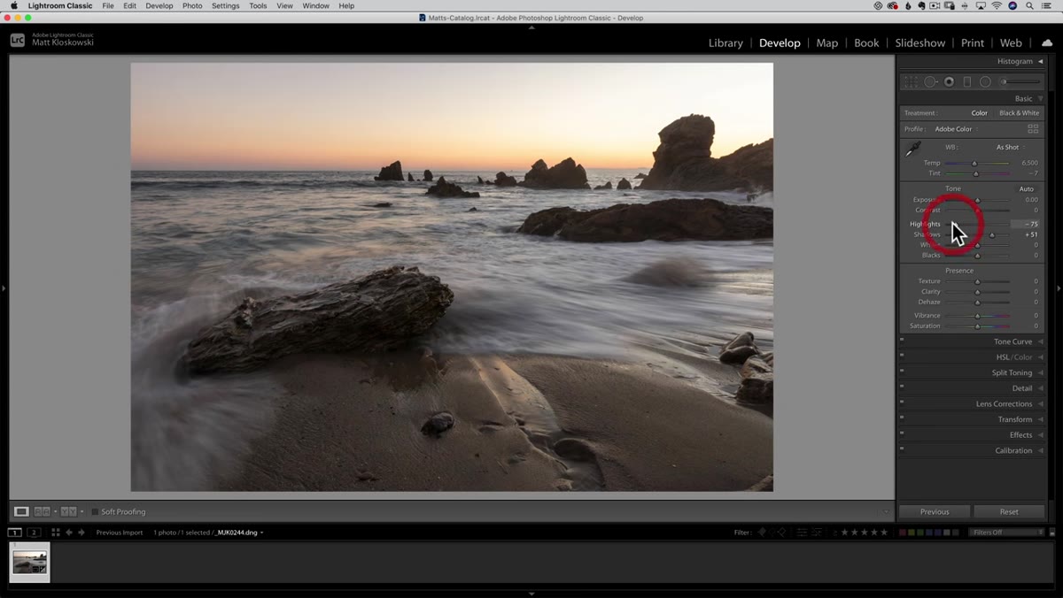 Exposure and highlights sliders being reduced in the Basic panel
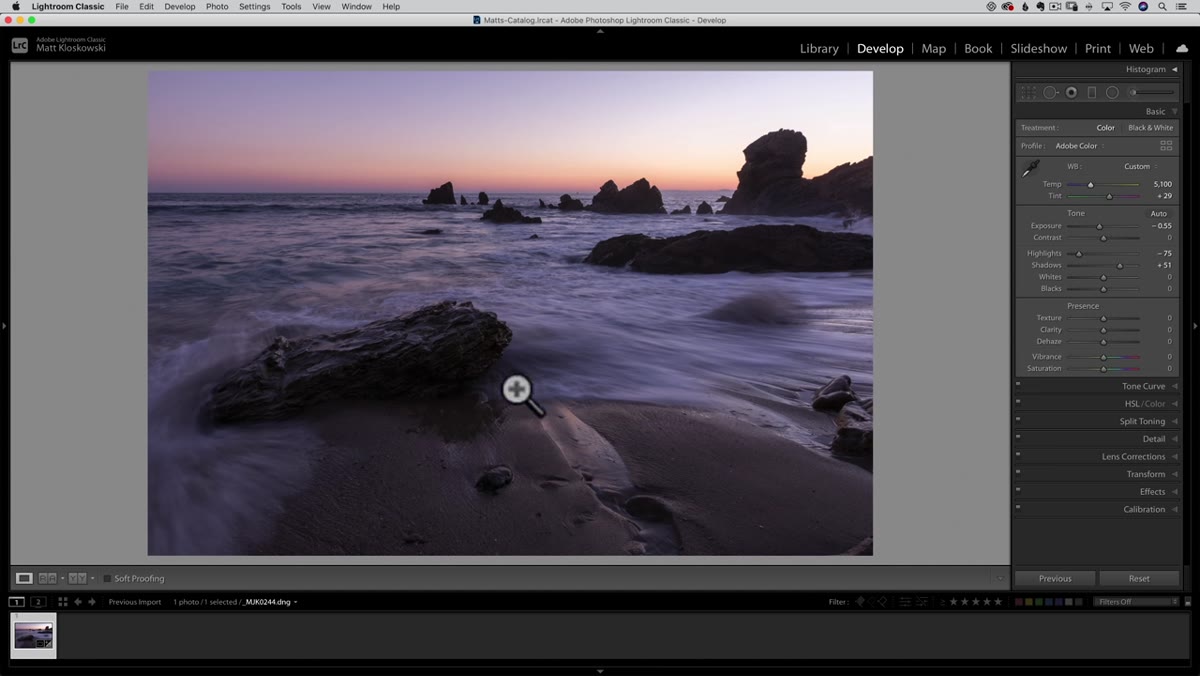
With the crop done, Matt moves into global tone adjustments in the Basic panel. His approach here is one I’ve seen work consistently on backlit coastal scenes: pull the overall exposure down first, then drag highlights further left to recover sky detail. The logic is that you are establishing a tonal ceiling. You want the brightest parts of the image manageable before you start lifting shadows or doing any selective work.
Exposure and highlights sliders being reduced in the Basic panel
With the crop done, Matt moves into global tone adjustments in the Basic panel. His approach here is one I’ve seen work consistently on backlit coastal scenes: pull the overall exposure down first, then drag highlights further left to recover sky detail. The logic is that you are establishing a tonal ceiling. You want the brightest parts of the image manageable before you start lifting shadows or doing any selective work.
He’s deliberate about not trying to fix everything at the global level. He’s lowering exposure knowing that he will bring specific areas back up later with selective adjustments. This sequencing matters. If you try to balance foreground and sky using only the global sliders, you almost always end up with a muddy middle ground that satisfies neither. Set the global tone conservatively, then fix the local problems locally.
Step 3: Push the White Balance Toward a Creative Color Grade
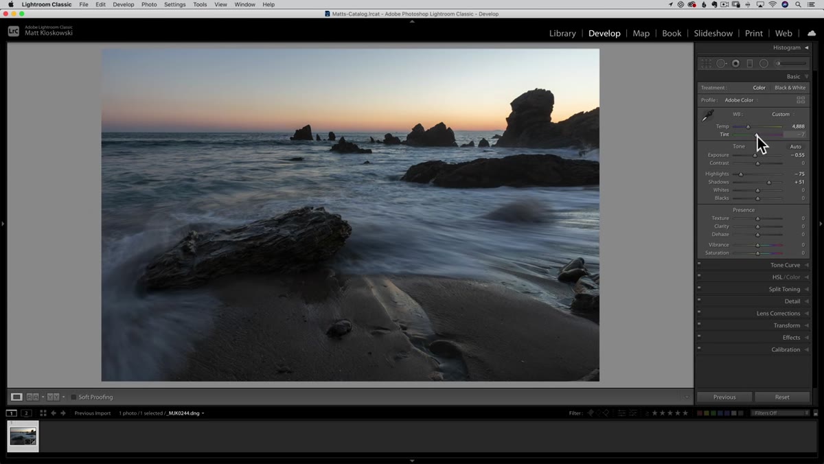 White balance sliders shifted toward blue and magenta in the Basic panel
This is where Matt takes what he calls a creative liberty, and I respect the honesty of naming it that. He shifts the white balance toward blue and pulls the tint toward magenta to chase a twilight feeling that the original scene had only in suggestion. The result reads as dusk even though the raw file looks more like a neutral late afternoon.
White balance sliders shifted toward blue and magenta in the Basic panel
This is where Matt takes what he calls a creative liberty, and I respect the honesty of naming it that. He shifts the white balance toward blue and pulls the tint toward magenta to chase a twilight feeling that the original scene had only in suggestion. The result reads as dusk even though the raw file looks more like a neutral late afternoon.
For anyone uncomfortable with this kind of move, it helps to think of white balance not as a correction tool but as a mood tool the moment you’re past a technically neutral starting point. On my own coastal work out of Bend, I often shoot in the blue hour before sunrise and still push further cool in post because the camera interprets that pre-dawn color more warmly than my eye does. The sensor and the human eye simply disagree about what blue looks like in low light, and the slider is how you resolve that dispute in your favor.
Step 4: Apply a Graduated Filter to Darken the Sky Selectively
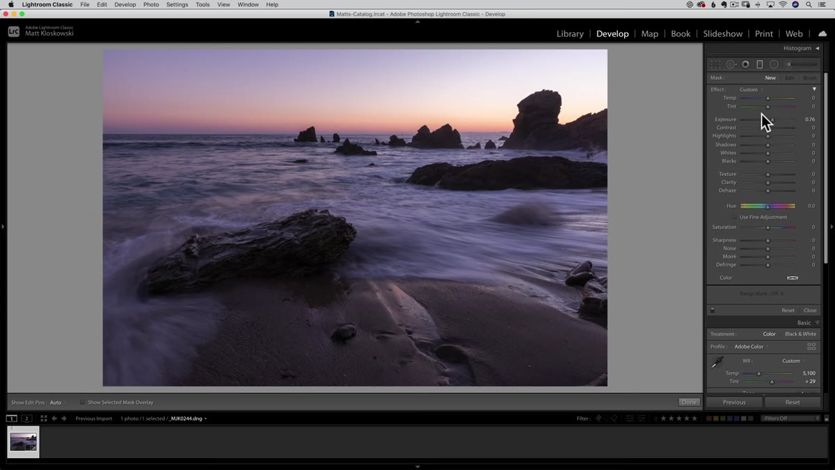 Graduated filter dragged down from top of frame at an angle
Global adjustments only take you so far on a scene with a bright sky and a darker foreground. Matt goes to the Graduated Filter and drags it down from the top of the frame, but he angles it deliberately – the filter is not perfectly horizontal. The reason is that the sun was setting on one side of the frame, making the sky unevenly bright. Rather than accepting that brightness imbalance, he angles the gradient to compensate, bringing down the hot side more than the cooler side.
Graduated filter dragged down from top of frame at an angle
Global adjustments only take you so far on a scene with a bright sky and a darker foreground. Matt goes to the Graduated Filter and drags it down from the top of the frame, but he angles it deliberately – the filter is not perfectly horizontal. The reason is that the sun was setting on one side of the frame, making the sky unevenly bright. Rather than accepting that brightness imbalance, he angles the gradient to compensate, bringing down the hot side more than the cooler side.
Inside the filter, he works with exposure and highlights depending on which one is actually causing the sky to feel heavy. Sometimes it’s the overall luminosity, sometimes it’s just specular bright spots. He checks both and adjusts accordingly. This kind of diagnostic thinking – asking “what exactly is the problem here?” before reaching for a slider – is a habit worth building early.
Step 5: Use Selective Adjustments to Lift the Foreground Rocks
 Selective adjustment being drawn over foreground rock area
The foreground rocks are where the photo earns its texture and its sense of place. Matt uses a separate selective adjustment to bring that area up, targeting the shadows and exposure in the lower portion of the frame. The goal isn’t to make the rocks look bright – it’s to make them readable, to give the viewer’s eye something to land on before traveling back to the sky.
Selective adjustment being drawn over foreground rock area
The foreground rocks are where the photo earns its texture and its sense of place. Matt uses a separate selective adjustment to bring that area up, targeting the shadows and exposure in the lower portion of the frame. The goal isn’t to make the rocks look bright – it’s to make them readable, to give the viewer’s eye something to land on before traveling back to the sky.
On coastal scenes especially, the foreground is your anchor. I’ve seen otherwise excellent images fail because the photographer spent all their energy on a dramatic sky and left the water and rock in a murky limbo. A few minutes with a graduated filter or a brush mask on the lower third can change everything about how an image reads.
A Note from My Own Practice: Don’t Let the Edit Erase the Weather
Matt’s workflow is methodical and transferable, and I use a version of it regularly. The one place I push back, gently, is on the color grade step – not because his approach is wrong, but because it’s easy to let a strong blue shift become a habit that homogenizes your portfolio. I learned this the hard way after a trip where I applied the same cool-magenta grade to thirty images from three different locations and they all looked like they were taken on the same afternoon.
The edit should serve the specific light you were standing in. Some days that means a warm amber grade. Some mornings at Smith Rock, the pre-dawn really is that cold blue and the file needs almost nothing. Let the raw file tell you what direction to push before you reach for a preset or a favorite slider position.
The single most important idea in Matt’s workflow is the sequencing: fix geometry, set global tone conservatively, handle color, then solve the local problems with selective tools. Each step creates the conditions for the next one to work. Try to do it all at once and you end up chasing your own adjustments in circles.
Watch the full tutorial on YouTube and follow along with your own coastal raw file. The specifics of his sliders matter less than the order of operations – internalize that, and you have a framework you can use on any landscape image you bring home.
Comments (4)
I've watched a dozen tutorials on this and yours is the clearest by far.
Bookmarked. Coming back to this one for sure.
This is going in my reference folder. Incredibly useful.
This is going in my reference folder. Incredibly useful.
Leave a Comment