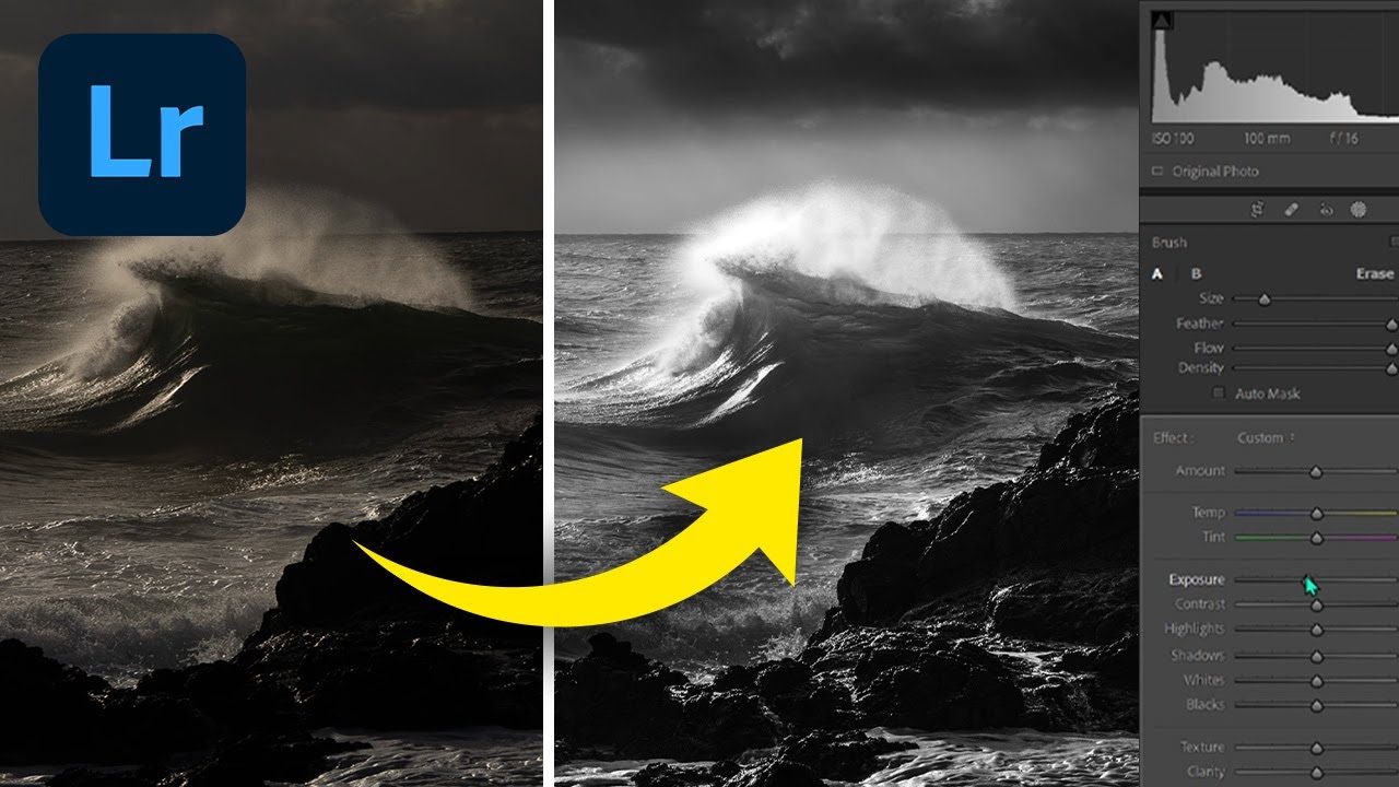
There is a particular kind of morning light that almost defeats you in color. The tones are real, the drama is there, but when you look at your raw file back home, something feels flat. The contrast that punched you in the chest when you were standing ankle-deep in cold water at first light just doesn’t translate. I’ve been making landscape photographs for twenty years and I still run into this problem regularly. Black and white conversion is often the answer, but a lazy conversion strips out the mood along with the color. You end up with grey, not drama.
This is exactly what William Patino’s Lightroom tutorial addresses, and he does it clearly and practically. Watch the full tutorial on YouTube before diving in here, or use this walkthrough alongside it. Patino works from a coastal raw file, waves, storm clouds, wet rocks catching the light, and the kind of scene that either becomes a print worth selling or a file you never open again. The difference is almost entirely in the processing decisions.
What I want to do here is walk through his process step by step, filling in the reasoning behind each move, so you can apply the same thinking to your own images rather than just copying settings.
Step 1: Straighten and Set Your Base Exposure
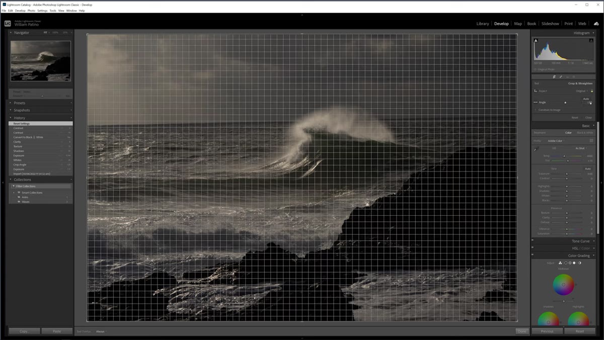 Crop and straighten tool applied to raw landscape file
Before any tonal work, get the geometry right. Patino levels the horizon using Lightroom’s crop tool, and it’s worth pausing here because a tilted horizon in a seascape will distract from everything you do afterward. Use the angle tool inside the crop overlay or just drag the slider until the waterline sits flat.
Crop and straighten tool applied to raw landscape file
Before any tonal work, get the geometry right. Patino levels the horizon using Lightroom’s crop tool, and it’s worth pausing here because a tilted horizon in a seascape will distract from everything you do afterward. Use the angle tool inside the crop overlay or just drag the slider until the waterline sits flat.
From there, he lifts the overall exposure slightly to bring up the midtones and then raises the shadows to open up the foreground. The key restraint here is not pushing shadows too hard. If the foreground gets as bright as the background sky, the eye parks itself in the bottom of the frame and never travels. You want the viewer pulled toward the horizon, toward the wave, toward the light. Keep the foreground lift subtle and plan to refine it with a local adjustment later.
Step 2: Convert to Black and White Using the B&W Panel
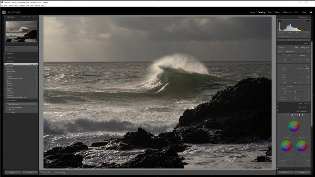 Black and white conversion panel open in Lightroom Develop module
The conversion itself happens in the top right panel of the Develop module, under the Treatment section. Click B&W and Lightroom strips the color information and maps each hue to a grey value. What opens below is the B&W Mix panel, which is where the real control lives.
Black and white conversion panel open in Lightroom Develop module
The conversion itself happens in the top right panel of the Develop module, under the Treatment section. Click B&W and Lightroom strips the color information and maps each hue to a grey value. What opens below is the B&W Mix panel, which is where the real control lives.
Think of this panel as a set of luminosity sliders for the colors that were in your original scene. Anything that contained yellow, orange, or red in the raw file can be brightened or darkened independently. For a coastal or storm scene, blue and aqua sliders control how your water and sky render. Patino doesn’t push these sliders dramatically, and that restraint is right. The conversion itself does most of the work. The mix panel is for refinement, not rescue.
Step 3: Darken the Sky With an Adjustment Brush and Dehaze
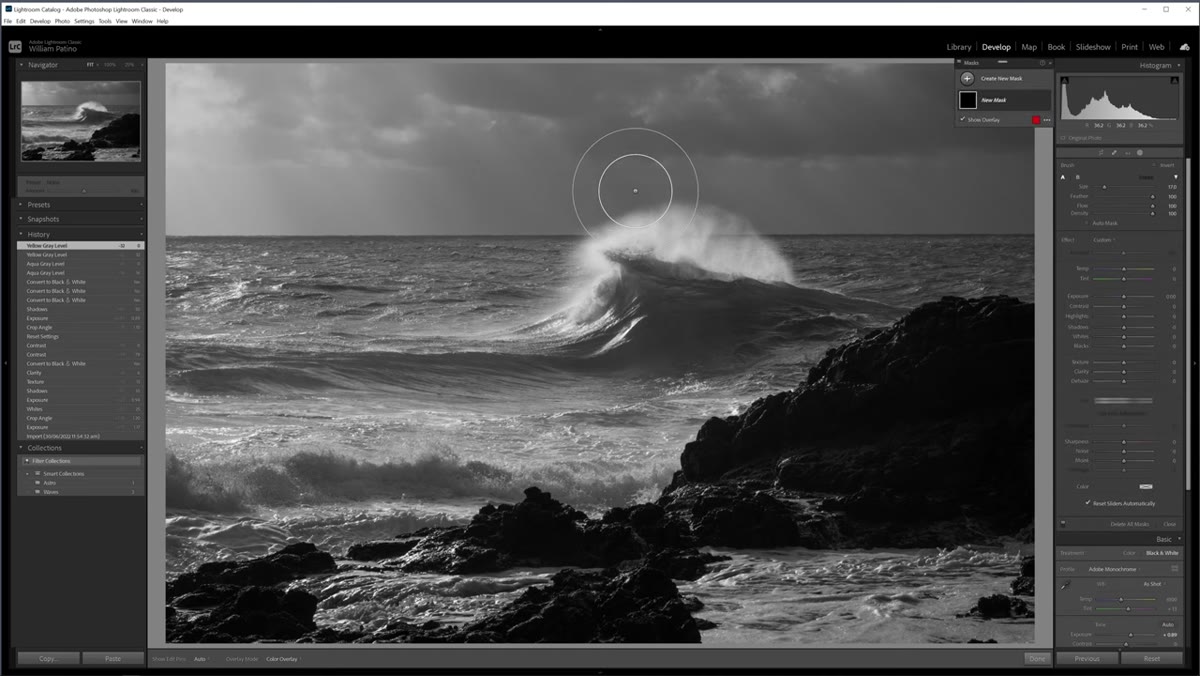 Adjustment brush applied over sky, dehaze slider being pulled down
This is the most important step in the whole process. Patino reaches for the adjustment brush (press K on your keyboard) and targets the sky. He reduces exposure first, which darkens everything uniformly, and then uses the Dehaze slider to selectively pull down the darker tones in the clouds without crushing the bright light breaking through.
Adjustment brush applied over sky, dehaze slider being pulled down
This is the most important step in the whole process. Patino reaches for the adjustment brush (press K on your keyboard) and targets the sky. He reduces exposure first, which darkens everything uniformly, and then uses the Dehaze slider to selectively pull down the darker tones in the clouds without crushing the bright light breaking through.
Watch what Dehaze actually does here. Pulling it down in a sky with storm clouds compresses the lower end of the tonal range in that region while leaving the highlights relatively intact. It’s a contrast move more than a simple darkening. The result is that the clouds get texture and weight without the light beams disappearing. You get drama without losing the thing that made you press the shutter in the first place. Spend time with this slider before committing to a value.
Step 4: Paint the Light Back Into the Sky With a Second Brush
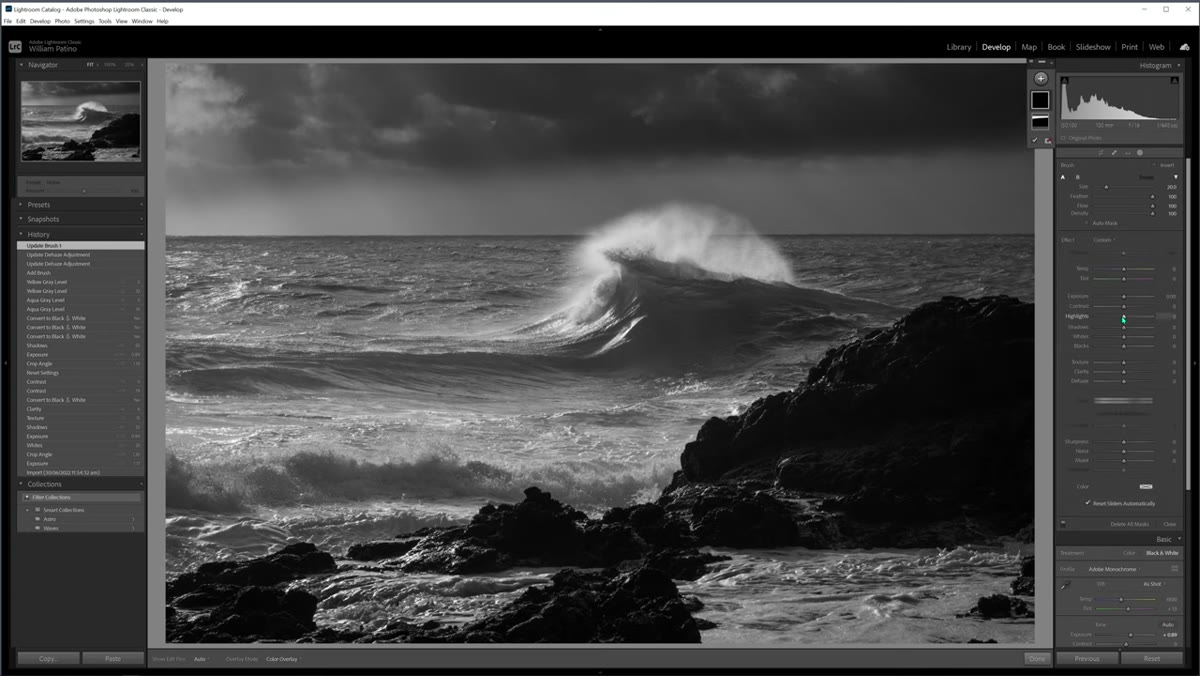 New adjustment brush stroke brightening highlights along the horizon
Once the sky is darkened with the first brush, Patino creates a new brush stroke and works in the opposite direction, lifting highlights and whites along the horizon and in the bright pockets between clouds. This is the move that separates a flat dark sky from a sky that looks like it has actual weather in it.
New adjustment brush stroke brightening highlights along the horizon
Once the sky is darkened with the first brush, Patino creates a new brush stroke and works in the opposite direction, lifting highlights and whites along the horizon and in the bright pockets between clouds. This is the move that separates a flat dark sky from a sky that looks like it has actual weather in it.
The concept is simple: you want a full tonal range within the sky itself, deep shadow in the heavy cloud mass and brightness where the light breaks through. Painting these back in after the exposure reduction restores the impression of volumetric light. Work along the horizon line first, then dab into the lighter areas of cloud above. Keep the brush soft and keep your strokes natural. You’re not drawing a line, you’re describing where light falls.
Step 5: Refine the Foreground With a Local Adjustment
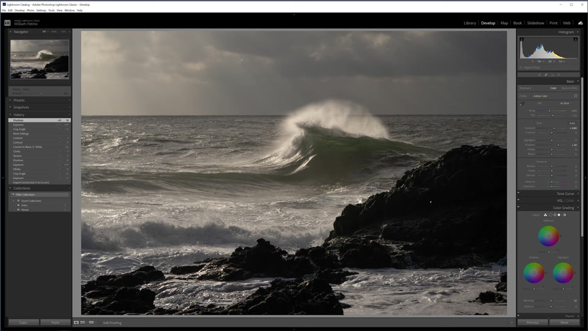 Shadows slider raised moderately to lift foreground rocks
Return to the foreground. Whether you use a gradient or a second adjustment brush, the goal is to lift the shadow detail in the rocks and water in the lower portion of the frame without letting it compete with the sky’s brightness. I usually handle this with a radial or linear gradient rather than a freehand brush for smoother transitions, but Patino’s brush approach gives you more control in scenes with complex edges.
Shadows slider raised moderately to lift foreground rocks
Return to the foreground. Whether you use a gradient or a second adjustment brush, the goal is to lift the shadow detail in the rocks and water in the lower portion of the frame without letting it compete with the sky’s brightness. I usually handle this with a radial or linear gradient rather than a freehand brush for smoother transitions, but Patino’s brush approach gives you more control in scenes with complex edges.
The final check is simple: stand back from your screen, squint slightly, and trace where your eye travels. It should move from the foreground through the wave toward the horizon and into the sky. If it stalls anywhere, that area is either too bright or needs more local contrast.
A Note From My Own Processing Experience
Patino’s workflow is efficient and transferable, but I want to add one thing I’ve learned the hard way. The temptation with dramatic black and white landscapes is to keep pushing the contrast until the image feels powerful. What you often get instead is something that looks processed rather than photographed.
I still shoot film occasionally, partly because it forces me to commit to an exposure without hedging. That same discipline applies in post. Set your sliders and then leave the image for an hour. Come back and look at it fresh. If the first thing you see is the editing rather than the scene, you’ve gone too far. The best black and white landscape prints I’ve ever sold are the ones where someone asks me what film I used, even though they were shot digital. The processing should feel inevitable, not labored.
The single most important idea in this tutorial is the two-brush sky technique: darken the overall sky first, then selectively restore the bright light on a separate stroke. That sequence builds tonal complexity that a single adjustment can never achieve, and it’s what makes a black and white sky look alive rather than grey.
Watch the full tutorial on YouTube to see William Patino work through the complete edit in real time. His pacing is clear and the original raw file is available to download so you can follow along step by step.
Comments
Leave a Comment