
There’s a particular kind of frustration that comes from returning home with a full memory card, pulling images up on the monitor, and feeling a quiet unease you can’t quite name. The photos aren’t technically wrong. Exposure is solid, focus is sharp, the light was genuinely beautiful. But something about them feels cluttered. Restless. Like a room where someone shoved too much furniture against the walls.
I’ve been shooting landscapes full-time for two decades, and I still run into this problem. It doesn’t go away with experience so much as you get better at catching it earlier. Which is why, when I came across this Mark Denney tutorial on overly busy compositions, I found myself nodding along and occasionally wincing in recognition. Mark digs into five specific signs that a landscape image has crossed the line from complex into chaotic, and he does it with real images from his own archive, which is the kind of transparency that actually teaches something. What follows is my breakdown of those five signs, filtered through twenty years of standing in fields and rivers wondering what went wrong.
Mark is careful to frame this as subjective territory, and he’s right. One photographer’s layered, atmospheric scene is another’s visual mess. But there are patterns worth knowing, and once you see them, you can’t unsee them.
Step 1: Run Edge Patrol on Every Frame
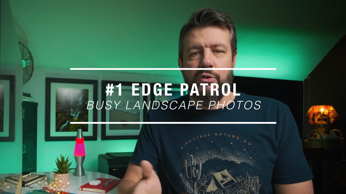 Kauai waterfall image with distracting buildings along frame edges
Before you chimp the shot or pack up your tripod, physically walk your eyes around the border of the frame. Not the center, where your subject lives. The perimeter. Look for elements that are partially cropped, things that are half-in and half-out: branches, rocks, structures, any shape that has been cut by the frame’s edge rather than contained within it.
Kauai waterfall image with distracting buildings along frame edges
Before you chimp the shot or pack up your tripod, physically walk your eyes around the border of the frame. Not the center, where your subject lives. The perimeter. Look for elements that are partially cropped, things that are half-in and half-out: branches, rocks, structures, any shape that has been cut by the frame’s edge rather than contained within it.
These partial shapes create a visual itch. The viewer’s brain tries to complete them, which pulls attention away from wherever you actually want it to land. Mark shows a Kauai waterfall image where the falls themselves are compelling, but buildings along the sides and cropped-off village structures at the top keep stealing focus. The fix is rarely dramatic. It’s usually a small reframe, a few steps left, a slightly tighter crop, or a deliberate choice to include the whole element rather than slice it.
Step 2: Settle the Subject Question Before You Press the Shutter
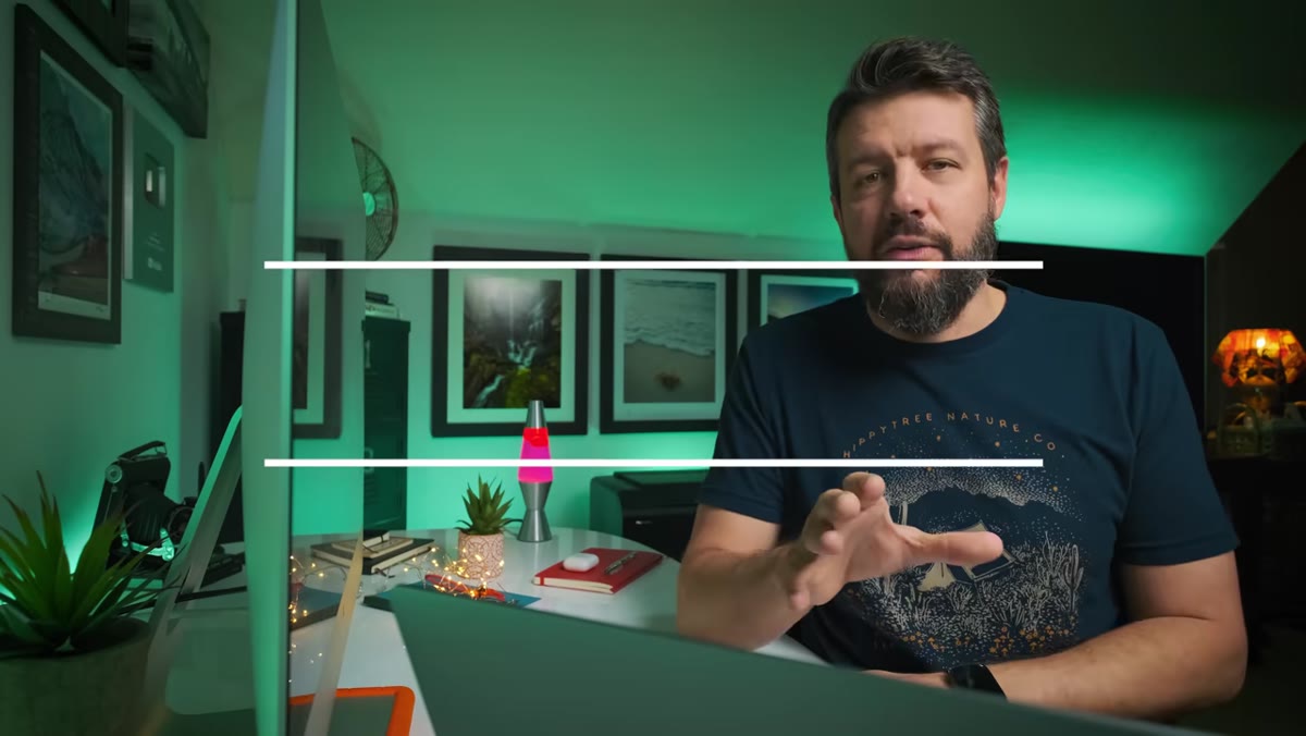 Example image with multiple competing subjects pulling viewer attention
This one still catches me. Mark’s position is nuanced and I think it’s the right one: not every landscape needs a single subject, but if you can’t answer the question “what is this image of?” in one breath, you may have a problem.
Example image with multiple competing subjects pulling viewer attention
This one still catches me. Mark’s position is nuanced and I think it’s the right one: not every landscape needs a single subject, but if you can’t answer the question “what is this image of?” in one breath, you may have a problem.
When two or more elements compete for dominance at equal visual weight, the viewer’s eye bounces without settling. That restlessness reads as busyness. The solution isn’t always to eliminate one subject. Sometimes it’s about subordinating one element so it supports the primary subject rather than challenges it. A foreground rock can anchor a composition without competing with a mountain peak if the scale relationship is handled carefully. Ask yourself which element you’d be most devastated to lose from the frame. That’s your subject. Build around it.
Step 3: Watch for Competing Lines
 Image showing multiple leading lines pulling in different directions
Leading lines are one of the first compositional tools photographers learn, and they’re powerful precisely because they direct the eye so efficiently. The problem comes when you have multiple strong lines in the same frame pointing in different directions. Two or three competing lines don’t guide the viewer, they divide them.
Image showing multiple leading lines pulling in different directions
Leading lines are one of the first compositional tools photographers learn, and they’re powerful precisely because they direct the eye so efficiently. The problem comes when you have multiple strong lines in the same frame pointing in different directions. Two or three competing lines don’t guide the viewer, they divide them.
In practice, this means paying attention to the geometry of a scene before you set up the tripod. Converging lines that flow toward a single point reinforce each other. Lines that cross or point toward opposite corners fight each other. On location, this is often solved by changing position rather than focal length. Moving laterally or adjusting your height can change how lines relate to each other more dramatically than any lens choice.
Step 4: Audit the Tonal and Color Complexity
 Side-by-side comparison showing high tonal complexity versus simplified scene
A frame can be physically sparse and still feel busy if the tonal range is all over the place. Harsh patches of direct sunlight surrounded by deep shadow, or a scene with six distinct color temperatures competing simultaneously, creates visual noise even when the physical subject count is low.
Side-by-side comparison showing high tonal complexity versus simplified scene
A frame can be physically sparse and still feel busy if the tonal range is all over the place. Harsh patches of direct sunlight surrounded by deep shadow, or a scene with six distinct color temperatures competing simultaneously, creates visual noise even when the physical subject count is low.
Mark points to this as an editing problem as often as a capture problem, and he’s right. I’ve pulled images from trips where the moment felt transcendent and the file looks like a ransom note. Overworked saturation sliders, aggressive local adjustments that create unnatural light pools, these things add complexity without adding meaning. Before reaching for the HSL panel, ask whether the image needs more color differentiation or less. More often than I’d like to admit, the answer is less.
Step 5: Check Whether the Foreground Earns Its Place
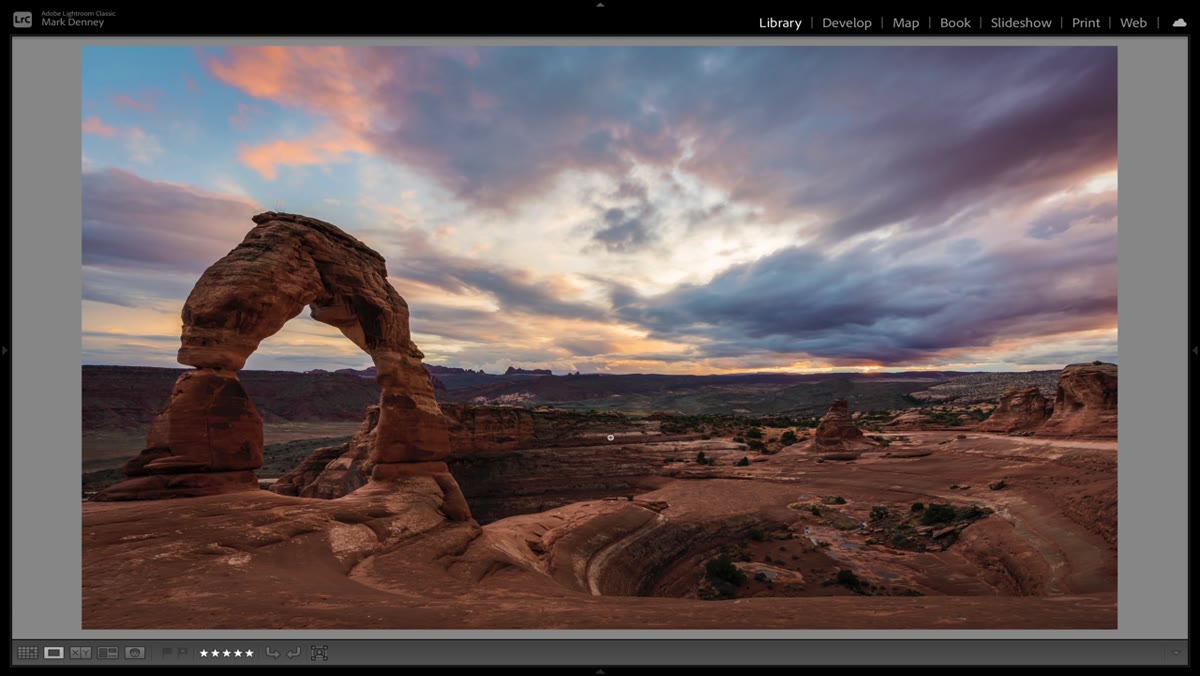 Landscape with overly dominant foreground element disrupting composition balance
Foreground interest is a cornerstone of landscape photography advice, and it’s good advice. A strong foreground creates depth, adds dimension, and gives the eye somewhere to enter the frame. But an oversized, visually aggressive foreground can overwhelm the midground and background elements that are actually doing the compositional heavy lifting.
Landscape with overly dominant foreground element disrupting composition balance
Foreground interest is a cornerstone of landscape photography advice, and it’s good advice. A strong foreground creates depth, adds dimension, and gives the eye somewhere to enter the frame. But an oversized, visually aggressive foreground can overwhelm the midground and background elements that are actually doing the compositional heavy lifting.
Mark’s point here is about proportion and relevance. A foreground element should invite the viewer into the scene, not block the door. If the foreground occupies more than a third of the frame and its texture or color is the most demanding thing in the image, reconsider your position. Step back. Raise the tripod. Give the background room to breathe. The foreground’s job is to serve the image, not to be the image.
What Twenty Years in the Field Adds to This
I shoot film occasionally, mostly because it slows me down and forces a reckoning before I press the shutter. When you have twelve frames on a roll and you’re standing in a river in November, you think harder about what’s in the frame and what isn’t. That discipline, that pre-shot audit, is exactly what Mark is describing with these five signs. Edge patrol, subject clarity, line management, tonal discipline, foreground restraint. These aren’t post-processing fixes. They’re field habits.
My honest caveat is this: sometimes the busiest compositions I’ve made have come from the most emotionally overwhelming scenes. When the light is doing something extraordinary, the instinct is to include everything. Resist it. The edit, the decision about what stays outside the frame, is the photograph. The camera just records what you’ve already decided.
The single most useful thing you can take into the field from Mark’s tutorial is the habit of asking “what would leave the frame be better?” rather than “what can I add?” Simplicity in landscape photography isn’t laziness. It’s the hardest kind of discipline to develop, and it makes everything else sharper.
Watch the full tutorial on YouTube to see Mark work through real examples from his own archive. His willingness to critique his past work is, by itself, worth the watch.
Comments (2)
Wow, I had no idea you could do this. Mind blown.
Bookmarked. Coming back to this one for sure.
Leave a Comment