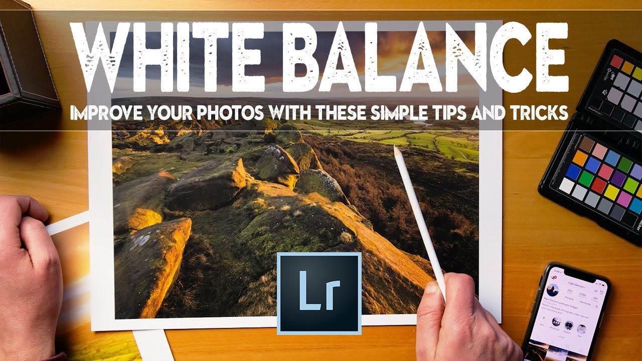
I spent years trying to nail white balance in-camera. Spot-on, neutral, technically correct. And for years, my landscape images felt flat in a way I couldn’t quite name. The light at 5am on a frozen riverbank in central Oregon looked like a product photo. Accurate, sure. But dead. It wasn’t until I started treating white balance as a creative decision rather than a calibration problem that my images started to feel like the places I actually stood in. Watch the full tutorial on YouTube
In this Nigel Danson tutorial on white balance in landscape photography, he walks through a real editing session in Lightroom and makes an argument I’ve believed for a long time but never heard stated so plainly: perfect white balance is often the wrong goal. What you want is expressive white balance. The difference between those two things is the difference between a record of a scene and a photograph of it.
What hooked me about his approach is that it came out of a workshop conversation, which is exactly how I learn best. Someone asks a question, you have to answer honestly, and suddenly you realize you’ve been doing something instinctively for years without ever breaking it down. This walkthrough does that. It’s practical, it’s specific, and it’s directly applicable the next time you’re pulling a RAW file from a cold morning shoot.
Step 1: Start With the Before Image and Identify What Isn’t Working
 Before and after images side by side in Lightroom grid
Before touching a single slider, Danson pulls up both the original RAW and the finished edit side by side in Lightroom. The exercise isn’t about admiring the result. It’s about training your eye to spot what white balance is actually doing in a scene. In his example, a foreground area reads as orange in the original, blending poorly with the background. In the finished version, it shifts toward green, and suddenly the whole image has depth and separation.
Before and after images side by side in Lightroom grid
Before touching a single slider, Danson pulls up both the original RAW and the finished edit side by side in Lightroom. The exercise isn’t about admiring the result. It’s about training your eye to spot what white balance is actually doing in a scene. In his example, a foreground area reads as orange in the original, blending poorly with the background. In the finished version, it shifts toward green, and suddenly the whole image has depth and separation.
Do this with your own images. Open the file, look at the color relationships between shadow areas and highlights. Ask whether those relationships feel true to the emotional memory of the place. That question, not a color checker, is your starting point.
Step 2: Understand What Kelvin Is Actually Telling You
 White balance Kelvin scale explanation in Lightroom panel
Danson takes a moment to explain the Kelvin scale in a way that’s worth sitting with. Higher Kelvin values mean cooler, bluer light. Lower Kelvin values mean warmer, more orange light. Counterintuitive if you think of a gas burner going from blue to orange as it cools, but that’s the physics. Sunset registers around 3200K. The cool blue light of deep shade or a clear-sky sunrise can push toward 10,000K.
White balance Kelvin scale explanation in Lightroom panel
Danson takes a moment to explain the Kelvin scale in a way that’s worth sitting with. Higher Kelvin values mean cooler, bluer light. Lower Kelvin values mean warmer, more orange light. Counterintuitive if you think of a gas burner going from blue to orange as it cools, but that’s the physics. Sunset registers around 3200K. The cool blue light of deep shade or a clear-sky sunrise can push toward 10,000K.
Knowing these anchor points matters because it tells you which direction to push. If you want to exaggerate the warmth of golden hour, you’ll probably be working in the 4000-6000K range. If you want shadow areas to feel genuinely cold, you might pull those down toward the 3000-3500K zone. The numbers give you a map.
Step 3: Set White Balance to Reflect the Mood, Not the Gray Card
 Dragging Kelvin slider away from neutral in Lightroom
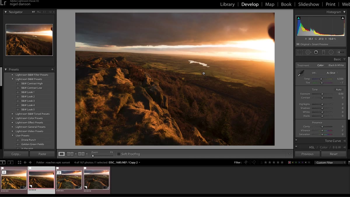
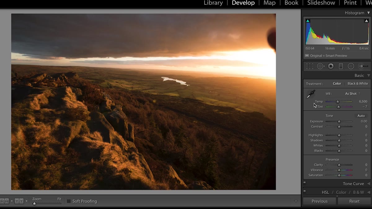
This is the core idea in the tutorial. Danson moves the Kelvin slider to roughly 3200K on his image and shows that while it’s technically closer to “correct” for the light conditions, it doesn’t feel right. The image goes flat. The warmth that made the scene worth photographing disappears.
Dragging Kelvin slider away from neutral in Lightroom
This is the core idea in the tutorial. Danson moves the Kelvin slider to roughly 3200K on his image and shows that while it’s technically closer to “correct” for the light conditions, it doesn’t feel right. The image goes flat. The warmth that made the scene worth photographing disappears.
His point is direct: accurate white balance at a warm-light scene often means canceling out the very color that makes the image work. Instead, he nudges the slider toward where the image feels alive, not where gray objects appear gray. In practice this means experimenting in a range on either side of neutral until the image starts to breathe.
Step 4: Use Tint Alongside Temperature for Full Color Control
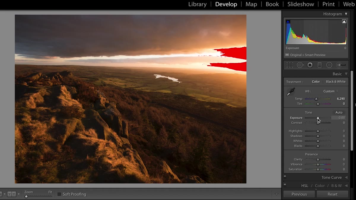 Adjusting the Tint slider alongside the Temperature slider
Temperature alone controls the blue-orange axis. But Lightroom’s Tint slider controls the green-magenta axis, and in landscape work, that second axis is where a lot of the naturalistic color lives. Danson adjusts both in combination, which is something a lot of photographers skip.
Adjusting the Tint slider alongside the Temperature slider
Temperature alone controls the blue-orange axis. But Lightroom’s Tint slider controls the green-magenta axis, and in landscape work, that second axis is where a lot of the naturalistic color lives. Danson adjusts both in combination, which is something a lot of photographers skip.
A slight push toward green in the Tint slider, combined with a warmer temperature setting, can shift a muddy brown foreground toward something that reads as living vegetation. Pull it toward magenta and you emphasize the purple tones in shadow areas at dusk. These are small moves, usually no more than 10-15 points in either direction, but the cumulative effect on the emotional temperature of an image is significant.
Step 5: Apply Differential White Balance Using Local Adjustments
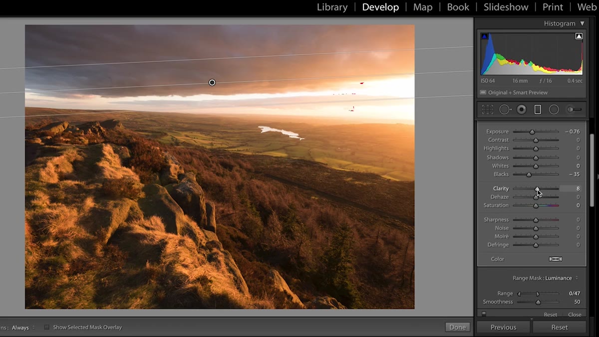 Gradient tool applied to lower portion of landscape image
Here is where the tutorial moves from useful to genuinely sophisticated. Rather than applying one white balance setting to the entire image, Danson uses Lightroom’s gradient and brush tools to shift white balance in specific zones. Warm tones in the sky, cooler tones in the shadows, different treatment for the midground. Each area gets its own color temperature nudge.
Gradient tool applied to lower portion of landscape image
Here is where the tutorial moves from useful to genuinely sophisticated. Rather than applying one white balance setting to the entire image, Danson uses Lightroom’s gradient and brush tools to shift white balance in specific zones. Warm tones in the sky, cooler tones in the shadows, different treatment for the midground. Each area gets its own color temperature nudge.
To do this, drop a gradient over the area you want to adjust. Inside the local adjustment panel, you’ll find Temperature and Tint sliders. These work independently of the global white balance. In practice, this means you can have a golden upper sky while the forest floor underneath stays in cool blue shadow, which is often exactly how those scenes actually feel when you’re standing in them.
Step 6: Print or Export and Evaluate at Arm’s Length
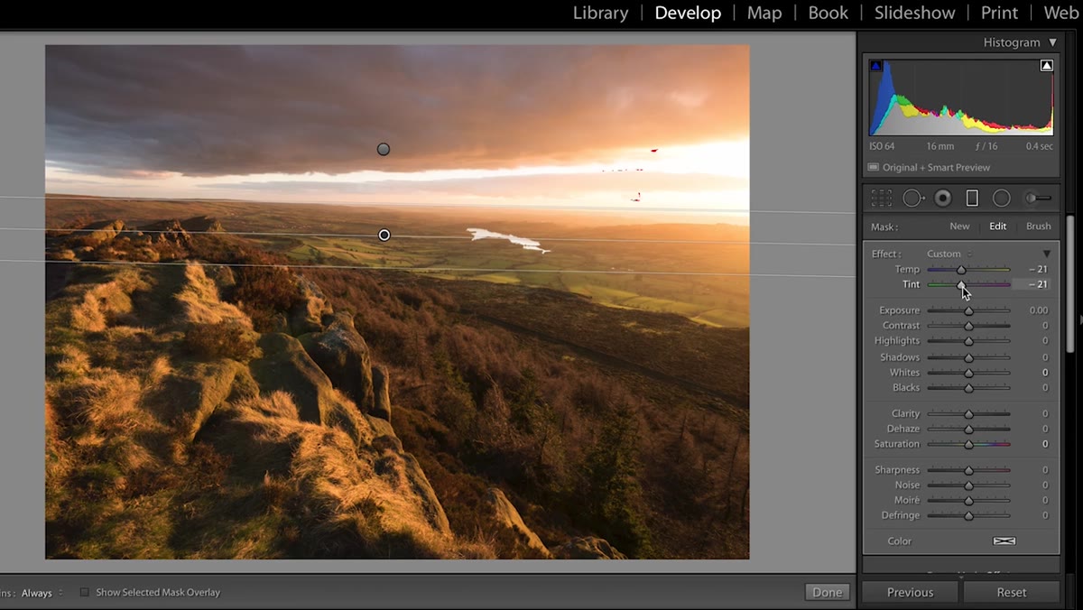 Finished edit displayed on screen beside a printed version
Danson mentions printing as a final check, and I’d echo that completely. What reads correctly on a backlit monitor often surprises you on paper. He notes that some of his images changed significantly in his estimation once he held them as prints. One he was uncertain about became a favorite.
Finished edit displayed on screen beside a printed version
Danson mentions printing as a final check, and I’d echo that completely. What reads correctly on a backlit monitor often surprises you on paper. He notes that some of his images changed significantly in his estimation once he held them as prints. One he was uncertain about became a favorite.
Even if you aren’t printing, export the file and look at it in a plain viewer without the Lightroom UI around it. The interface creates a kind of tunnel vision. Stepping outside it, even briefly, resets your eye and helps you see whether the white balance choices you made are doing what you intended.
A Word From My Own Experience With This
I teach a version of this in my workshops, but I frame it around emotional memory. Before I touch the white balance sliders, I ask myself what the air felt like. Not what it looked like on the histogram. What it felt like. Was it cold enough to see your breath? Was the light genuinely warm or was it that thin, watery warmth you get in November that looks golden but has no real heat in it? Those sensory memories are your editing guide.
The Kelvin scale gives you a tool. Your memory of being there gives you the direction to point it. I still shoot a few frames on film every season partly for this reason. When you only get 36 exposures, you commit to your vision of the light before you press the shutter. That discipline sharpens your instinct for white balance in a way that unlimited RAW capture sometimes doesn’t.
The single most important idea in this tutorial is one that will save you hours of flat, technically-correct edits: white balance is a creative lever, not a calibration task. Set it where the image feels true, not where a gray card would tell you to. That shift in thinking is worth more than any preset or plugin.
Watch the full tutorial on YouTube and spend particular attention on the sections where Danson applies local white balance adjustments. That’s where the technique gets genuinely powerful for landscape work.
Comments
Leave a Comment