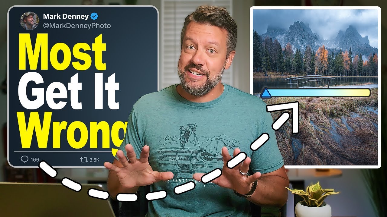
There’s a particular kind of frustration that hits when you bring an image home from a shoot you know was good - the light was right, the composition was right, the morning was cold and quiet and worth waking up for - and the processed file just looks wrong. Not dramatically wrong. Subtly wrong. Like a song played slightly out of tune. I’ve been chasing that feeling for twenty years, trying to understand why some edits hold together and others slowly fall apart the more you stare at them. Most of the time, the problem isn’t the photo. It’s the editing habits we’ve built up without realizing it.
Watch the full tutorial on YouTube
In this Mark Denney tutorial, he identifies seven specific editing mistakes that quietly degrade landscape images - some that destroy technical quality, others that just make a photo feel artificial or flat. What I appreciate about Denney’s approach is that he’s not vague about it. He shows exact sliders, exact values, and explains the reasoning behind each correction. I’ve watched a lot of editing content over the years, and this one is worth your time whether you’ve been shooting for two years or twenty. Below I’ve broken down the core techniques from the video into steps you can apply directly in Lightroom.
Step 1: Recognize When You’re Using a Global Tool on a Local Problem
 Shadows slider at plus 100 affecting entire image globally
The first and most common mistake Denney addresses is reaching for global sliders when only one part of the frame actually needs help. The example he uses is a forest scene where the foreground trees are very dark. The instinct is to drag the Shadows slider up to around plus 100 to open them up. The problem is that every shadow in the frame lifts with it - including the areas where shadow depth is what makes the light look beautiful. You end up brightening the problem area and flattening the mood of everything else simultaneously.
The fix is to leave the global Shadows slider at zero, or bring it up only a few points, and then isolate the correction. Use a mask - Denney uses a Linear Gradient dragged from the bottom of the frame upward, covering just the dark foreground trees - and apply the shadow recovery only to that region. The rest of the image, where the light is doing its job, stays untouched. It sounds simple, but most photographers skip this step because global edits are faster. Faster is not the same as better.
Step 2: Pull Back on Over-Edited Skies
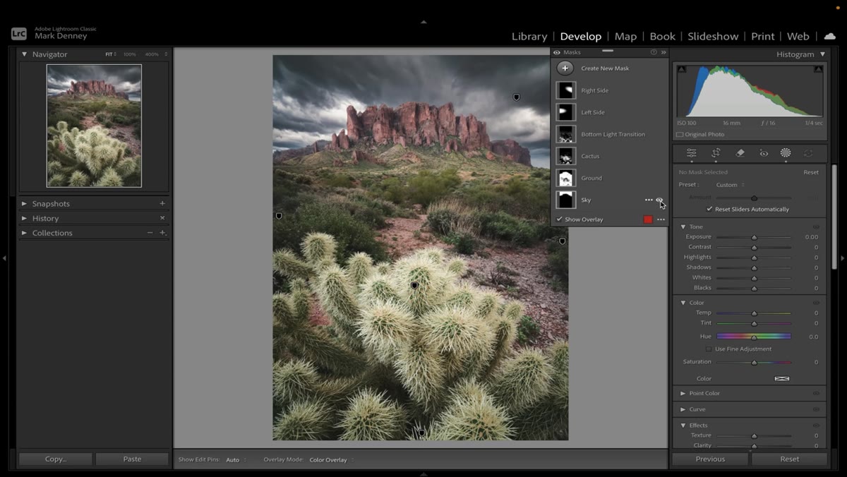 Sky mask toggled on and off showing dramatic over-editing
Skies in landscape photography are easy to overwork. Denney shows an image where a sky mask has Clarity pushed to 75 and Dehaze sitting at 50. Toggling the mask on and off reveals how crunchy and artificial the sky has become - dark in a way that reads as processed rather than dramatic.
His recommendation is to keep Clarity on a sky mask in the 20-to-30 range, and to treat Dehaze with the same restraint. The sky is not where you prove you know how to use Lightroom. It’s where you need to show the most discipline, because the human eye is extremely sensitive to skies that look fake. If a viewer can’t articulate what’s wrong with your photo but something feels off, an over-processed sky is often the culprit.
Step 3: Correct Toxic Greens in the Color Mixer
 Color Mixer open showing green hue slider adjusted
Greens are the defining color of most landscape photography, which makes them the most dangerous color to get wrong. Denney calls the specific problem “toxic greens” - a neon, artificial cast that shows up even when vibrance and saturation are untouched. The issue lives in the Color Mixer’s Hue panel.
If your greens feel electric or slightly wrong, open the HSL/Color panel and look at the Green Hue slider. Pulling it slightly toward yellow typically brings foliage back toward the organic tones we actually see in a forest or meadow. The same logic applies to Aqua and Yellow, depending on your scene. Saturation and Luminance adjustments within the mixer let you deepen or soften specific color ranges without affecting the rest of the image. The goal is green that looks like it grew there, not green that looks like it was painted on.
Step 4: Avoid Lifting Blacks to Fake a Fade
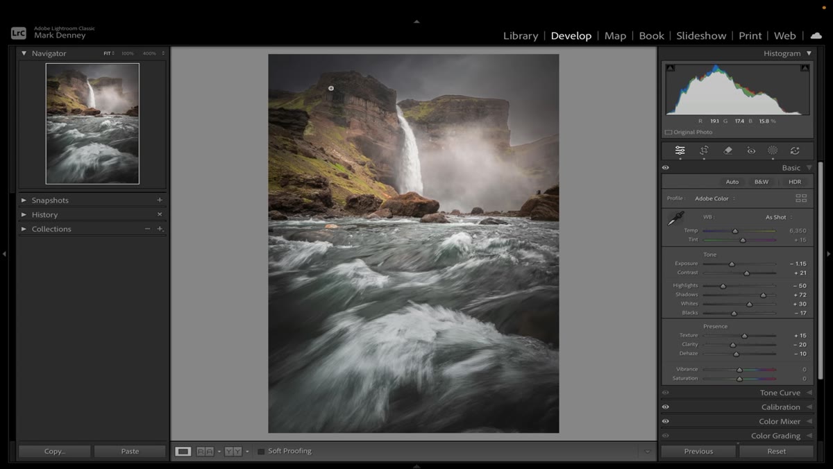
 Blacks slider raised creating flat washed-out shadows
Raising the Blacks slider to create a faded, filmic look is one of those trends that spread through photography editing and stuck around long past its welcome. Denney flags this as a mistake because lifting Blacks destroys the depth that anchors a landscape image. When shadows have no base, everything floats. The image loses weight.
If you want a matte or low-contrast aesthetic, there are more controlled ways to achieve it - working with tone curves in specific channels, or using calibration adjustments - rather than simply lifting the entire black point. Reserve your Blacks slider for genuine technical corrections, not stylistic shortcuts.
Step 5: Stop Sharpening Everything Uniformly
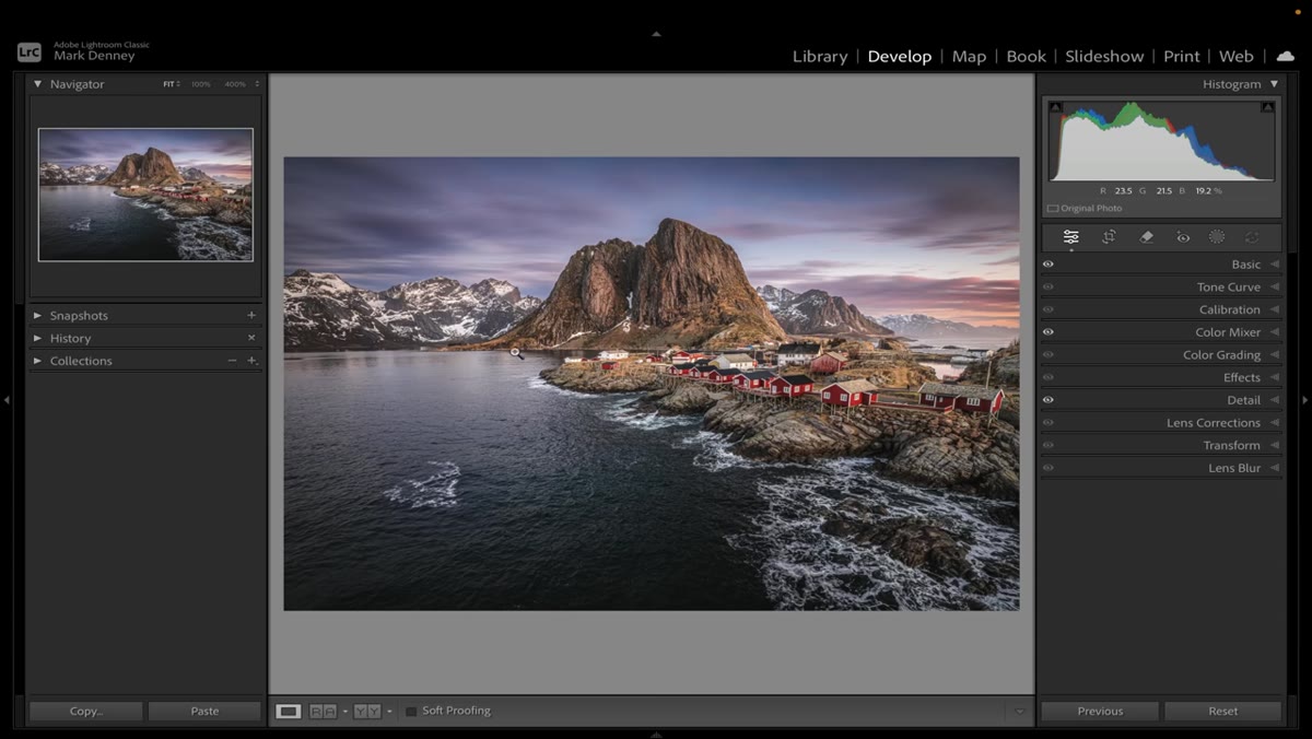
 Detail panel showing aggressive sharpening applied globally
Global sharpening in the Detail panel is another global tool applied where precision is needed. Denney’s concern here is that sharpening applied across the entire frame also sharpens noise, compression artifacts, and smooth areas like skies and water where texture is not an asset.
Use the Masking slider in the Detail panel - hold Alt or Option while dragging it and Lightroom will show you a black-and-white preview of exactly where the sharpening is being applied. White areas receive sharpening, black areas are protected. Pulling Masking up to 60 or 70 for most landscape scenes protects smooth gradients and limits sharpening to edges and actual texture. Sharpening everything equally is not the same as making a sharp image.
A Note from the Field
There’s something Denney says indirectly throughout this tutorial that I think is the deeper lesson: most editing mistakes come from working too fast and thinking in categories instead of looking at the specific image in front of you. I’ve made every one of these mistakes, usually when I’m tired or impatient or convinced I already know what an image needs before I’ve really looked at it.
My mentor used to say that the mountain doesn’t care about your schedule. The image doesn’t care about your workflow either. The edits that hold up over time are the ones where you slowed down long enough to ask what this particular photo actually needs, not what your preset or habit says to do with photos that look like this one. That question is what separates an edit that feels true from one that just feels finished.
The single most important thing I took from this tutorial is the first point: global edits solve global problems. When only part of your frame is broken, fix only that part. Everything else you do in post should follow from that same principle. Work locally, think specifically, and the edits that feel off will start to feel right.
Watch the full tutorial on YouTube to see all seven mistakes demonstrated on real images, with Mark Denney walking through before and after comparisons for each one.
Comments
Leave a Comment