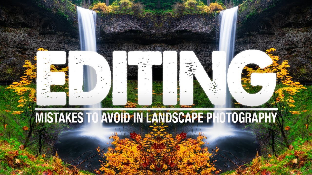
After twenty years of making landscape photographs, I still catch myself making the same editing errors I was making at year three. That’s the uncomfortable truth about post-processing mistakes. They’re slippery. Unlike field mistakes, which tend to be obvious and correctable in the moment, editing mistakes accumulate quietly. You finish a session thinking the image looks great, and then two weeks later you open the file again and something feels wrong. You just can’t name it.
That’s exactly why I kept coming back to this tutorial. In this Mark Denney tutorial, Watch the full tutorial on YouTube, he walks through five specific editing habits that degrade landscape images in ways that are easy to miss in the moment but obvious in hindsight. Mark ranks them by impact, from least damaging to most egregious, and the order itself is instructive. What he identifies as the single worst mistake is also, in my experience, the most universal one.
What follows is my attempt to break down each mistake into something you can actually act on. These aren’t abstract principles. They’re specific slider behaviors, workflow patterns, and perceptual traps that I’ve fallen into myself, and that I’ve watched students fall into during my workshops out here in the high desert of central Oregon.
Step 1: Stop Lifting Your Shadows Into Flatness
Shadow recovery is one of Lightroom’s most seductive tools. When you’re working with a raw file that has deep, blocked-up shadow areas, dragging that slider up feels like rescue. The detail comes back. The image opens up. The problem is that most of us, including me for a long time, take it too far.
Shadows exist for a reason. They give a photograph its sense of volume and physical depth. When you pull them all the way up, you’re not recovering detail, you’re manufacturing a kind of tonal soup that reads as flat and artificial. The fix Mark suggests is using Lightroom’s shadow clipping indicator, the small triangle in the upper left of the histogram, to show you exactly which areas are fully clipped. Use that as your floor, not your ceiling. Recover just enough to show structure, then stop.
Step 2: Don’t Let Your Highlights Blow Out Quietly
The highlight end of the histogram gets less mercy from me than it probably deserves. I tend to be aggressive with highlight recovery because I shoot a lot of golden hour and blue hour scenes where the sky holds the most important tonal information. But Mark’s point here is about knowing when you’ve gone too far in the other direction, crunching highlights so hard that the sky turns a flat, textureless gray.
Use the highlight clipping indicator, the triangle in the upper right of the histogram, the same way you use the shadow one. Click it, look at where the image is blowing out, and then recover only to the point where texture is visible. A slightly bright sky that retains cloud texture will almost always look more natural than one that’s been dragged down to a lifeless mid-tone.
Step 3: Watch What Texture and Clarity Are Actually Doing
Texture and Clarity are powerful tools, and that power is exactly what makes them dangerous. Both sliders increase local contrast, but they work at different scales. Clarity affects broader mid-tone contrast, while Texture works on finer surface detail. Pushed too hard, either one will make your image look crunchy and processed in a way that calls attention to itself.
The mistake isn’t using these tools. It’s using them globally at high values without checking what they’re doing to specific areas. Smooth water, skin on a figure in the landscape, soft clouds, these areas suffer first. Consider applying Texture and Clarity selectively with a brush or a masking tool, keeping them off the areas that should remain soft. The goal is to guide the eye, not to make every pixel fight for attention.
Step 4: Color Grading Needs Restraint, Not Ambition
This one stings because I love color. I’ve always loved color. But there’s a version of loving color that crosses into distorting it, and Mark’s point about HSL and color grading is worth sitting with. It’s easy to inflate the saturation of a specific hue, say the orange in a sunrise, to the point where it no longer resembles anything you actually saw in the field.
The test I’ve started using is simple. Ask yourself whether the color you’re looking at could exist in nature under the right conditions. If the answer is no, dial it back. Vibrance is generally more forgiving than Saturation because it protects already-saturated hues while lifting the flatter ones. Use that asymmetry to your advantage, and be especially careful with blues and aquas in water, which can tip into neon very fast.
Step 5: The Worst Mistake Is Editing Without a Clear Intention
Mark saves the most important point for last in reverse. The number one mistake, ranked as most damaging, is beginning an edit without a clear sense of what you want the image to feel like when you’re done. Without that north star, you end up chasing sliders. You boost contrast because it looks better than it did, then you compensate with shadow recovery, then you add clarity to bring back detail, then the sky looks weird so you pull highlights, and before long you’ve made twenty decisions that contradict each other.
The practice he recommends, and one I’ve adopted in my own workflow, is to spend sixty seconds with the raw file before touching anything. Just look at it. Decide on a tone, a mood, a direction. That intention shapes every decision that follows, and it’s the difference between an image that feels cohesive and one that feels like a series of corrections.
One Thing I’d Add From the Field
The tutorials I trust most are the ones where the instructor admits the mistake is ongoing. Mark does that here, and I respect it. I’d add one caveat from my own experience: the best defense against all five of these mistakes is taking a break before your final export. Seriously. Close the file, go outside, come back in an hour or the next morning. Your eyes recalibrate, and problems that were invisible become obvious. Some of my worst processed images are ones I exported while still excited about the shoot. Some of my best are ones I sat with for a week before touching.
The single biggest idea in this tutorial is that editing mistakes compound. One bad decision doesn’t ruin an image, but five small ones layered on top of each other will. The path forward isn’t perfection, it’s awareness. Start with intention, trust the histogram, and learn to recognize when a slider is helping the image versus helping you feel like you’re doing something.
Watch the full tutorial on YouTube and pay close attention to the before-and-after comparisons. Seeing the mistakes on screen, side by side with the corrected versions, makes the lessons stick in a way that reading about them simply can’t match.
Comments
Leave a Comment