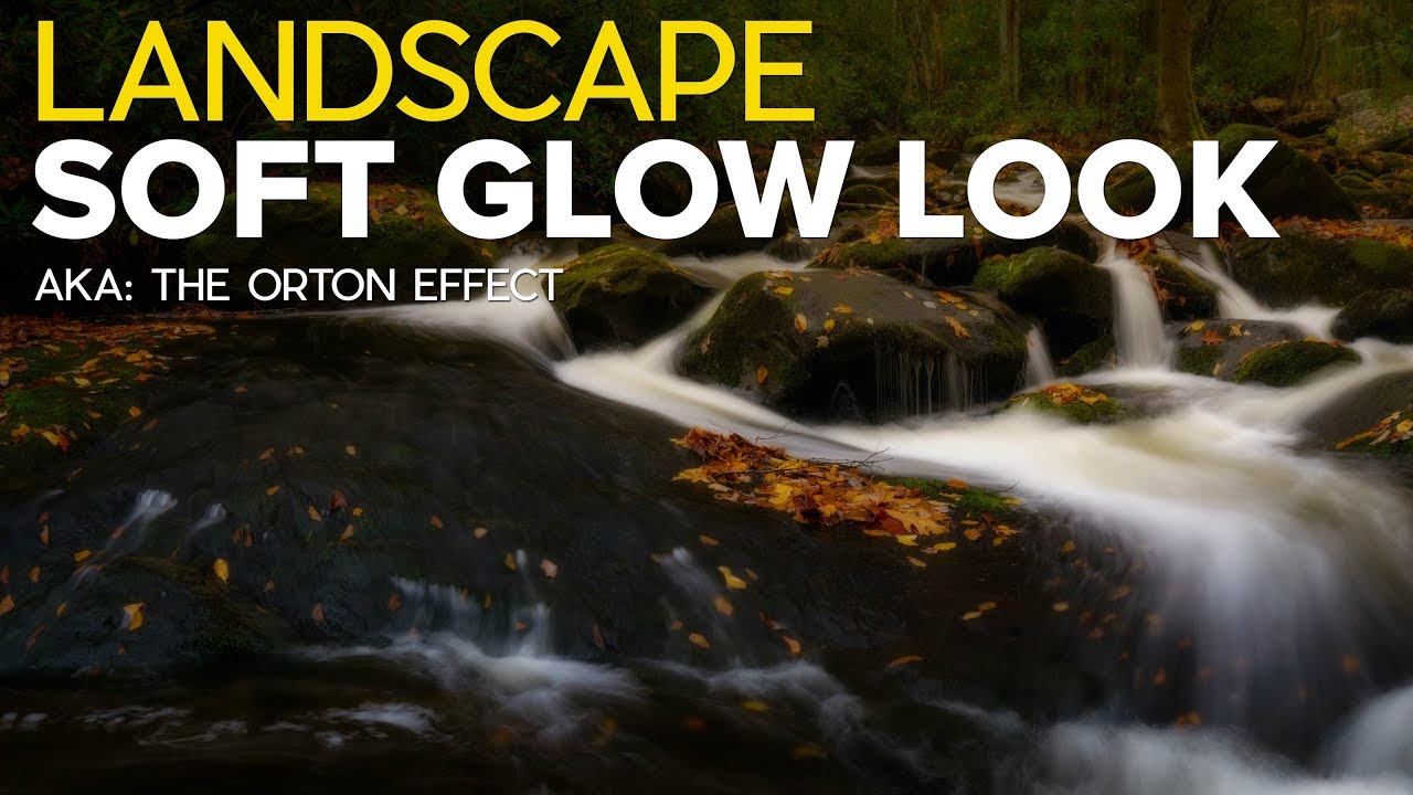
There is a quality of light I chase constantly out here in the high desert around Bend. It happens maybe a dozen mornings a year, when the atmosphere is thick enough to scatter the first rays but thin enough to still let color through. Everything glows from the inside. The trees, the ridgelines, the frost on the grass. I have been trying to recreate that feeling in post-processing for two decades, with mixed results. The Orton Effect, when applied with some care and restraint, gets closer than almost anything else I have tried.
In this Matt Kloskowski tutorial, Watch the full tutorial on YouTube, Matt walks through the technique from its origins as a darkroom film method invented by photographer Michael Orton in the 1980s, all the way into practical Lightroom and Photoshop workflows. What I appreciate most is that he doesn’t just show you one recipe and send you home. He builds the concept in layers, from a quick Lightroom approximation up through a more controllable Photoshop approach, so you actually understand what you’re doing rather than blindly dragging a slider.
The core idea is simple: the original Orton Effect combined two film exposures, one sharp, one intentionally out of focus and slightly overexposed. The result was a luminous softness that felt painterly without losing all structure. Digitally, we are simulating that same principle. Understanding that history makes it easier to decide how far to push the effect and when to pull back.
Step 1: Understand What the Effect Is Actually Doing
 Matt introducing the Orton Effect concept on screen
Before touching a single slider, sit with the idea. The Orton Effect is not a sharpening technique. It is not an HDR technique. It is a softening and brightening pass that sits on top of your sharp base image. If you go in thinking you are adding drama through contrast, you will push it too far and end up with something that looks overprocessed. The goal is a gentle glow, like diffused morning light, not a bloom filter from a 2009 video game. Keep that image in your head while you work.
Matt introducing the Orton Effect concept on screen
Before touching a single slider, sit with the idea. The Orton Effect is not a sharpening technique. It is not an HDR technique. It is a softening and brightening pass that sits on top of your sharp base image. If you go in thinking you are adding drama through contrast, you will push it too far and end up with something that looks overprocessed. The goal is a gentle glow, like diffused morning light, not a bloom filter from a 2009 video game. Keep that image in your head while you work.
Step 2: Try the Quick Lightroom Version with Clarity
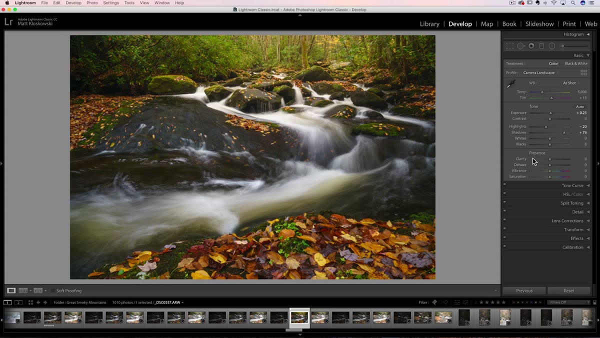 Clarity slider being pulled into negative values in Lightroom
Open your image in Lightroom’s Develop module and find the Clarity slider in the Basic panel. Most landscape photographers, myself included, spend a lot of time pulling Clarity upward toward that crunchy, contrasty look. For the Orton Effect, you go the opposite direction. Pull Clarity down, somewhere between negative 40 and negative 100 depending on your image. You will immediately see the midtone contrast soften and the image take on a hazy, diffused quality. It is a rough approximation of the effect, and it applies globally, but it gives you an instant read on whether the technique suits a particular photo.
Clarity slider being pulled into negative values in Lightroom
Open your image in Lightroom’s Develop module and find the Clarity slider in the Basic panel. Most landscape photographers, myself included, spend a lot of time pulling Clarity upward toward that crunchy, contrasty look. For the Orton Effect, you go the opposite direction. Pull Clarity down, somewhere between negative 40 and negative 100 depending on your image. You will immediately see the midtone contrast soften and the image take on a hazy, diffused quality. It is a rough approximation of the effect, and it applies globally, but it gives you an instant read on whether the technique suits a particular photo.
Step 3: Refine the Lightroom Approach with a Graduated Filter
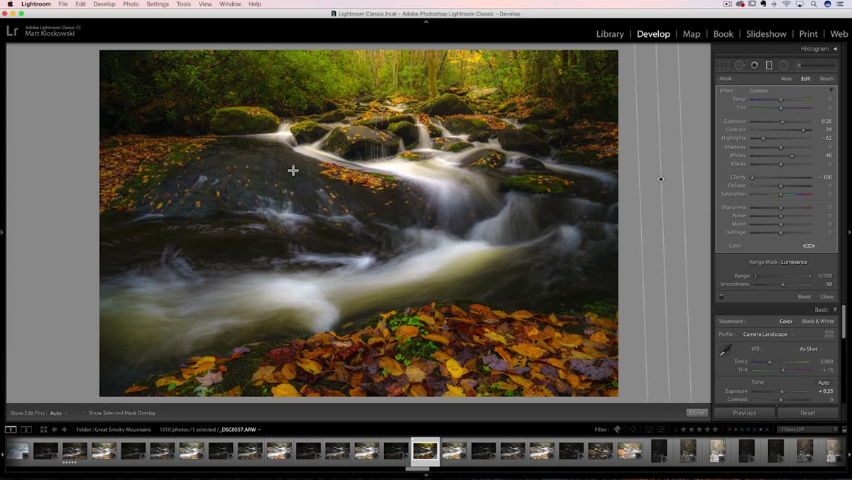
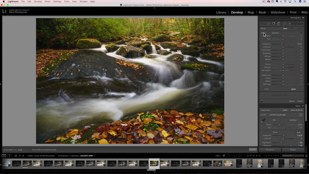 Graduated filter dragged across the full image in Lightroom
Here is where the Lightroom method gets more useful. Instead of applying negative Clarity through the Basic panel, use the Graduated Filter tool (the keyboard shortcut is M). Double-click the word “Effect” in the filter panel to zero out all sliders, then drag the filter so it covers the entire frame. You can drag from just outside one edge to just outside the other, effectively making the filter global. Now set Clarity to around negative 100. The reason you want this inside a Graduated Filter instead of the Basic panel is that you now have access to additional controls. You can lift the Exposure slightly to mimic that second overexposed Orton layer. You can pull Highlights back if the brightest areas start to blow out. You can even add a touch of Contrast to give the glow some body. The Basic panel gives you one knob. The filter gives you a mixing board.
Graduated filter dragged across the full image in Lightroom
Here is where the Lightroom method gets more useful. Instead of applying negative Clarity through the Basic panel, use the Graduated Filter tool (the keyboard shortcut is M). Double-click the word “Effect” in the filter panel to zero out all sliders, then drag the filter so it covers the entire frame. You can drag from just outside one edge to just outside the other, effectively making the filter global. Now set Clarity to around negative 100. The reason you want this inside a Graduated Filter instead of the Basic panel is that you now have access to additional controls. You can lift the Exposure slightly to mimic that second overexposed Orton layer. You can pull Highlights back if the brightest areas start to blow out. You can even add a touch of Contrast to give the glow some body. The Basic panel gives you one knob. The filter gives you a mixing board.
Step 4: Move to Photoshop for Real Control
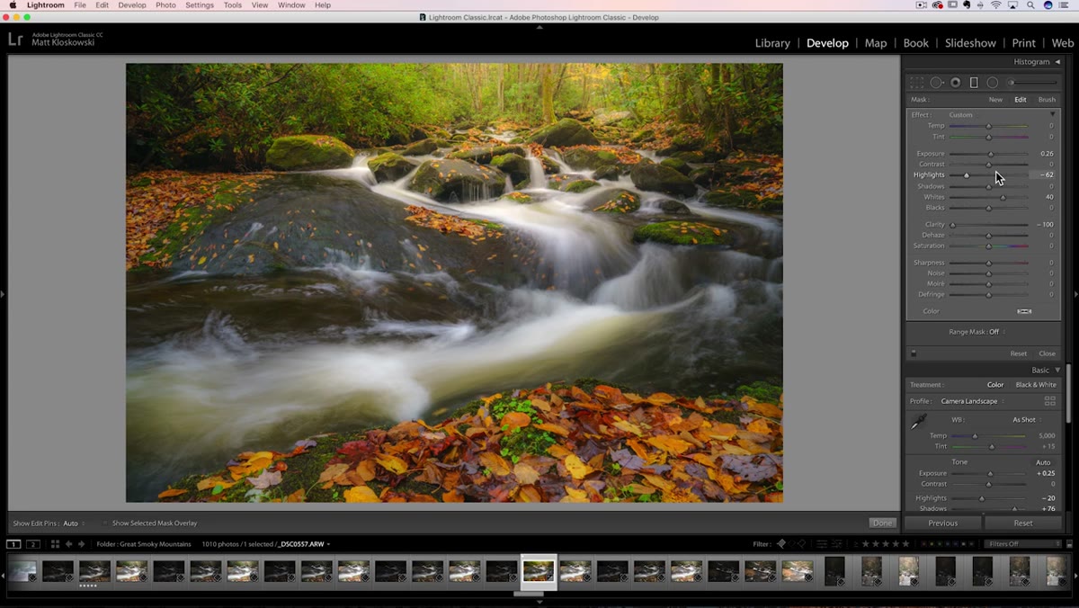 Image opening in Photoshop from Lightroom
The Lightroom method is a solid starting point, but if you want to be precise about where the effect lands and how strong it reads, you need Photoshop. Send your image from Lightroom to Photoshop as a flattened file or a Smart Object, whichever fits your workflow. Once it’s open, duplicate the background layer. This duplicate is going to become your soft, glowing layer, while your original stays sharp underneath. Keeping that sharp base is the whole game. The contrast between the two is what creates the dimensionality. Without a sharp layer underneath, you just have a blurry photo.
Image opening in Photoshop from Lightroom
The Lightroom method is a solid starting point, but if you want to be precise about where the effect lands and how strong it reads, you need Photoshop. Send your image from Lightroom to Photoshop as a flattened file or a Smart Object, whichever fits your workflow. Once it’s open, duplicate the background layer. This duplicate is going to become your soft, glowing layer, while your original stays sharp underneath. Keeping that sharp base is the whole game. The contrast between the two is what creates the dimensionality. Without a sharp layer underneath, you just have a blurry photo.
Step 5: Apply the Blur and Blend Mode to the Duplicate Layer
 Gaussian Blur applied to duplicate layer in Photoshop
With your duplicate layer selected, go to Filter, then Blur, then Gaussian Blur. The radius you choose will depend on your image resolution, but somewhere between 15 and 40 pixels is a reasonable starting range for a high-resolution landscape file. You want enough blur that the detail disappears into softness, but you are not trying to create an abstract smear. Once the blur is applied, change the layer’s blend mode from Normal to Screen. The Screen blend mode brightens and combines layers in a way that mimics overexposure, which is exactly what Orton’s second film layer was doing. You will see the image light up with that characteristic glow. From here, dial the layer’s opacity down until the effect feels integrated rather than applied. Somewhere between 30 and 60 percent is where I usually land.
Gaussian Blur applied to duplicate layer in Photoshop
With your duplicate layer selected, go to Filter, then Blur, then Gaussian Blur. The radius you choose will depend on your image resolution, but somewhere between 15 and 40 pixels is a reasonable starting range for a high-resolution landscape file. You want enough blur that the detail disappears into softness, but you are not trying to create an abstract smear. Once the blur is applied, change the layer’s blend mode from Normal to Screen. The Screen blend mode brightens and combines layers in a way that mimics overexposure, which is exactly what Orton’s second film layer was doing. You will see the image light up with that characteristic glow. From here, dial the layer’s opacity down until the effect feels integrated rather than applied. Somewhere between 30 and 60 percent is where I usually land.
Step 6: Mask the Effect Away from Sharp Focal Points
 Layer mask being painted to protect sharp foreground detail
This is the step most tutorials gloss over and the one that makes the biggest difference in practice. Add a black layer mask to your blurred Screen layer. With a soft white brush at low opacity, paint the glow back in selectively over areas where it enhances the image: skies, background trees, soft water, misty middle distances. Keep the mask dark over your primary subject or any area where sharpness matters to the story of the image. A wildflower in the foreground, a mountain peak, a person, these should stay crisp. The glow should feel like atmosphere, not like your lens fogged up.
Layer mask being painted to protect sharp foreground detail
This is the step most tutorials gloss over and the one that makes the biggest difference in practice. Add a black layer mask to your blurred Screen layer. With a soft white brush at low opacity, paint the glow back in selectively over areas where it enhances the image: skies, background trees, soft water, misty middle distances. Keep the mask dark over your primary subject or any area where sharpness matters to the story of the image. A wildflower in the foreground, a mountain peak, a person, these should stay crisp. The glow should feel like atmosphere, not like your lens fogged up.
What I Do Differently After 20 Years of Chasing Soft Light
I almost never apply the Orton Effect at full strength, even when I love it on a particular image. My habit is to group all my Orton layers into a single Photoshop group, then drop the group’s opacity to somewhere between 50 and 75 percent. That extra step gives me one master dial to adjust when I come back to an image a week later with fresh eyes. And I always revisit. My mentor used to say that finishing a photo the same day you shot it is like reading the last page of a book while you’re still too excited to absorb it. Let it sit. The Orton Effect especially benefits from distance because it’s easy to over-apply when you’re caught up in how beautiful that morning light felt in the field.
The single most important thing Matt’s tutorial reinforced for me is that the effect is most powerful when it’s invisible. If someone looks at your photo and immediately says “nice Orton Effect,” you’ve gone too far. The goal is for them to feel that quality of light and not know why. That subtlety is the whole craft.
Watch the full tutorial on YouTube and work through it with one of your own images open beside it. The explanation makes more sense when you see your own photo transform in real time.
Comments
Leave a Comment