There is a particular kind of disappointment I know well. You were there. The light was extraordinary. You felt something standing in that landscape. Then you open the raw file and the image looks… compressed. Airless. Like everything is sitting on the same plane, equidistant from the viewer, none of it going anywhere. Flat. I have been shooting landscape photography full-time for two decades and I still encounter this problem regularly, especially when I push contrast or clarity too hard during processing.
That is exactly why I found myself nodding all the way through Watch the full tutorial on YouTube this image critique session by William Patino. Using real student submissions from his Facebook academy, Patino walks through a deceptively simple framework: depth in landscape photography is not just a compositional concern at the time of capture. It is something you build and protect in post-processing, decision by decision, from foreground to sky. The principles he lays out are ones I wish someone had spelled out for me clearly back when I was still learning to trust the process rather than blast everything with a global contrast slider.
What follows is my attempt to translate those principles into concrete steps you can take into your own editing sessions today.
Step 1: Evaluate Your Foreground Before You Touch a Single Slider
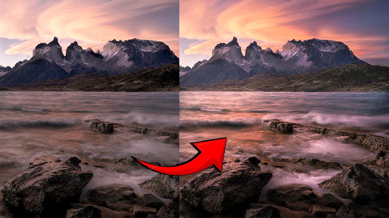
 Eric’s Patagonia landscape displayed for critique on screen
Before opening any editing panel, sit with the image and ask whether the composition itself is doing any depth work for you. Patino points to a strong example in one of the submitted images: large foreground rocks giving way to smaller mid-ground rocks, which then lead the eye toward water and a mountain backdrop with a stellar sky. The size relationship between those near and far elements is doing real heavy lifting. Big to small, close to distant. That visual cue alone tells the viewer’s brain that space exists in this frame.
Eric’s Patagonia landscape displayed for critique on screen
Before opening any editing panel, sit with the image and ask whether the composition itself is doing any depth work for you. Patino points to a strong example in one of the submitted images: large foreground rocks giving way to smaller mid-ground rocks, which then lead the eye toward water and a mountain backdrop with a stellar sky. The size relationship between those near and far elements is doing real heavy lifting. Big to small, close to distant. That visual cue alone tells the viewer’s brain that space exists in this frame.
If your image lacks a foreground anchor entirely, no amount of post-processing will manufacture that sense of recession into the landscape. Consider this your first diagnostic checkpoint. Does the frame have near, middle, and far? If not, file that lesson for the field. If it does, move forward knowing the structure is there to work with.
Step 2: Set Your Shutter Speed to Preserve Texture in Moving Water
 Critique of water smoothness and shutter speed discussion begins
This is a capture-side note Patino makes that is worth internalizing before your next shoot. The student image shows water that has been blended into a smooth, undifferentiated surface, likely shot at around half a second. The critique is not that long exposures are wrong. It is that when the water becomes completely glassy and uniform, it loses the texture that would otherwise contrast against the rocks and reinforce the sense of material difference between elements.
Critique of water smoothness and shutter speed discussion begins
This is a capture-side note Patino makes that is worth internalizing before your next shoot. The student image shows water that has been blended into a smooth, undifferentiated surface, likely shot at around half a second. The critique is not that long exposures are wrong. It is that when the water becomes completely glassy and uniform, it loses the texture that would otherwise contrast against the rocks and reinforce the sense of material difference between elements.
A slightly faster shutter, somewhere in the range of 1/4 second to 1/2 second depending on wave speed, can preserve individual wave crests and splashes while still conveying movement. That texture is part of what separates foreground from mid-ground visually. Test a few shutter speeds on location rather than committing to one approach automatically. I keep a mental habit of bracketing shutter speeds the way I bracket exposure on tricky light.
Step 3: Lift the Dark Tones in Your Background Using Atmospheric Perspective
 Discussion of background tonal values being too dark relative to foreground
This is the central post-processing insight in the tutorial and the one most photographers get backwards. Atmospheric perspective is the optical phenomenon where distant elements in a landscape appear lighter and lower in contrast than near elements, because atmosphere scatters light between you and them. Patino’s critique of the student image is that the dark tones in the distant background are nearly as dark as the foreground. That equality collapses depth.
Discussion of background tonal values being too dark relative to foreground
This is the central post-processing insight in the tutorial and the one most photographers get backwards. Atmospheric perspective is the optical phenomenon where distant elements in a landscape appear lighter and lower in contrast than near elements, because atmosphere scatters light between you and them. Patino’s critique of the student image is that the dark tones in the distant background are nearly as dark as the foreground. That equality collapses depth.
In practice, open a gradient or range mask targeted at your background zone and gently lift the shadows and blacks there. Not so much that the area loses its character, but enough that it reads as being farther away. If you have mountains, lift them a touch more than the mid-ground. The layers of increasing lightness as you recede toward the horizon are what convince the eye that it is looking into real space rather than at a painted backdrop.
Step 4: Darken and Enrich the Upper Sky, Lighten Toward the Horizon
 Selective darkening of upper sky area demonstrated with brush tool
The same atmospheric logic applies vertically in the sky. The upper portion of the sky is, relatively speaking, overhead and nearby in the visual hierarchy. It should carry more richness and depth of tone. The sky near the horizon is where atmosphere is thickest, where light has scattered the most, and where tones should be the lightest. This gradient is what gives night skies and dramatic cloudscapes their sense of dome-like volume.
Selective darkening of upper sky area demonstrated with brush tool
The same atmospheric logic applies vertically in the sky. The upper portion of the sky is, relatively speaking, overhead and nearby in the visual hierarchy. It should carry more richness and depth of tone. The sky near the horizon is where atmosphere is thickest, where light has scattered the most, and where tones should be the lightest. This gradient is what gives night skies and dramatic cloudscapes their sense of dome-like volume.
Use a linear gradient from the top of the frame downward, or paint the adjustment in with a brush if the sky has a complicated edge. Bring the upper sky down slightly in exposure or add a touch of contrast there, then ease off as you approach the horizon. Patino demonstrates this on a compressed JPEG and even the modest result is instructive. On a full raw file, this adjustment can transform a sky that looked printed-on into one that feels like it is actually curving overhead.
Step 5: Darken the Foreground to Anchor the Composition
 Foreground area being selectively darkened in post-processing
After brightening the distance, come back to the foreground and darken it slightly. This completes the tonal gradient and reinforces the near-to-far recession. A slightly heavier foreground anchors the viewer at the bottom of the frame and gives the composition a sense of gravitational grounding. It also increases the perceived contrast between the near and far zones without your having to apply a blunt global contrast adjustment that would crush your background detail.
Foreground area being selectively darkened in post-processing
After brightening the distance, come back to the foreground and darken it slightly. This completes the tonal gradient and reinforces the near-to-far recession. A slightly heavier foreground anchors the viewer at the bottom of the frame and gives the composition a sense of gravitational grounding. It also increases the perceived contrast between the near and far zones without your having to apply a blunt global contrast adjustment that would crush your background detail.
Keep the adjustment subtle. You are not creating a vignette. You are leaning into a tonal relationship that already exists in nature and that your raw file may have partially flattened during capture.
Step 6: Pull Back Global Clarity to Unify the Image
 Global clarity reduction applied to soften and integrate the image
Patino’s final global recommendation is one I have come to independently: reduce clarity slightly across the whole image once your localized tonal work is done. Clarity adds midtone contrast, which reads as texture and sharpness, and it is easy to over-apply during processing when you want an image to feel dramatic. The problem is that high global clarity creates a kind of visual noise across the whole frame that fights the depth cues you have just built in.
Global clarity reduction applied to soften and integrate the image
Patino’s final global recommendation is one I have come to independently: reduce clarity slightly across the whole image once your localized tonal work is done. Clarity adds midtone contrast, which reads as texture and sharpness, and it is easy to over-apply during processing when you want an image to feel dramatic. The problem is that high global clarity creates a kind of visual noise across the whole frame that fights the depth cues you have just built in.
A small negative clarity adjustment, just a few points, softens the integration between tonal zones and gives the image a cohesion that feels more natural and more cinematic. Think of it as the difference between a landscape that shouts at you and one that pulls you in slowly.
A Field Note From Twenty Years of Doing This
Patino is teaching from image review and that is a valuable vantage point. My own addition to this framework comes from something a mentor told me early in my career: the mountain doesn’t care about your schedule. I have stood in locations and felt the depth of a landscape with my whole body, then come home and had to reconstruct that feeling in post because the camera recorded it neutrally.
The lesson I keep relearning is that atmospheric perspective is real and your eye automatically compensates for it when you are on location. The camera does not. So your job in post is not to “edit” the image so much as to restore the spatial logic your eye already understood when you were standing there. Patino’s tonal gradient approach is essentially that restoration, done deliberately and with restraint.
The single idea worth carrying into your next editing session is this: depth is a tonal gradient, not just a compositional one. Darken what is near, lighten what is far, and protect that relationship from global adjustments that flatten it. Watch the full tutorial on YouTube to see William Patino demonstrate these adjustments in real time on actual student work. Seeing the before-and-after on a real image, even a compressed one, makes the principle click faster than any description can.
Comments
Leave a Comment