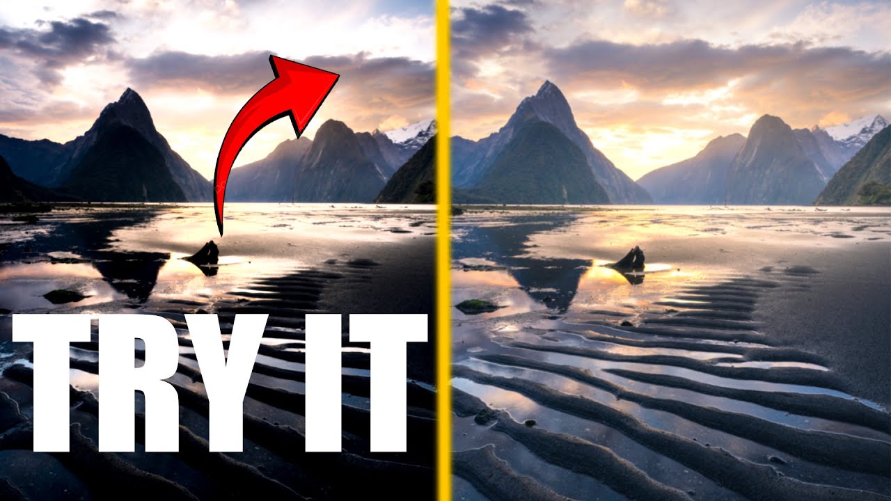
I’ve been standing in cold water before dawn for twenty years, and if there’s one conversation I still have at every workshop I run, it’s this one: “My phone takes a better photo than my camera.” I hear it from beginners, from people who just bought a serious mirrorless kit, from folks who drove three hours to catch a golden hour and came home with a folder full of dark, muddy RAW files that looked nothing like what their eyes saw. The frustration is real. The problem, though, isn’t the camera.
Smartphones apply computational processing the instant you press the shutter. Your RAW file does nothing. It just sits there, flat and patient, waiting for you to do the work. That gap between what you captured and what you saw is where editing lives, and it’s exactly the gap that Watch the full tutorial on YouTube this William Patino tutorial addresses so well. Working from a sunset scene shot at Milford Sound, Will walks through a clean, repeatable RAW workflow inside Photoshop’s Camera Raw, which is close enough to Lightroom’s Develop module that the steps translate directly between the two.
What struck me watching this wasn’t any single slider move. It was that Will starts with intention, not with knobs. He looks at the image, identifies three specific problems, and then solves them in order. That’s a discipline I learned the hard way, and it’s the thing that separates photographers who grow from ones who just keep tweaking.
Step 1: Build a Game Plan Before You Touch a Slider
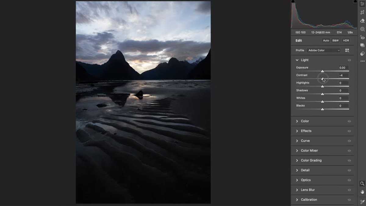
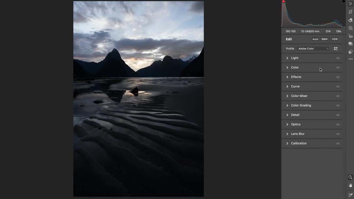 Flat, dark RAW file open in Camera Raw panel
Before adjusting anything, Will pauses and assesses the image out loud. He names exactly what the photo needs: overall brightness, restored color, and depth through tonal separation. This step costs you thirty seconds and saves you twenty minutes of aimless slider-dragging. When I open a RAW file, I do the same thing. I ask three questions. What is broken? What is missing? What needs to be pushed? Write those answers down if you’re new to this. The habit builds faster than you think.
Flat, dark RAW file open in Camera Raw panel
Before adjusting anything, Will pauses and assesses the image out loud. He names exactly what the photo needs: overall brightness, restored color, and depth through tonal separation. This step costs you thirty seconds and saves you twenty minutes of aimless slider-dragging. When I open a RAW file, I do the same thing. I ask three questions. What is broken? What is missing? What needs to be pushed? Write those answers down if you’re new to this. The habit builds faster than you think.
Step 2: Set Your Color Profile First
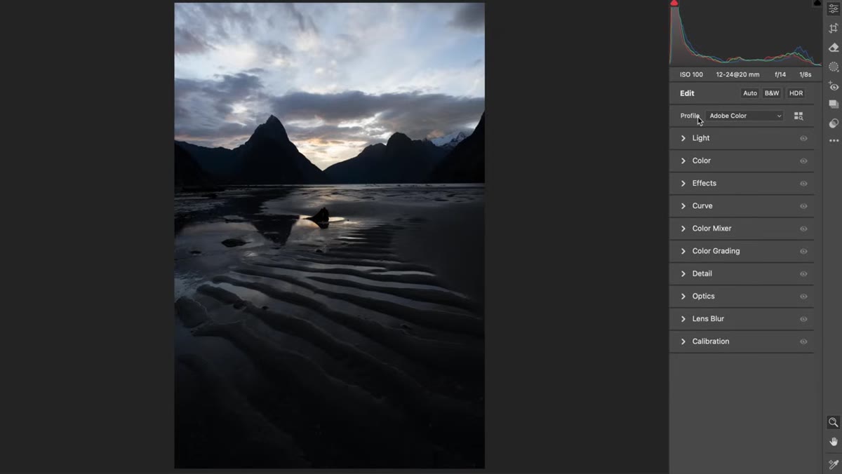 Color profile dropdown showing Landscape option selected
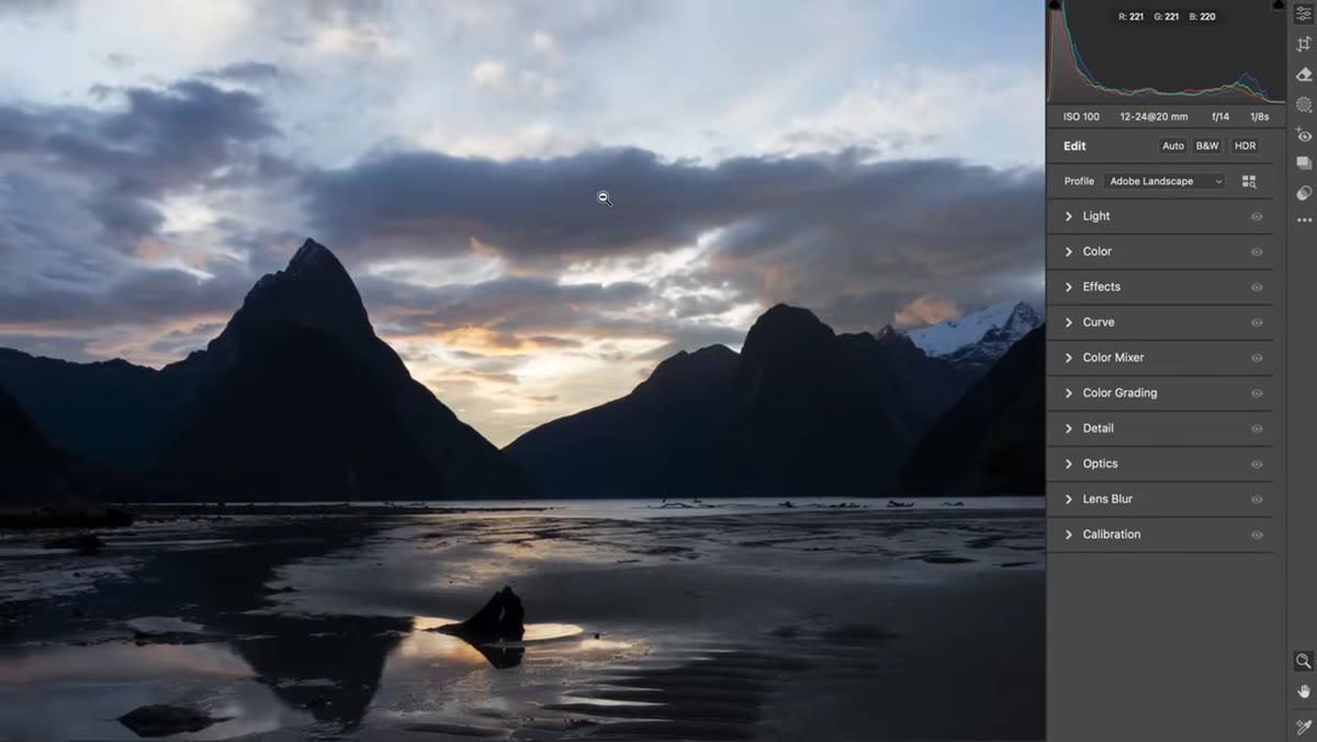
Will’s first actual adjustment is the color profile, found at the top of the Basic panel in Camera Raw and Lightroom. He switches it to “Landscape,” which quietly does three things at once: it lifts the shadows slightly, pulls back the highlights, and nudges saturation and vibrance upward. Watch your histogram when you make this change. You’ll see it shift. The profile isn’t magic, but it’s a sensible starting point for outdoor scenes, and if it overcooks a particular image, you simply switch back. Think of it as a foundation layer, not a final answer.
Color profile dropdown showing Landscape option selected
Will’s first actual adjustment is the color profile, found at the top of the Basic panel in Camera Raw and Lightroom. He switches it to “Landscape,” which quietly does three things at once: it lifts the shadows slightly, pulls back the highlights, and nudges saturation and vibrance upward. Watch your histogram when you make this change. You’ll see it shift. The profile isn’t magic, but it’s a sensible starting point for outdoor scenes, and if it overcooks a particular image, you simply switch back. Think of it as a foundation layer, not a final answer.
Step 3: Raise Exposure to Reveal the Whole Frame
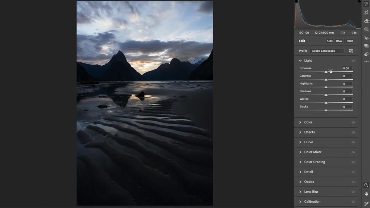 Exposure slider being pulled right, image brightening evenly
This is where most beginners reach for the Shadows slider, and it’s the wrong move for a globally underexposed file. Will lifts the Exposure slider instead, which raises all tones evenly and proportionally. The reason this matters is subtle but important. When you only lift shadows, you create a disconnect between the tonal zones in the image. Midtones and highlights don’t follow along. The result looks unnatural, like someone turned a dim light on in one corner of the room. Lifting overall exposure first gives you a truer baseline to work from. Adjust until the image reads as properly lit, even if it feels slightly bright. You’ll rein it in next.
Exposure slider being pulled right, image brightening evenly
This is where most beginners reach for the Shadows slider, and it’s the wrong move for a globally underexposed file. Will lifts the Exposure slider instead, which raises all tones evenly and proportionally. The reason this matters is subtle but important. When you only lift shadows, you create a disconnect between the tonal zones in the image. Midtones and highlights don’t follow along. The result looks unnatural, like someone turned a dim light on in one corner of the room. Lifting overall exposure first gives you a truer baseline to work from. Adjust until the image reads as properly lit, even if it feels slightly bright. You’ll rein it in next.
Step 4: Recover Highlights and Refine Shadows Separately
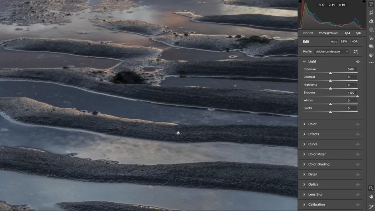 Highlights slider pulled left while shadows are adjusted independently
Once the exposure is raised, the highlights will likely be clipped or close to it. This is expected because you pushed the whole image up. Now pull the Highlights slider left to recover that sky detail and any bright water or reflections. Then, and only then, nudge the Shadows slider to taste. This order matters. Exposure first, then targeted recovery. The Whites and Blacks sliders can follow to set your true endpoints, but go gently. The goal here is a full, rich tonal range, not maximum contrast.
Highlights slider pulled left while shadows are adjusted independently
Once the exposure is raised, the highlights will likely be clipped or close to it. This is expected because you pushed the whole image up. Now pull the Highlights slider left to recover that sky detail and any bright water or reflections. Then, and only then, nudge the Shadows slider to taste. This order matters. Exposure first, then targeted recovery. The Whites and Blacks sliders can follow to set your true endpoints, but go gently. The goal here is a full, rich tonal range, not maximum contrast.
Step 5: Protect Atmospheric Perspective When Adding Contrast
 Distant mountains losing depth as global contrast increases
This is the most important conceptual point in the entire tutorial, and it’s the one most editing guides skip entirely. In the real world, distant mountains and far-off ridgelines appear lighter and slightly bluer than your foreground. This is atmospheric perspective, the natural haze of air and moisture that creates a sense of three-dimensional space. When you drag the Contrast slider to the right globally, you darken every tone in the image equally, including those pale distant hills. They get crushed down toward the same value as your near rocks or grass, and the image flattens out. The three-dimensional landscape becomes a two-dimensional wallpaper. Will’s solution is to be surgical: protect those far tones rather than boosting contrast across the board. Use local adjustments, the HSL panel, or targeted masking to add contrast only where you want the visual weight.
Distant mountains losing depth as global contrast increases
This is the most important conceptual point in the entire tutorial, and it’s the one most editing guides skip entirely. In the real world, distant mountains and far-off ridgelines appear lighter and slightly bluer than your foreground. This is atmospheric perspective, the natural haze of air and moisture that creates a sense of three-dimensional space. When you drag the Contrast slider to the right globally, you darken every tone in the image equally, including those pale distant hills. They get crushed down toward the same value as your near rocks or grass, and the image flattens out. The three-dimensional landscape becomes a two-dimensional wallpaper. Will’s solution is to be surgical: protect those far tones rather than boosting contrast across the board. Use local adjustments, the HSL panel, or targeted masking to add contrast only where you want the visual weight.
Step 6: Bring Color Back With Vibrance and Saturation
 Vibrance and Saturation sliders being lifted in the Basic panel
By this stage, the image has shape and light. Now color gets its turn. Will lifts Vibrance before Saturation, which is the right order. Vibrance is a smarter saturation boost because it protects skin tones and colors that are already saturated while lifting the muted ones. Saturation is a blunt instrument by comparison, raising everything uniformly. For a landscape with warm sunset tones and cool shadows, Vibrance will make the image sing without pushing the reds and oranges into something cartoonish. Use the HSL panel afterward for any color-specific refinements, especially if you want to shift the hue of a sky or deepen greens in foliage.
Vibrance and Saturation sliders being lifted in the Basic panel
By this stage, the image has shape and light. Now color gets its turn. Will lifts Vibrance before Saturation, which is the right order. Vibrance is a smarter saturation boost because it protects skin tones and colors that are already saturated while lifting the muted ones. Saturation is a blunt instrument by comparison, raising everything uniformly. For a landscape with warm sunset tones and cool shadows, Vibrance will make the image sing without pushing the reds and oranges into something cartoonish. Use the HSL panel afterward for any color-specific refinements, especially if you want to shift the hue of a sky or deepen greens in foliage.
A Note From My Own Workflow
The sequence Will teaches here is nearly identical to the order I’ve been using since before Camera Raw had half these sliders. The one thing I’d add from my own experience is this: do a final check at 1:1 zoom before you export. When you’re zoomed to fit the whole image on screen, noise in the shadows is invisible. It becomes very visible in a print. I’ve had clients notice shadow noise in pieces I thought were clean. Now I zoom in, check the darker areas, and apply luminance noise reduction if needed. It’s a small habit that protects the finished work.
The single most important thing Will demonstrates here isn’t any individual adjustment. It’s that editing is a structured conversation with your image, not a random exploration of sliders. Identify what the photo needs, solve each problem in a logical order, and always think about how local adjustments serve the three-dimensional reality you actually witnessed in the field. That’s the whole game.
Watch the full tutorial on YouTube to see every adjustment applied in real time against that Milford Sound sunset file. Watching the histogram respond to each move is worth the watch on its own.
Comments
Leave a Comment