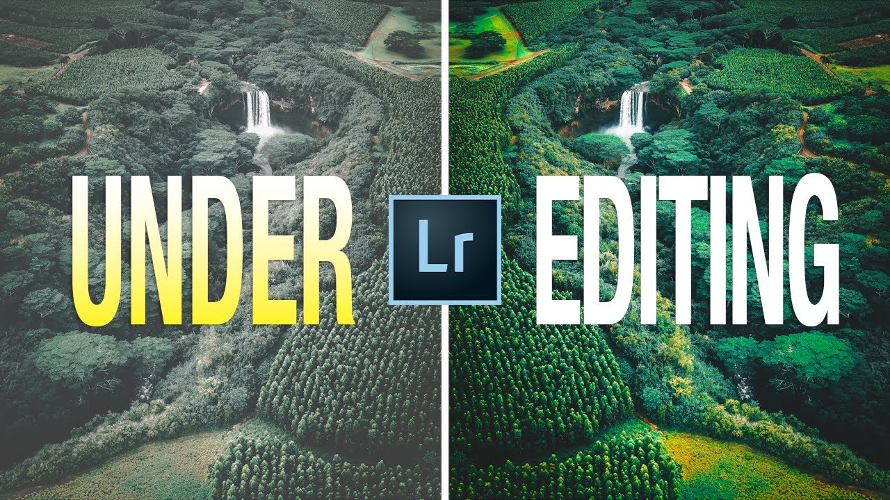
There’s a conversation happening constantly in photography communities about over-editing. Too much saturation, too heavy a hand with clarity, skies that glow like reactor cores. I’ve had that conversation myself, usually while cringing at something I processed in my early years. But the problem I’ve battled far longer, and far more quietly, is the opposite one. Under-editing. Stopping too soon. Leaving images on the digital equivalent of a half-cleared workbench.
Watch the full tutorial on YouTube
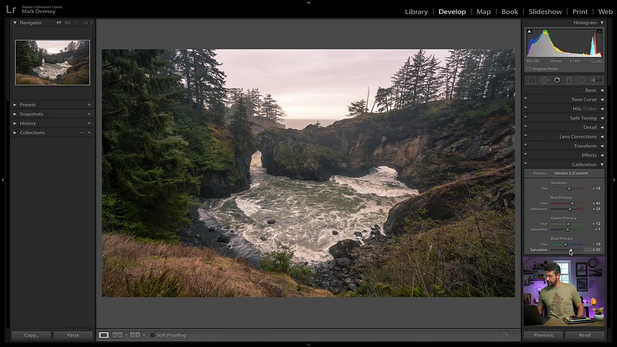
In this Mark Denney tutorial, he names and diagnoses five specific signs that your editing process is cutting out before the photo is actually done. What struck me watching it is how accurately it describes the editing habits of photographers who’ve gotten past the beginner stage. Once you’ve trained yourself away from over-processing, it’s easy to overcorrect and start calling “restraint” what is actually just incompleteness. I’ve done it more times than I want to count, right here in my Bend studio, staring at an image from the Cascades that felt finished but wasn’t.
Step 1: Tighten Your Crops
 Loose crop of Hawaii waterfall image with distracting background
The first sign Denney addresses is what he calls a loose crop, and it’s one that gets you on a delay. You edit, you post, you move on. Then three months later you pull the image back up and immediately see five things you would cut out. The original frame does the mechanical work of straightening the horizon, but it doesn’t do the compositional work of removing what doesn’t belong.
When you’re evaluating a crop, ask yourself whether every edge of the frame is earning its place. Busy sky with no color or structure? Crop down. Buildings or roads bleeding in from one side? Crop them out before they pull the viewer’s eye off your subject. Denney’s revision of a Kauai lighthouse shot is instructive here: balancing the land mass on one side against the water on the other created visual equilibrium that the technically correct rule-of-thirds crop had missed. Revisit crops on images you haven’t looked at in a few months. You’ll see them differently.
Step 2: Push Color Past Flat
 RAW file with desaturated, low-contrast flat colors in Lightroom
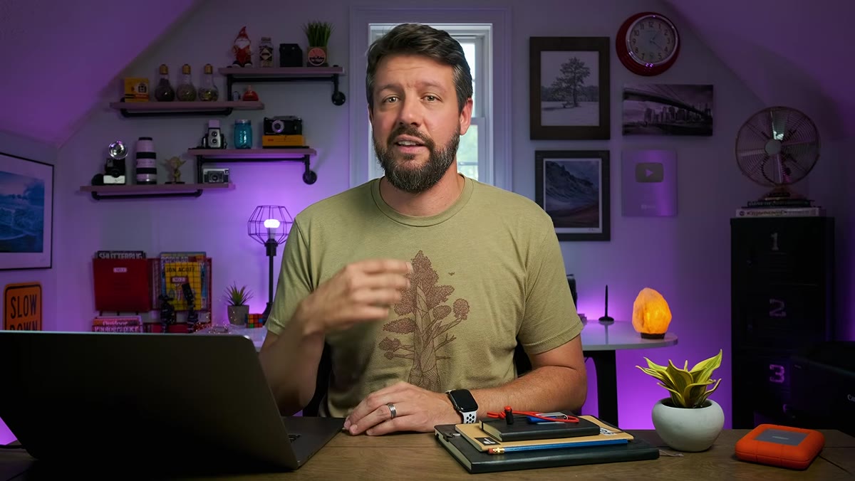
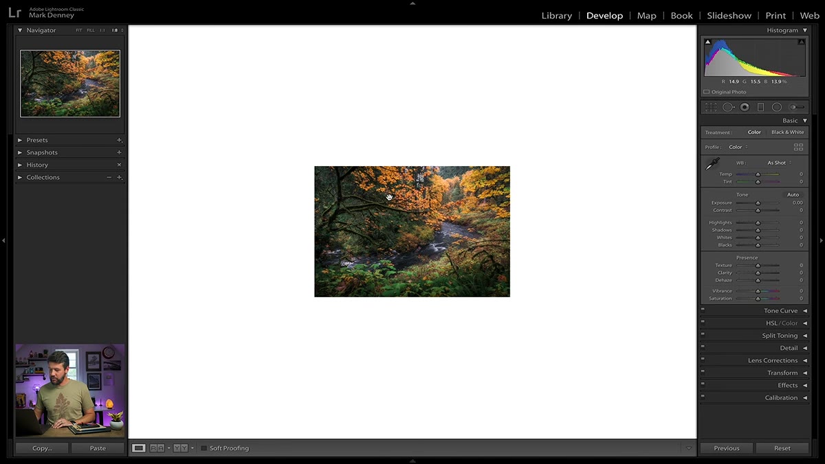
RAW files are deliberately flat. That’s not a flaw, it’s a feature, but it means the image you open in Lightroom is not the image you’re supposed to deliver. It’s the raw ingredient. Denney’s second sign of under-editing is accepting flat, lifeless color as the finished result, and I see this in workshop students constantly. They’ve heard “subtle” so many times that they’ve stopped developing the photo at all.
Start by lifting contrast and then target your colors individually using the HSL panel. Bump luminance on the sky tones to deepen blues. Pull saturation selectively on colors that are competing with your hero tones rather than slamming global saturation up. If you shot golden hour and the warmth of the light isn’t reading in the image, use a targeted color range adjustment or a radial filter over the light source. The goal is for the image to feel the way the scene actually felt, not to look like a filtered social post, but not to look like a passport photo either.
Step 3: Develop Real Contrast, Not Just the Contrast Slider
 Tone curve adjustment showing S-curve applied to landscape image
Denney’s third sign involves contrast, specifically the mistake of treating the Contrast slider as the solution. The basic Contrast slider in Lightroom compresses or expands tones across the whole image at once. It works, roughly, but it’s blunt. The tone curve gives you something the slider doesn’t: control over which part of the tonal range you’re affecting and by how much.
Build an S-curve by anchoring the midtones and then gently pulling the shadows down and the highlights up. This creates depth in the image without clipping your whites or crushing detail in the darks. For landscape work, I often keep the shadow end of the curve slightly lifted, because I want to hold texture in dark rocks or shadowed forest floors. If the image still looks flat after a curve adjustment, check your blacks. Pulling the blacks slider left until you just barely clip the deepest shadows will add punch without destroying detail.
Step 4: Address Each Area of the Frame Separately
 Graduated filter applied to sky to balance exposure in Lightroom
A single global edit treats a mountain the same way it treats the sky above it, which is almost never right. Denney’s fourth sign is the failure to use local adjustments, and this is where a lot of intermediate photographers stall out. They’ve gotten comfortable with the basic panel and haven’t pushed into graduated filters, radial filters, or the adjustment brush.
The most common case in landscape photography is a sky that needs darkening and cooling while the foreground needs brightening and warming. Drop a graduated filter from the top of the frame down to the horizon line, reduce exposure by somewhere between half a stop and a full stop, add a slight negative temperature shift to increase the perceived blue in the sky, and then separately use a radial filter or brush over the foreground to lift it. Work each zone of your image independently, and the whole frame will feel like it was lit with intention rather than just captured.
Step 5: Check the Details at Full Resolution
 100% zoom view showing sharpening and noise reduction panel in Lightroom
The fifth sign Denney covers is neglecting the fine detail work, specifically sharpening and noise reduction, which many photographers skip or leave at defaults. At export resolution, these decisions become visible in ways they don’t on a small preview. If you’re selling prints or displaying work at any significant size, this matters enormously.
In Lightroom’s Detail panel, hold Alt or Option while dragging the Masking slider under Sharpening. This shows you a black-and-white mask where white areas receive sharpening and black areas are protected. For most landscapes, you want sharpening on edges and texture, not on smooth skies or water where it will introduce grain. For noise, don’t just drag Luminance Noise Reduction up until the grain disappears, because you’ll also erase texture. Use the Detail slider in the noise reduction section to recover some of that texture after reducing the noise.
What I’d Add From the Field
One thing Denney doesn’t cover in depth, and that I’d push on from my own experience, is the value of editing in separate sessions. I process a first pass on an image the day I import it, then I leave it alone for at least a week before I make final decisions. The image I think is finished on day one is almost never the image I’d export on day eight. You need distance from the experience of being there. When you’re still feeling the cold air and the sound of the water, your editing instincts are colored by memory, not by what’s actually on screen. Time is a tool, same as any slider.
The core lesson from Denney’s tutorial is worth carrying with you: restraint and incompleteness are not the same thing. Getting your images to where they should be isn’t over-editing. It’s doing the job. Watch the full tutorial on YouTube and work through each of these five signs against your own recent edits. You’ll probably find at least two of them waiting for you.
Comments (4)
I keep coming back to this article. It's that useful.
Printing this out and pinning it next to my monitor. That good.
This is exactly what I needed today. Been struggling with this for weeks.
Couldn't agree more. I've seen this make a huge difference in lighting work specifically.
Leave a Comment