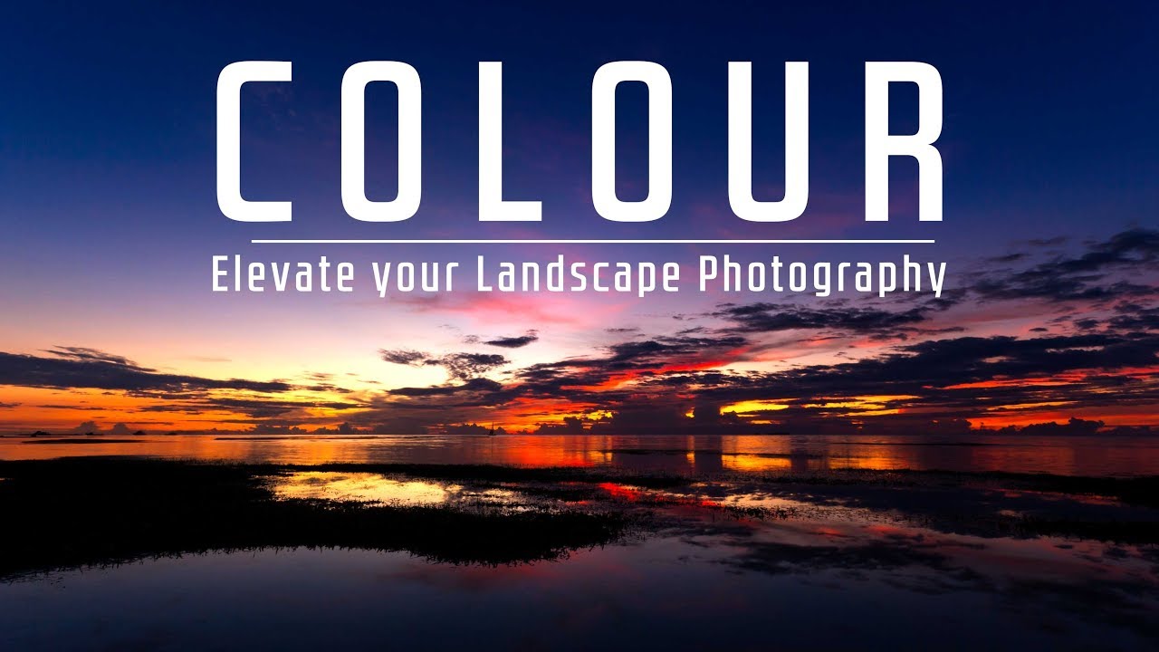
Color used to be something I reacted to. I’d get home, open Lightroom, and start pushing sliders around until the image “felt right.” Sometimes it worked. More often I was just guessing, hoping the oranges would pop or the blues would settle without blowing the whole thing out. Twenty years of doing this for a living will eventually teach you that hoping isn’t a strategy.
What changed for me was learning to treat color as a deliberate choice made before I ever leave the house — not a correction made after the fact. Watch the full tutorial on YouTube from First Man Photography, and you’ll see exactly what I mean. Ross breaks down the entire color decision chain, from planning and composition through to editing, in a way that’s practical and immediately usable in the field. I’ve been shooting landscapes since before most current gear existed and I still walked away with a cleaner framework for something I thought I already understood.
What follows is my breakdown of the tutorial’s core steps, expanded with what I’ve learned from shooting the high desert light here in Oregon and from years of teaching workshops where I watch photographers make the same color mistakes I once made.
Step 1: Decide What Emotional Story You’re Telling Before You Go Out
 Narrator explaining color’s emotional link to storytelling
Color is not decoration. It’s emotional language. Saturated, vibrant tones read as hopeful and energetic. Muted, cooler palettes feel contemplative, quieter, more melancholy. Before you pick a location or check the weather app, ask yourself what feeling you want to produce in the person who looks at your image. That question should come first, and the logistics follow from it.
Narrator explaining color’s emotional link to storytelling
Color is not decoration. It’s emotional language. Saturated, vibrant tones read as hopeful and energetic. Muted, cooler palettes feel contemplative, quieter, more melancholy. Before you pick a location or check the weather app, ask yourself what feeling you want to produce in the person who looks at your image. That question should come first, and the logistics follow from it.
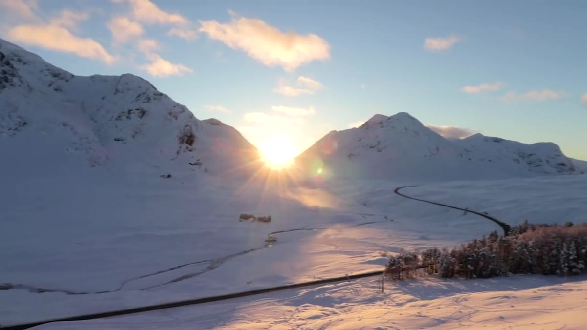
This is the part most photographers skip. They chase conditions and figure out the story later. Ross argues, correctly, that the story should drive the chase. If you want warmth and optimism, you’re looking for golden hour on open ground. If you want something more austere, flat grey light in a narrow canyon is your friend. The location, the weather, the time of day, all of these become tools once you know the emotional target.
Step 2: Let the Weather Shape the Color Narrative Across a Session
 Series of images showing color shift from morning to evening during one day
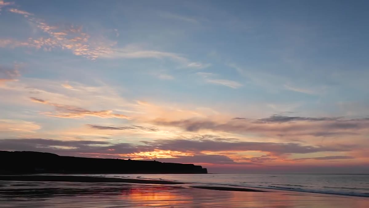
A single shoot doesn’t have to tell a single color story. Ross describes a day in the Peak District where the weather moved through full sun, overcast, near-monochrome, and eventually a vivid sunset. Rather than fighting that variability or treating it as a problem, he leaned into each shift and let the color of each hour tell part of a larger story across the day’s images.
Series of images showing color shift from morning to evening during one day
A single shoot doesn’t have to tell a single color story. Ross describes a day in the Peak District where the weather moved through full sun, overcast, near-monochrome, and eventually a vivid sunset. Rather than fighting that variability or treating it as a problem, he leaned into each shift and let the color of each hour tell part of a larger story across the day’s images.
I’ve done something similar on long shooting days in the Cascades. When you wake up at 4am and you’re committed to being out until the last light, you’re essentially photographing multiple different scenes even if you never move locations. The color shifts are the story. Plan for that flexibility rather than arriving with one rigid vision that the weather will almost certainly disrupt.
Step 3: Compose to Include, Isolate, or Contrast Color Deliberately
 Heather moorland image showing foreground color against plain sky
Once you’re on location, color becomes a compositional tool. An obvious case is a dramatic sunset sky. You expose for and compose around it because the color is the subject. But Ross gives a better example: heather moorland. For most of the year it’s a dull greenish-brown. In late August into early September, it erupts into a blanket of pink-purple that transforms the entire landscape and, more importantly, transforms what’s possible in the frame.
Heather moorland image showing foreground color against plain sky
Once you’re on location, color becomes a compositional tool. An obvious case is a dramatic sunset sky. You expose for and compose around it because the color is the subject. But Ross gives a better example: heather moorland. For most of the year it’s a dull greenish-brown. In late August into early September, it erupts into a blanket of pink-purple that transforms the entire landscape and, more importantly, transforms what’s possible in the frame.
When a strong color element is present, ask yourself whether it should dominate the frame, anchor the foreground, or contrast against something neutral behind it. Heather against a grey sky reads very differently than heather under warm golden light. Neither is wrong, but they produce different images. Train yourself to see color masses in the scene the same way you see shapes and lines. It’s another layer of visual grammar.
Step 4: Use White Balance as a Creative Tool, Not a Correction
 White balance settings being adjusted in camera menu
White balance is where a lot of photographers leave creative control on the table. Auto white balance is reliable, but reliability isn’t the same as intentional. Shooting in RAW gives you full control in post, but developing habits around white balance in-camera forces you to think about color temperature as part of the shot rather than an afterthought.
White balance settings being adjusted in camera menu
White balance is where a lot of photographers leave creative control on the table. Auto white balance is reliable, but reliability isn’t the same as intentional. Shooting in RAW gives you full control in post, but developing habits around white balance in-camera forces you to think about color temperature as part of the shot rather than an afterthought.
Cooler white balance settings push a scene toward blue and teal, reinforcing a mood of stillness or isolation. Warmer settings amplify the emotional weight of golden hour, making an already warm scene feel even more immersive. I still shoot film occasionally because it forces exactly this kind of upstream thinking. You choose your film stock before you shoot, and that choice locks in a color character. Treating white balance with the same seriousness in digital work produces sharper, more consistent results.
Step 5: Edit Color with Intention, Not Instinct
 Lightroom HSL panel being used to target specific color ranges
In post, the HSL panel in Lightroom (or equivalent tools in Capture One or Luminar) lets you target specific color ranges and adjust their hue, saturation, and luminance independently. This is where you refine rather than invent. If the sky has a magenta cast that’s pulling attention from the warmer tones in your foreground, you pull back the magenta in the reds and purples without touching anything else. If your greens are reading too lime-yellow, you shift the hue slider toward teal until the vegetation looks like vegetation.
Lightroom HSL panel being used to target specific color ranges
In post, the HSL panel in Lightroom (or equivalent tools in Capture One or Luminar) lets you target specific color ranges and adjust their hue, saturation, and luminance independently. This is where you refine rather than invent. If the sky has a magenta cast that’s pulling attention from the warmer tones in your foreground, you pull back the magenta in the reds and purples without touching anything else. If your greens are reading too lime-yellow, you shift the hue slider toward teal until the vegetation looks like vegetation.
The key discipline here is restraint. Push any color too hard and it starts to look processed in a way that pulls the viewer out of the image. The goal is to land on the color palette you planned for at Step 1, not to discover a new one by accident in the edit. Every slider move should be a decision traceable back to the story you decided to tell before you left the house.
What Twenty Years in the Field Adds
I’d extend Ross’s framework with one caveat built from experience: location scouting for color is its own skill, and seasonal timing is more specific than most photographers realize. The heather example in the tutorial is a perfect illustration. A week early and the bloom isn’t there. A week late and it’s fading. The same applies to autumn foliage in the Pacific Northwest, to the bloom of high desert wildflowers here in Bend, to the blue ice exposed in glaciers at specific times of year.
Building a personal calendar of color windows at your regular locations gives you something most photographers don’t have: predictability. You’re not just waiting for a colorful day. You’re arriving during a narrow window when a specific color is available in a specific place, and you’ve already decided what story it’s going to tell.
Color should never happen to you. It should be something you planned, pursued, composed around, and refined through editing into exactly the feeling you were after when you first had the idea for the shot. That upstream intention is what separates images that feel accidental from images that feel inevitable.
Watch the full tutorial on YouTube from First Man Photography. It’s one of the cleaner treatments of color as a full-process discipline I’ve come across, and worth watching with a notebook open.
Comments (4)
Quality content like this is rare. Keep it up.
This saved me so much time on my last edit. Wish I'd found this sooner.
This is the kind of content that keeps me coming back.
Love this. I referenced a similar technique in one of my recent posts. Always good to see other perspectives.
Leave a Comment